NATA S HA - Glauco Cavaciuti Arte€¦ · FRAGILE NATA S HA. NATASHA FRAGILE. FRAGILE NATASHA...
59
FRAGILE NATA S HA
Transcript of NATA S HA - Glauco Cavaciuti Arte€¦ · FRAGILE NATA S HA. NATASHA FRAGILE. FRAGILE NATASHA...
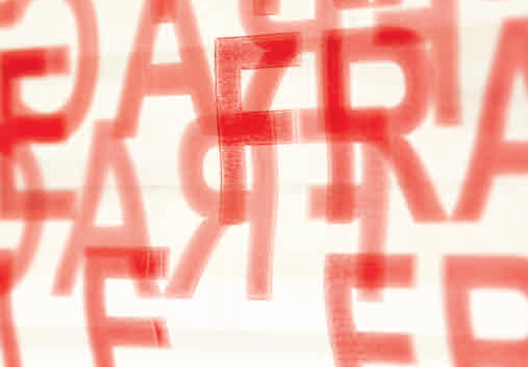
FRAGILE
NA
TAS
HA

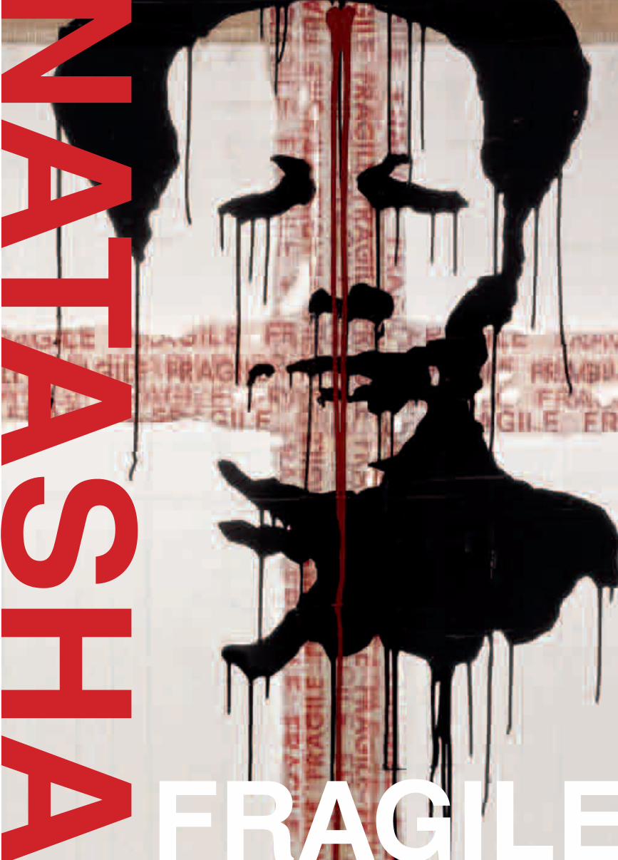
NATASHA
FRAGILE
FRAGILENATASHA
saggio critico / essay
luca beatrice
immagini / photographs
Giovanni ricci-novara
flora bigaia r t e c o n t e m p o r a n e a
Desidero ringraziare Armando, Claudio, Emanuela, Flora, Giovanni, Mattia e Michele. Il loro sostegno ha reso possibile la realizzazione di questo progetto.
Natasha
Progetto grafico – Graphic designles hérissons, parigi
Impaginazione – Layoutlarissa pusceddu
Traduzioni – Translationsimon turner
Fotolito – Photolithographyles hérissons, parigi
Stampa – Printingblueprint, bernate ticino (mi)
La realizzazione di questo progetto si deve all’impegno congiunto di:
flora bigaia r t e c o n t e m p o r a n e a
CERVIETTI Franco & Cl a v o r a z i o n e a r t i s t i c a d e l m a r m oSrl
PH: © Giovanni Ricci-Novara, Pariswww.giovanniriccinovara.com
Marginal note
Nota a margine Reading is a stroll through others’ souls.
The beauty and profundity of certain pages turn this roving into an experience and, quite often, into an intimate pleasure. There is an alternation of affinities revealed and of distance from the author: the undulating motion this causes cradles and revives our spirit.
The intellectual mechanisms that are brought into play when reading a work of art are pretty well the same, but the pleasure is inevitably intensified by the involvement of sight, the most sophisticated of the senses.
In drafting this little volume, the original idea was to offer a view of Natasha’s work that would go beyond a merely didactic presentation of each item. The idea was to create a catalogue that would also be a story, recounting in pictures the phantoms of Natasha’s world and her highly personal way of working. An idea that was shared by all those involved in this project: Flora, who formulated and coordinated its various aspects, Mattia who first perceived its true value and, of course, Natasha.
The broadest possible sharing of an idea is the most desirable of prospects.
Giovanni Ricci-Novara
Leggere è vagare per anime altrui.
La bellezza e la profondità di certe pagine trasformano il girovagare in esperienza e, non di rado, in intimo piacere.Affinità svelate e lontananza dall’autore si alternano; il moto ondoso che ne deriva culla la nostra anima e la ristora.
Nel leggere un’opera d’arte i meccanismi intellettuali chiamati in causa sono pressoché gli stessi, ma il piacere risulta inevitabilmente accresciuto dal coinvolgimento alla lettura del più raffinato dei sensi: la vista.
Nel progettare questo piccolo volume l’intento originario era quello di offrire uno sguardo sul lavoro di Natasha che differisse dalla semplice, didascalica, presentazione dei lavori stessi.L’idea era di proporre un catalogo, che fosse anche un racconto, capace di svelare attraverso le immagini i fantasmi di un mondo e il personalissimo modo di lavorare di Natasha.Un’idea peraltro condivisa da tutti gli attori di questo progetto: Flora, che ne ha ideato e coordinato i vari aspetti, Mattia che per primo ne ha intuito il valore e, naturalmente, Natasha.
La più ampia condivisione possibile dell’idea è la più auspicabile delle attese.
Giovanni Ricci-Novara
9
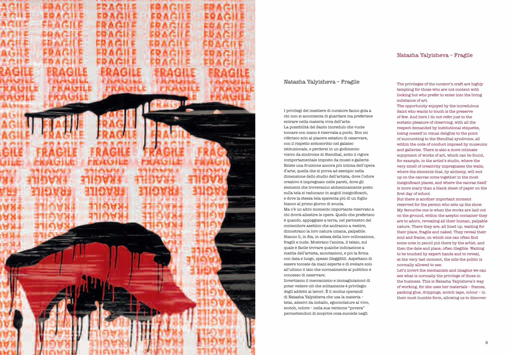
The privileges of the curator’s craft are highly tempting for those who are not content with looking but who prefer to enter into the living substance of art. The opportunity enjoyed by the incredulous Saint who wants to touch is the preserve of few. And here I do not refer just to the ecstatic pleasure of observing, with all the respect demanded by institutional etiquette, losing oneself in visual delights to the point of succumbing to the Stendhal syndrome, all within the code of conduct imposed by museums and galleries. There is also a more intimate enjoyment of works of art, which can be found, for example, in the artist’s studio, where the very smell of creativity impregnates the walls, where the elements that, by alchemy, will end up on the canvas come together in the most insignificant places, and where the canvas itself is more scary than a blank sheet of paper on the first day of school. But there is another important moment reserved for the person who sets up the show. My favourite one is when the works are laid out on the ground, within the aseptic container they are to adorn, revealing all their human, palpable nature. There they are, all lined up, waiting for their place, fragile and naked. They reveal their soul and frame, on which one can often find some note in pencil put there by the artist, and then the date and place, often illegible. Waiting to be touched by expert hands and to reveal, at the very last moment, the side the public is normally allowed to see.Let’s invert the mechanism and imagine we can see what is normally the privilege of those in the business. This is Natasha Yalyisheva’s way of working, for she uses her materials – frames, packing glue, drippings, scotch tape, colour – in their most humble form, allowing us to discover
Natasha Yalyisheva – Fragile
Natasha Yalyisheva – Fragile
I privilegi del mestiere di curatore fanno gola a chi non si accontenta di guardare ma preferisce entrare nella materia viva dell’arte. La possibilità del Santo incredulo che vuole toccare con mano è riservata a pochi. Non mi riferisco solo al piacere estatico di osservare, con il rispetto sottoscritto nel galateo istituzionale, e perdersi in un godimento visivo da sindrome di Stendhal, sotto il rigore comportamentale imposto da musei e gallerie. Esiste una fruizione ancora più intima dell’opera d’arte, quella che si prova ad esempio nella dimensione dello studio dell’artista, dove l’odore creativo è impregnato nelle pareti, dove gli elementi che troveranno alchemicamente posto sulla tela si radunano in angoli insignificanti, e dove la stessa tela spaventa più di un foglio bianco al primo giorno di scuola. Ma c’è un altro momento importante riservato a chi dovrà allestire le opere. Quello che preferisco è quando, appoggiate a terra, nel perimetro del contenitore asettico che andranno a vestire, dimostrano la loro natura umana, palpabile. Stanno lì, in fila, in attesa della loro collocazione, fragili e nude. Mostrano l’anima, il telaio, sul quale è facile trovare qualche indicazione a matita dell’artista, annotazioni, e poi la firma con data e luogo, spesso illeggibili. Aspettano di essere toccate da mani esperte e di svelare solo all’ultimo il lato che normalmente al pubblico è concesso di osservare.Invertiamo il meccanismo e immaginiamoci di poter vedere ciò che solitamente è privilegio degli addetti ai lavori. È il modus operandi di Natasha Yalyisheva che usa la materia – telai, adesivi da imballo, sgocciolature al vivo, scotch, colore – nella sua versione “povera” permettendoci di scoprire cosa succede negli
9
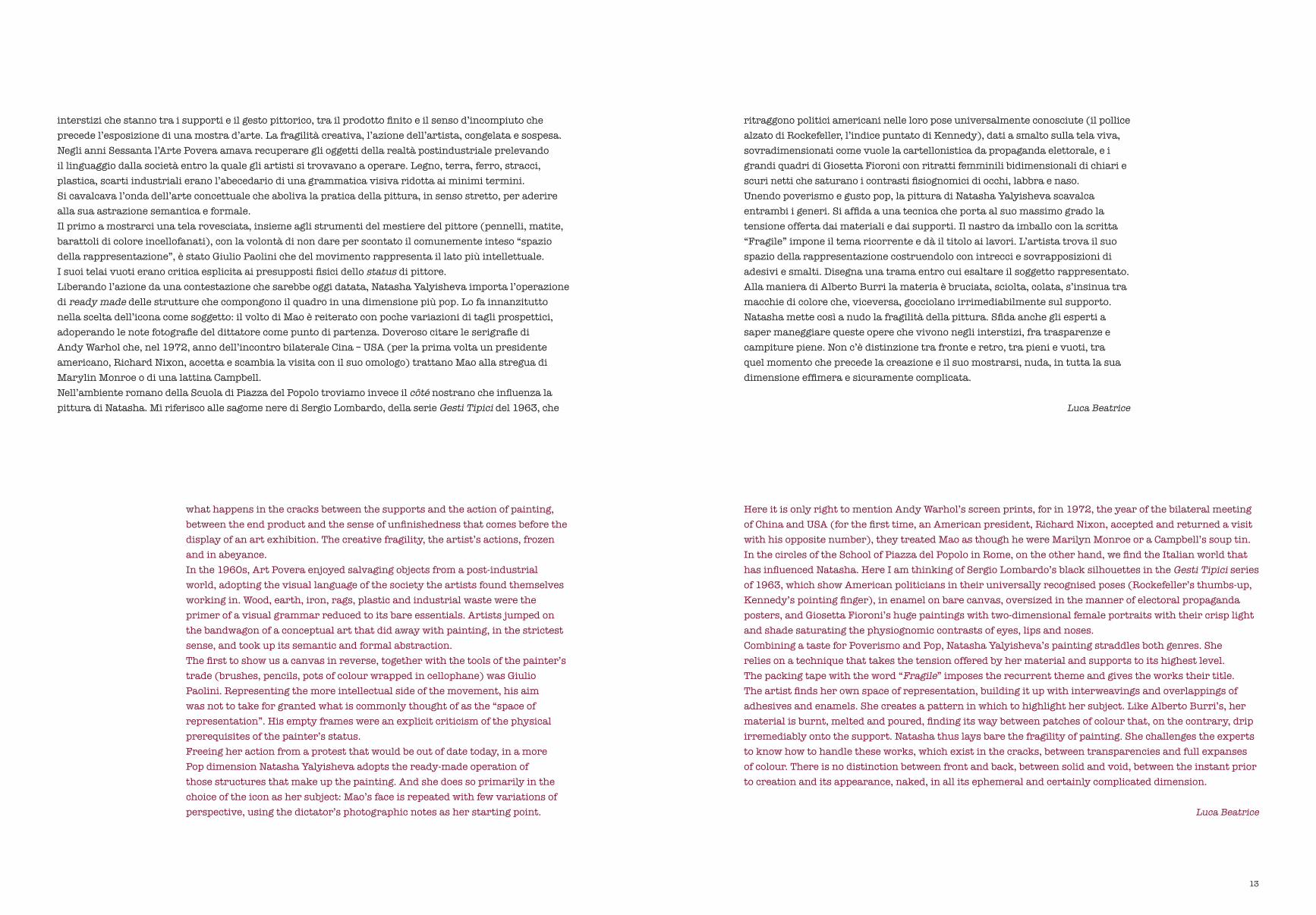
what happens in the cracks between the supports and the action of painting, between the end product and the sense of unfinishedness that comes before the display of an art exhibition. The creative fragility, the artist’s actions, frozen and in abeyance.In the 1960s, Art Povera enjoyed salvaging objects from a post-industrial world, adopting the visual language of the society the artists found themselves working in. Wood, earth, iron, rags, plastic and industrial waste were the primer of a visual grammar reduced to its bare essentials. Artists jumped on the bandwagon of a conceptual art that did away with painting, in the strictest sense, and took up its semantic and formal abstraction.The first to show us a canvas in reverse, together with the tools of the painter’s trade (brushes, pencils, pots of colour wrapped in cellophane) was Giulio Paolini. Representing the more intellectual side of the movement, his aim was not to take for granted what is commonly thought of as the “space of representation”. His empty frames were an explicit criticism of the physical prerequisites of the painter’s status. Freeing her action from a protest that would be out of date today, in a more Pop dimension Natasha Yalyisheva adopts the ready-made operation of those structures that make up the painting. And she does so primarily in the choice of the icon as her subject: Mao’s face is repeated with few variations of perspective, using the dictator’s photographic notes as her starting point.
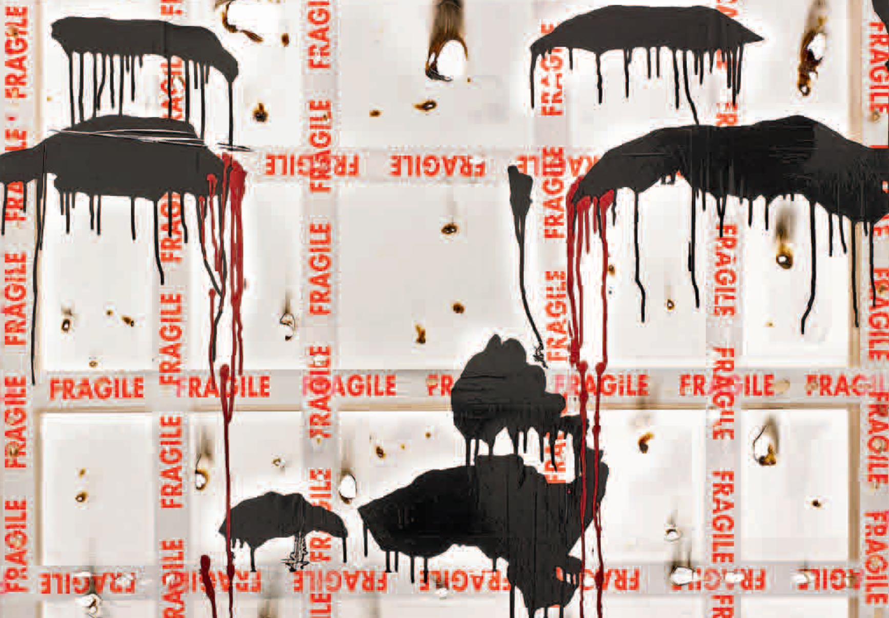
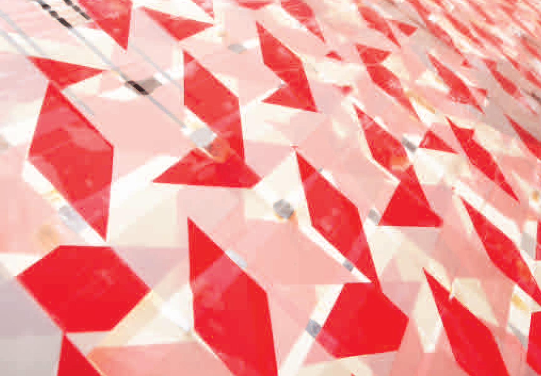
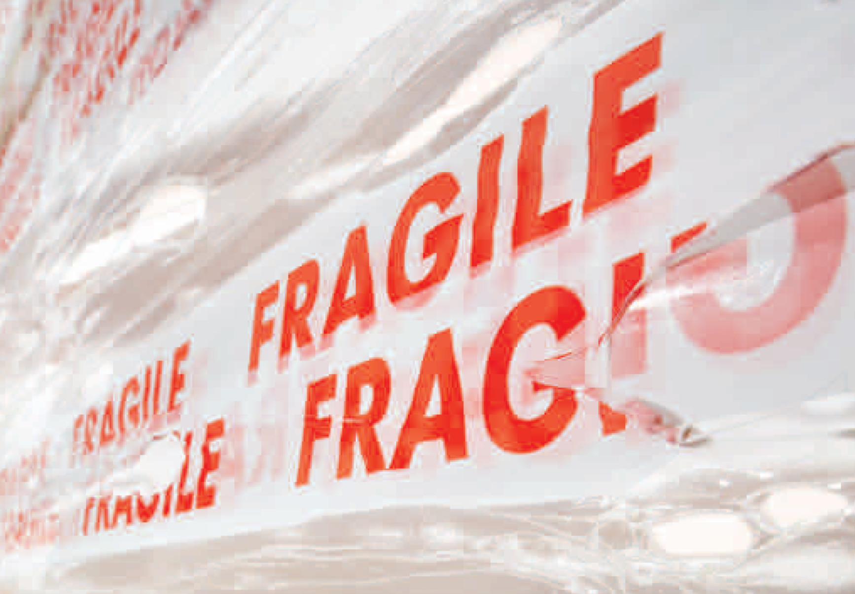
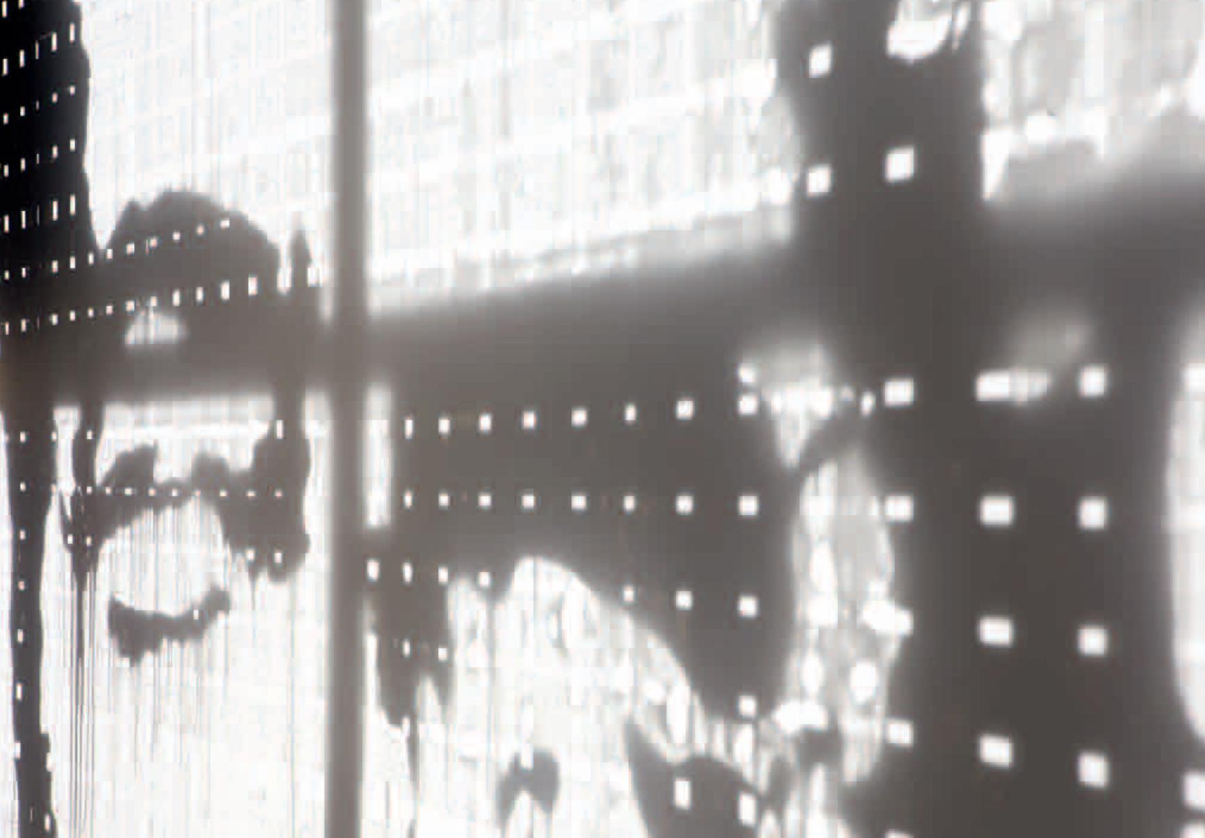
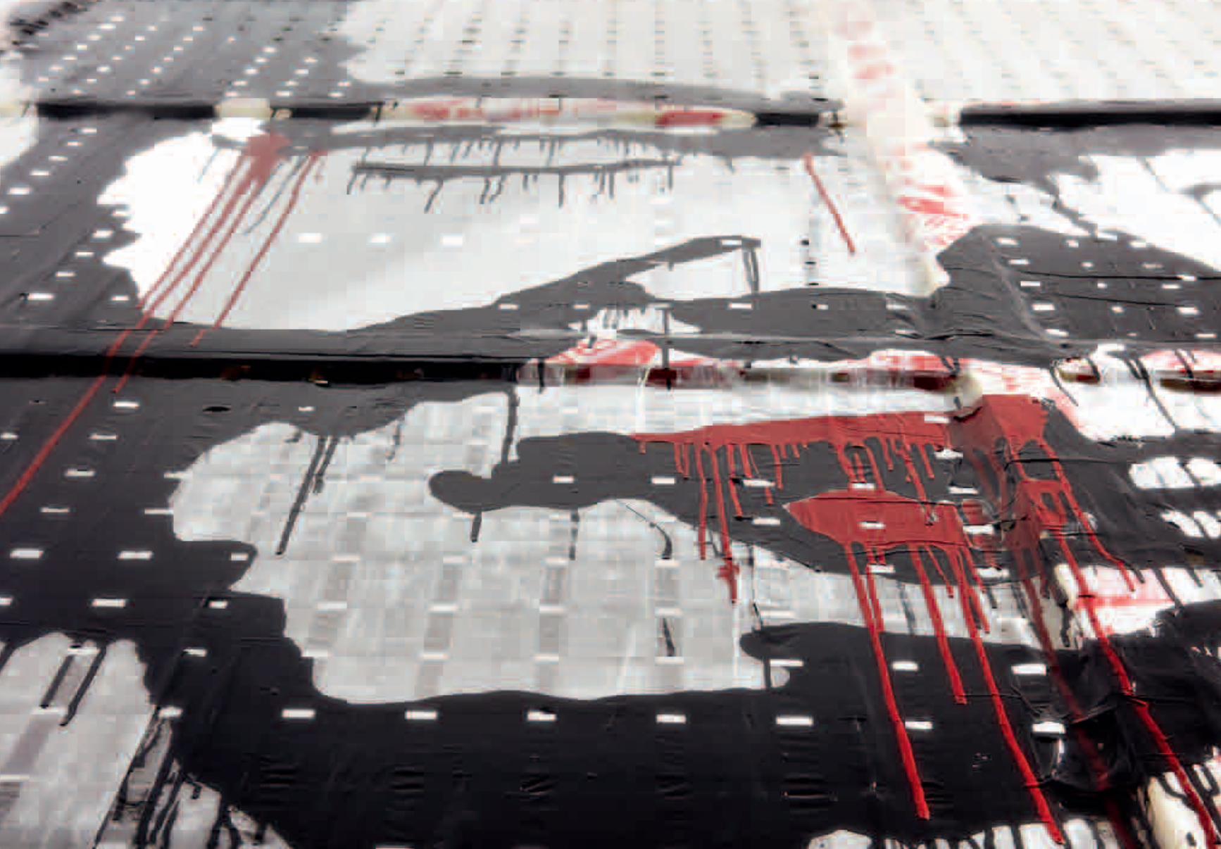
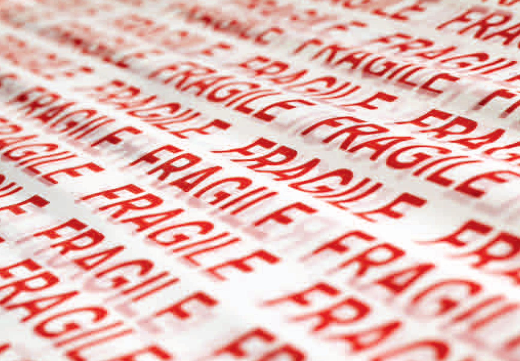
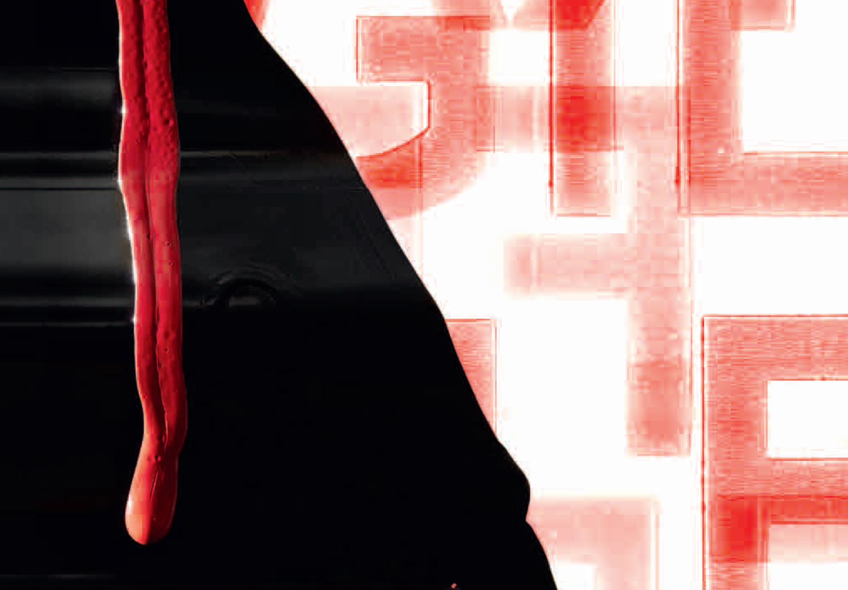
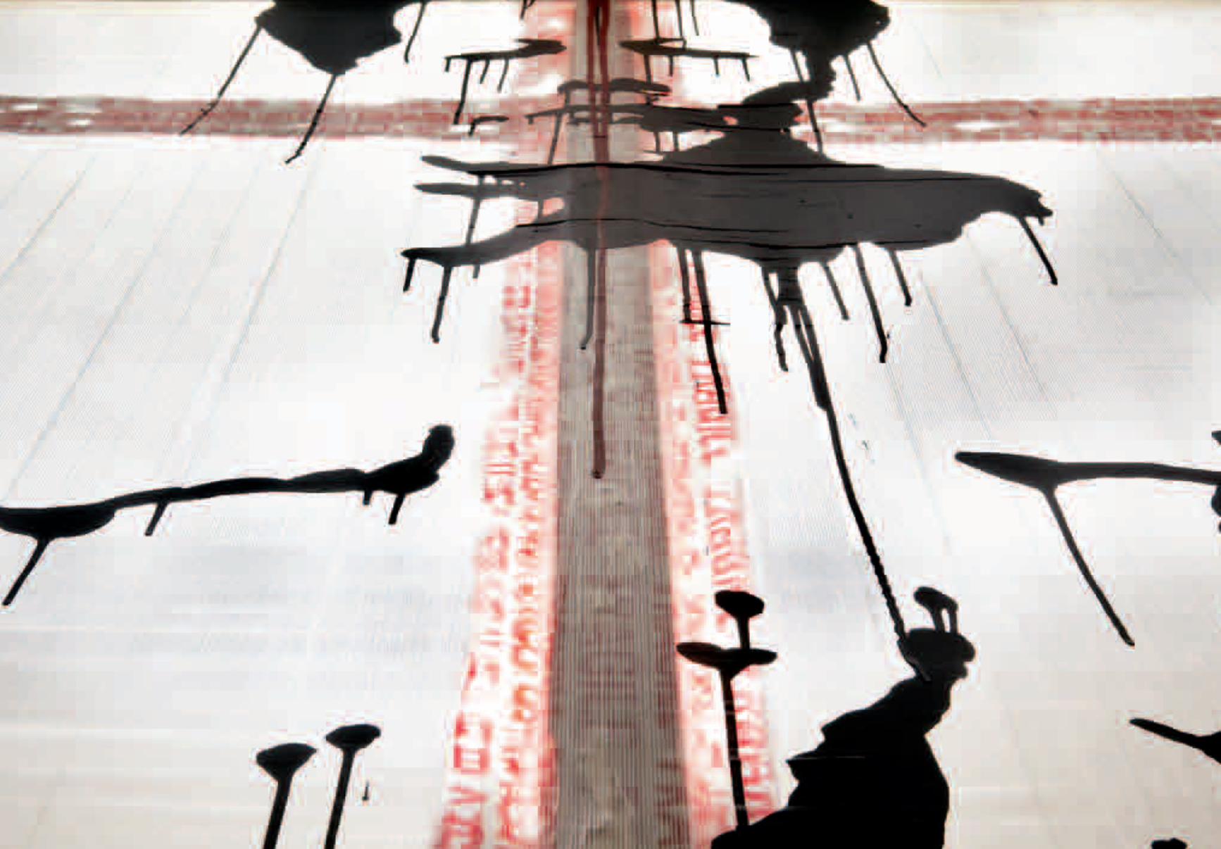
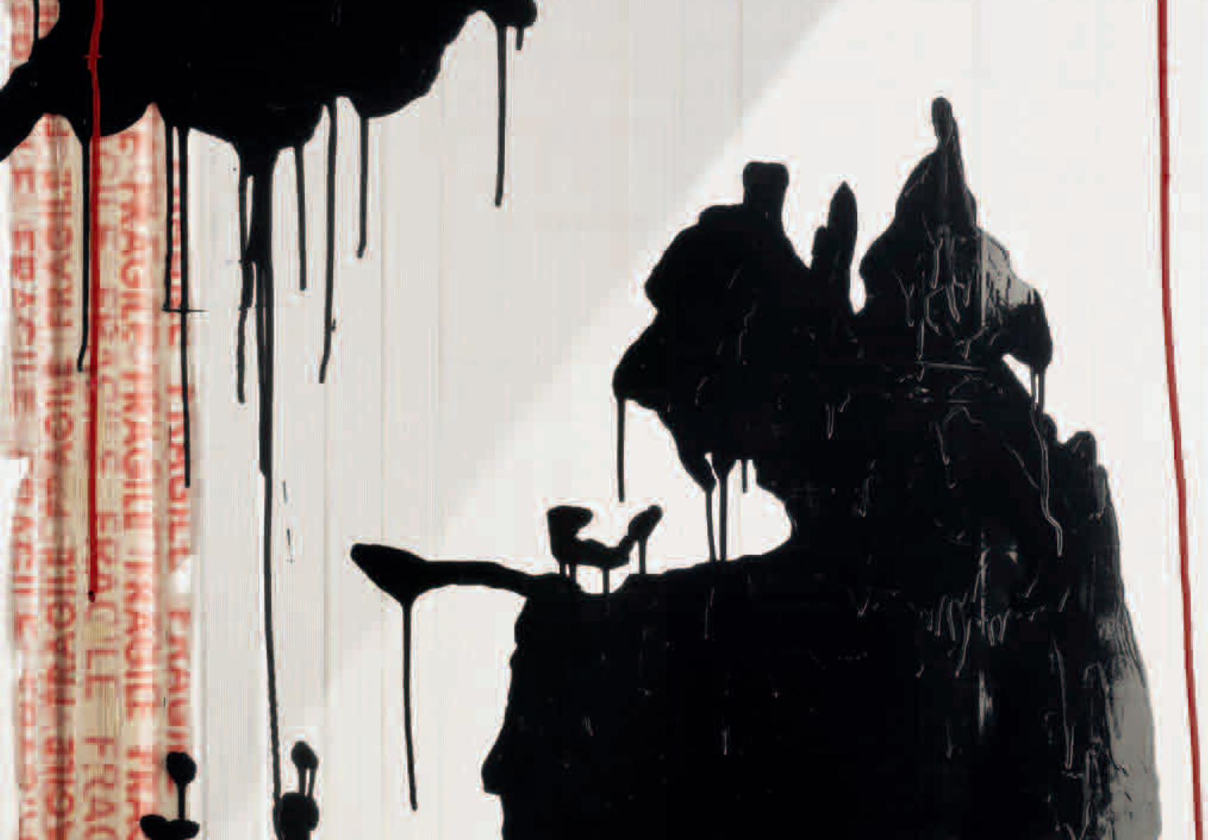
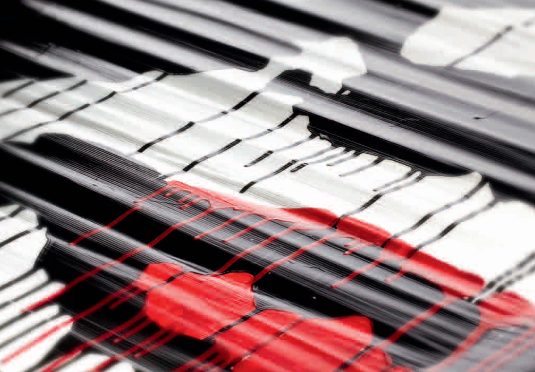
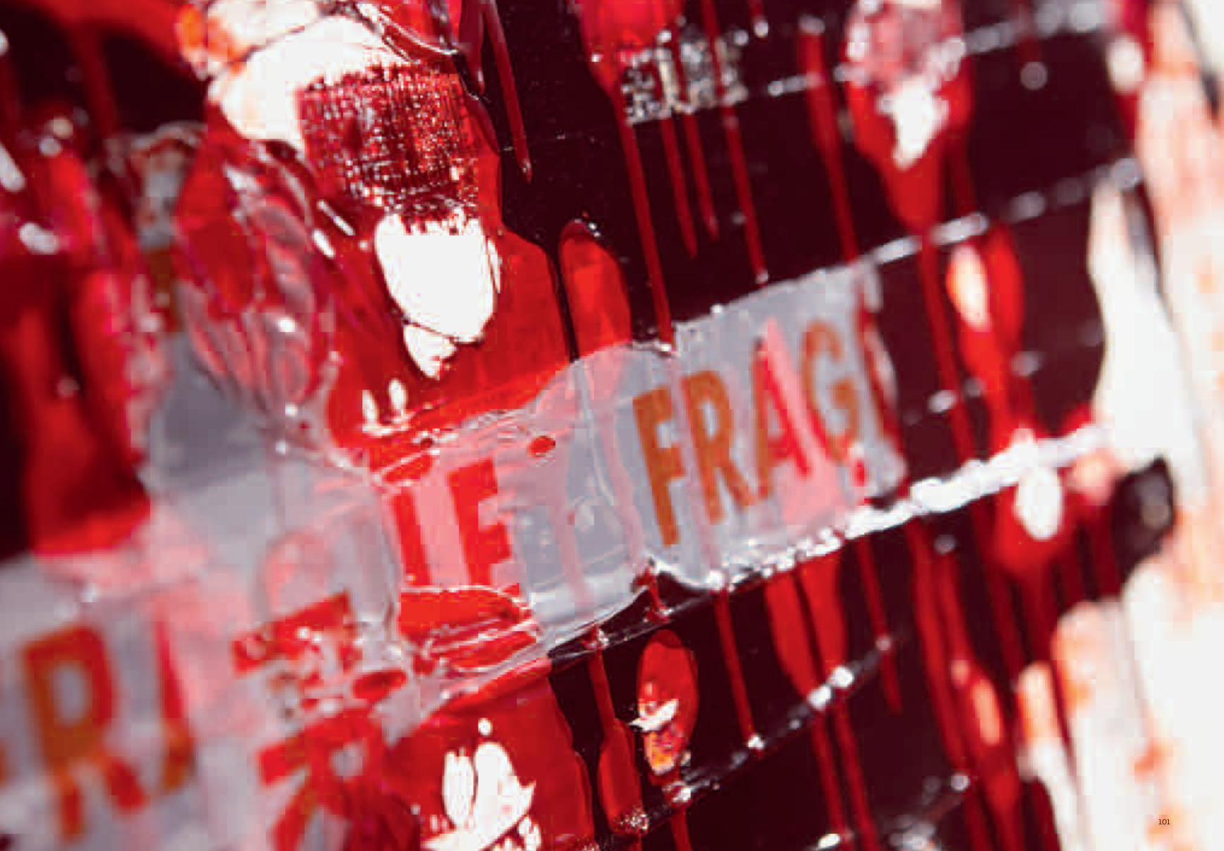
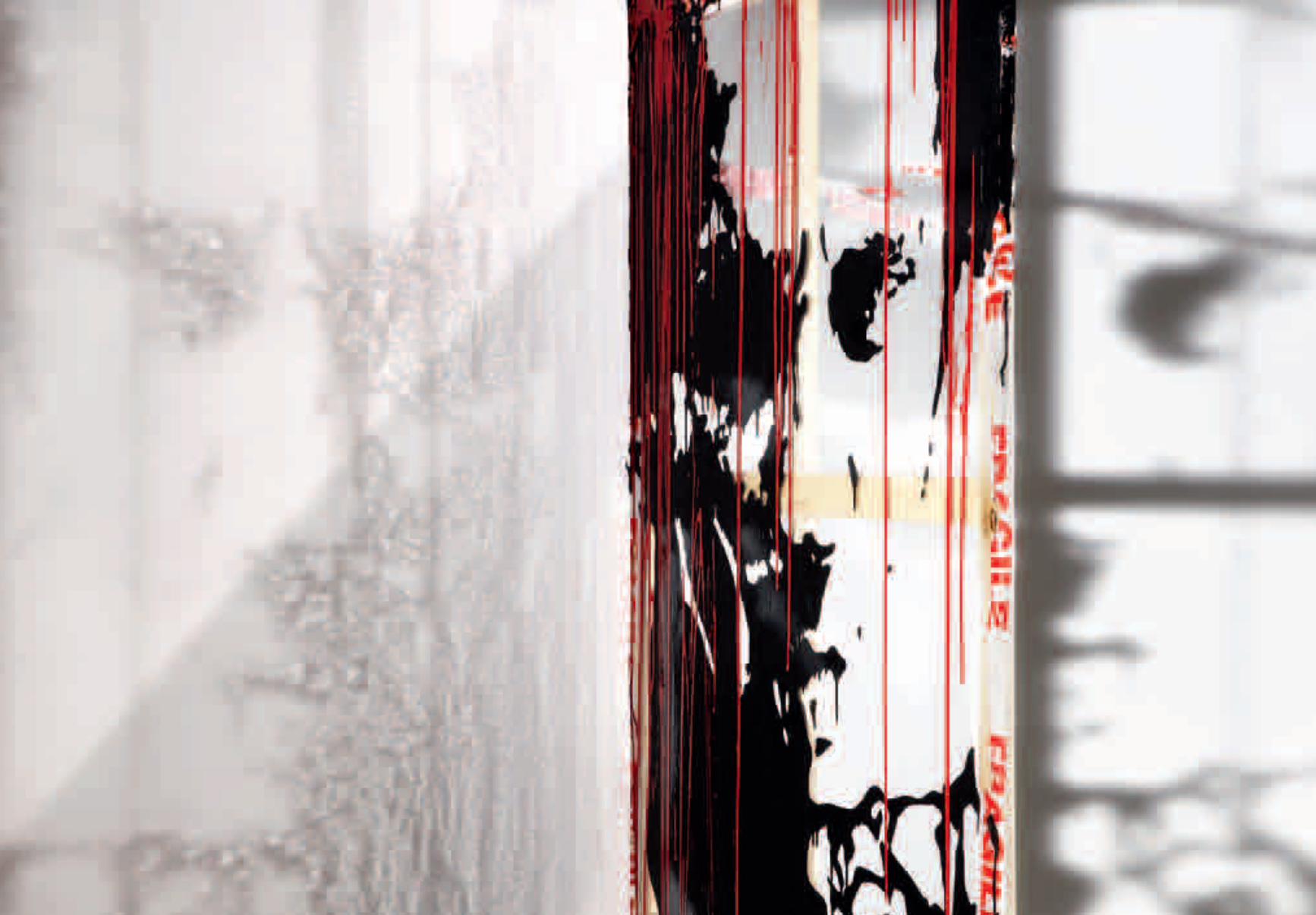
Here it is only right to mention Andy Warhol’s screen prints, for in 1972, the year of the bilateral meeting of China and USA (for the first time, an American president, Richard Nixon, accepted and returned a visit with his opposite number), they treated Mao as though he were Marilyn Monroe or a Campbell’s soup tin.In the circles of the School of Piazza del Popolo in Rome, on the other hand, we find the Italian world that has influenced Natasha. Here I am thinking of Sergio Lombardo’s black silhouettes in the Gesti Tipici series of 1963, which show American politicians in their universally recognised poses (Rockefeller’s thumbs-up, Kennedy’s pointing finger), in enamel on bare canvas, oversized in the manner of electoral propaganda posters, and Giosetta Fioroni’s huge paintings with two-dimensional female portraits with their crisp light and shade saturating the physiognomic contrasts of eyes, lips and noses. Combining a taste for Poverismo and Pop, Natasha Yalyisheva’s painting straddles both genres. She relies on a technique that takes the tension offered by her material and supports to its highest level. The packing tape with the word “Fragile” imposes the recurrent theme and gives the works their title. The artist finds her own space of representation, building it up with interweavings and overlappings of adhesives and enamels. She creates a pattern in which to highlight her subject. Like Alberto Burri’s, her material is burnt, melted and poured, finding its way between patches of colour that, on the contrary, drip irremediably onto the support. Natasha thus lays bare the fragility of painting. She challenges the experts to know how to handle these works, which exist in the cracks, between transparencies and full expanses of colour. There is no distinction between front and back, between solid and void, between the instant prior to creation and its appearance, naked, in all its ephemeral and certainly complicated dimension.
Luca Beatrice
interstizi che stanno tra i supporti e il gesto pittorico, tra il prodotto finito e il senso d’incompiuto che precede l’esposizione di una mostra d’arte. La fragilità creativa, l’azione dell’artista, congelata e sospesa.Negli anni Sessanta l’Arte Povera amava recuperare gli oggetti della realtà postindustriale prelevando il linguaggio dalla società entro la quale gli artisti si trovavano a operare. Legno, terra, ferro, stracci, plastica, scarti industriali erano l’abecedario di una grammatica visiva ridotta ai minimi termini. Si cavalcava l’onda dell’arte concettuale che aboliva la pratica della pittura, in senso stretto, per aderire alla sua astrazione semantica e formale.Il primo a mostrarci una tela rovesciata, insieme agli strumenti del mestiere del pittore (pennelli, matite, barattoli di colore incellofanati), con la volontà di non dare per scontato il comunemente inteso “spazio della rappresentazione”, è stato Giulio Paolini che del movimento rappresenta il lato più intellettuale. I suoi telai vuoti erano critica esplicita ai presupposti fisici dello status di pittore. Liberando l’azione da una contestazione che sarebbe oggi datata, Natasha Yalyisheva importa l’operazione di ready made delle strutture che compongono il quadro in una dimensione più pop. Lo fa innanzitutto nella scelta dell’icona come soggetto: il volto di Mao è reiterato con poche variazioni di tagli prospettici, adoperando le note fotografie del dittatore come punto di partenza. Doveroso citare le serigrafie di Andy Warhol che, nel 1972, anno dell’incontro bilaterale Cina – USA (per la prima volta un presidente americano, Richard Nixon, accetta e scambia la visita con il suo omologo) trattano Mao alla stregua di Marylin Monroe o di una lattina Campbell.Nell’ambiente romano della Scuola di Piazza del Popolo troviamo invece il côté nostrano che influenza la pittura di Natasha. Mi riferisco alle sagome nere di Sergio Lombardo, della serie Gesti Tipici del 1963, che
ritraggono politici americani nelle loro pose universalmente conosciute (il pollice alzato di Rockefeller, l’indice puntato di Kennedy), dati a smalto sulla tela viva, sovradimensionati come vuole la cartellonistica da propaganda elettorale, e i grandi quadri di Giosetta Fioroni con ritratti femminili bidimensionali di chiari e scuri netti che saturano i contrasti fisiognomici di occhi, labbra e naso. Unendo poverismo e gusto pop, la pittura di Natasha Yalyisheva scavalca entrambi i generi. Si affida a una tecnica che porta al suo massimo grado la tensione offerta dai materiali e dai supporti. Il nastro da imballo con la scritta “Fragile” impone il tema ricorrente e dà il titolo ai lavori. L’artista trova il suo spazio della rappresentazione costruendolo con intrecci e sovrapposizioni di adesivi e smalti. Disegna una trama entro cui esaltare il soggetto rappresentato. Alla maniera di Alberto Burri la materia è bruciata, sciolta, colata, s’insinua tra macchie di colore che, viceversa, gocciolano irrimediabilmente sul supporto. Natasha mette così a nudo la fragilità della pittura. Sfida anche gli esperti a saper maneggiare queste opere che vivono negli interstizi, fra trasparenze e campiture piene. Non c’è distinzione tra fronte e retro, tra pieni e vuoti, tra quel momento che precede la creazione e il suo mostrarsi, nuda, in tutta la sua dimensione effimera e sicuramente complicata.
Luca Beatrice
13
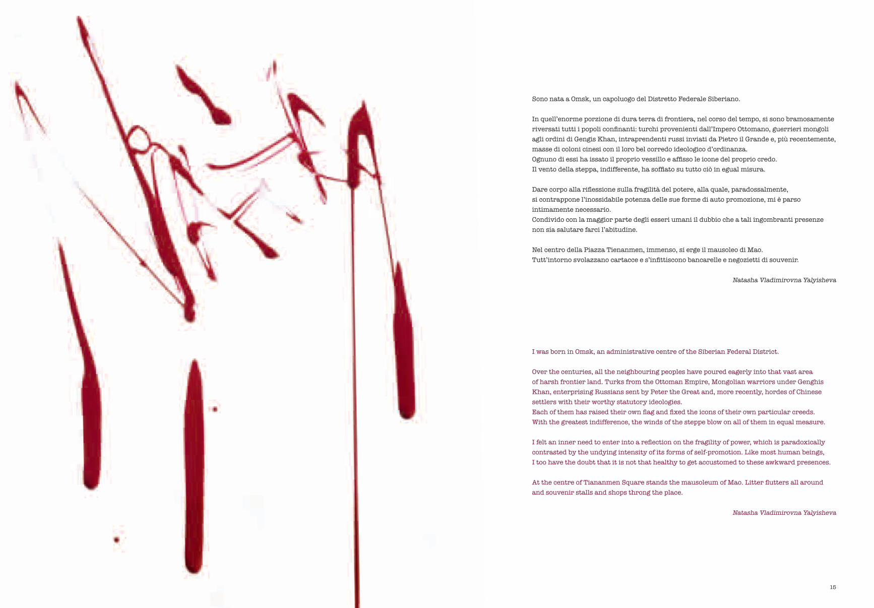
Sono nata a Omsk, un capoluogo del Distretto Federale Siberiano.
In quell’enorme porzione di dura terra di frontiera, nel corso del tempo, si sono bramosamente riversati tutti i popoli confinanti: turchi provenienti dall’Impero Ottomano, guerrieri mongoli agli ordini di Gengis Khan, intraprendenti russi inviati da Pietro il Grande e, più recentemente, masse di coloni cinesi con il loro bel corredo ideologico d’ordinanza.Ognuno di essi ha issato il proprio vessillo e affisso le icone del proprio credo.Il vento della steppa, indifferente, ha soffiato su tutto ciò in egual misura.
Dare corpo alla riflessione sulla fragilità del potere, alla quale, paradossalmente, si contrappone l’inossidabile potenza delle sue forme di auto promozione, mi è parso intimamente necessario.Condivido con la maggior parte degli esseri umani il dubbio che a tali ingombranti presenze non sia salutare farci l’abitudine.
Nel centro della Piazza Tienanmen, immenso, si erge il mausoleo di Mao.Tutt’intorno svolazzano cartacce e s’infittiscono bancarelle e negozietti di souvenir.
Natasha Vladimirovna Yalyisheva
I was born in Omsk, an administrative centre of the Siberian Federal District.
Over the centuries, all the neighbouring peoples have poured eagerly into that vast area of harsh frontier land. Turks from the Ottoman Empire, Mongolian warriors under Genghis Khan, enterprising Russians sent by Peter the Great and, more recently, hordes of Chinese settlers with their worthy statutory ideologies.Each of them has raised their own flag and fixed the icons of their own particular creeds. With the greatest indifference, the winds of the steppe blow on all of them in equal measure.
I felt an inner need to enter into a reflection on the fragility of power, which is paradoxically contrasted by the undying intensity of its forms of self-promotion. Like most human beings, I too have the doubt that it is not that healthy to get accustomed to these awkward presences.
At the centre of Tiananmen Square stands the mausoleum of Mao. Litter flutters all around and souvenir stalls and shops throng the place.
Natasha Vladimirovna Yalyisheva
15
16
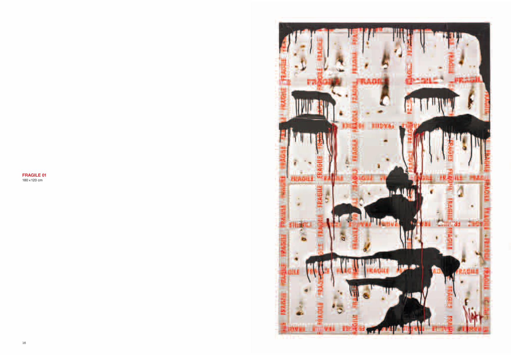
FRAGILE 01180 × 120 cm
19

25
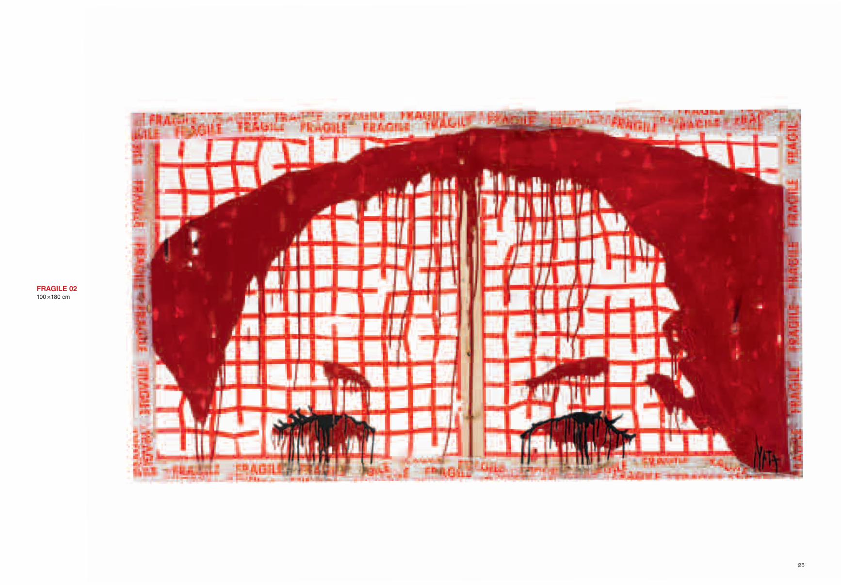
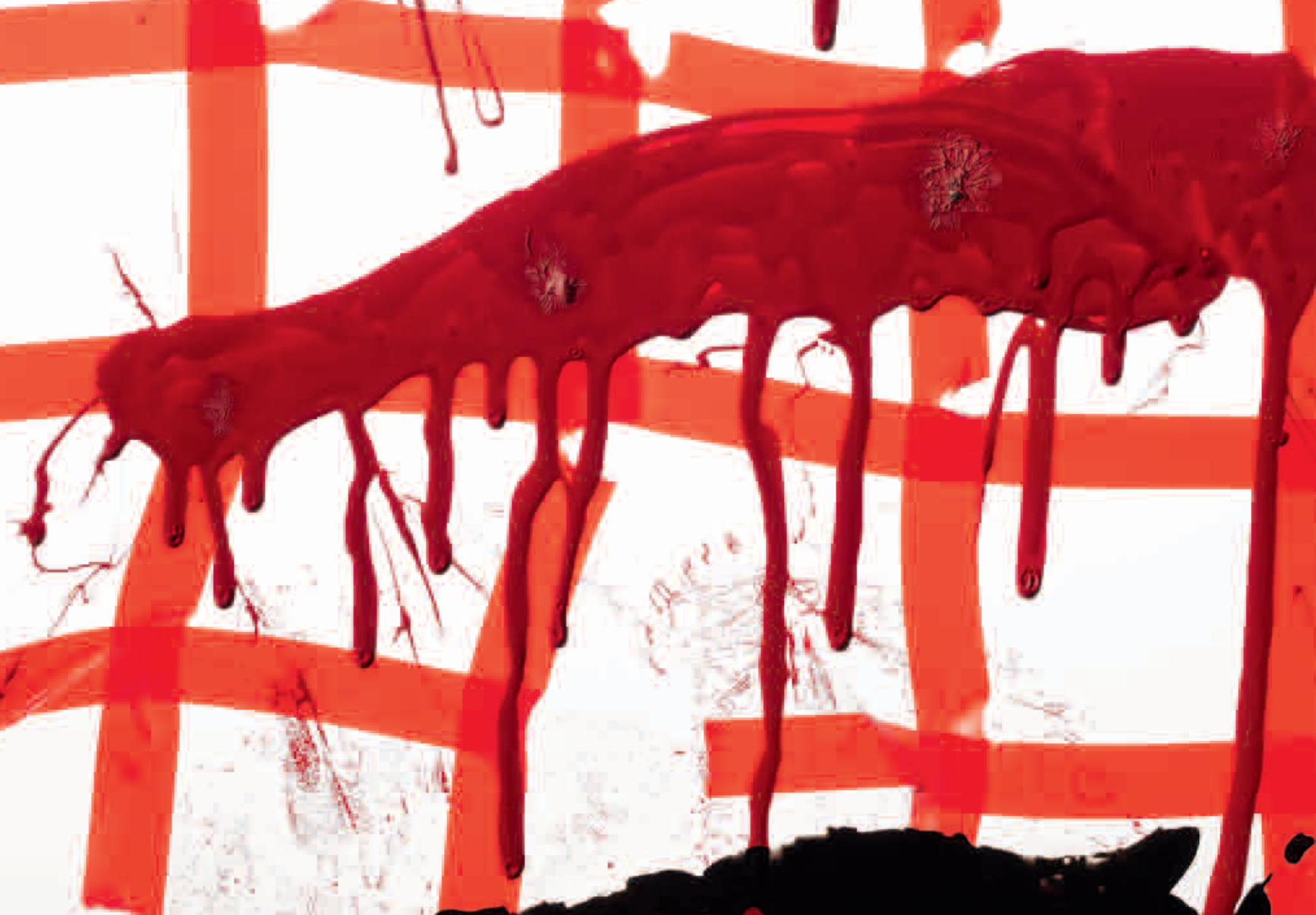
FRAGILE 02100 × 180 cm
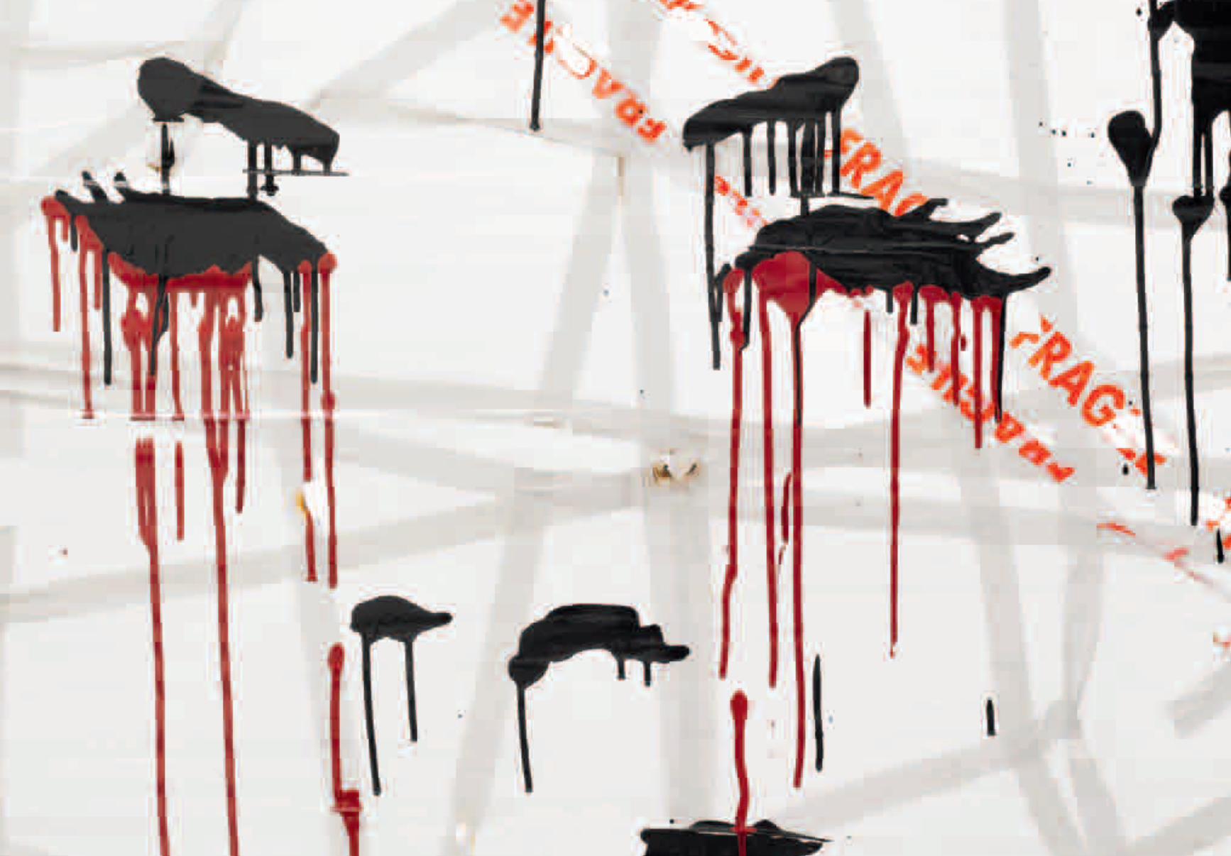
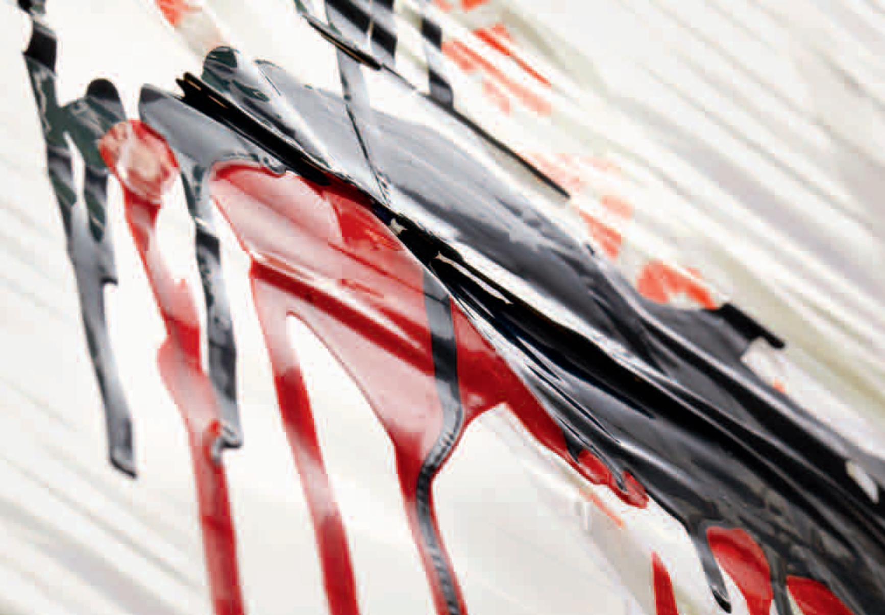
31
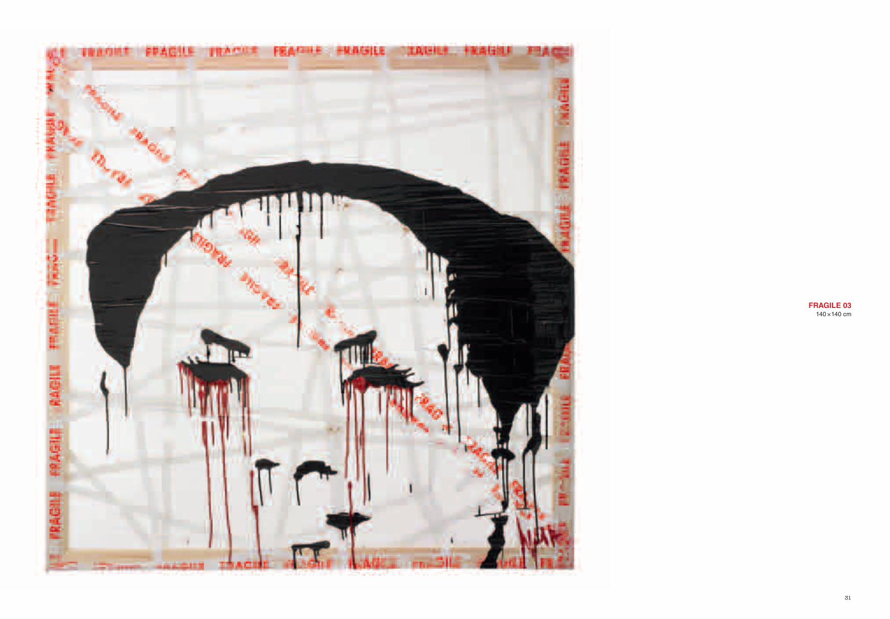
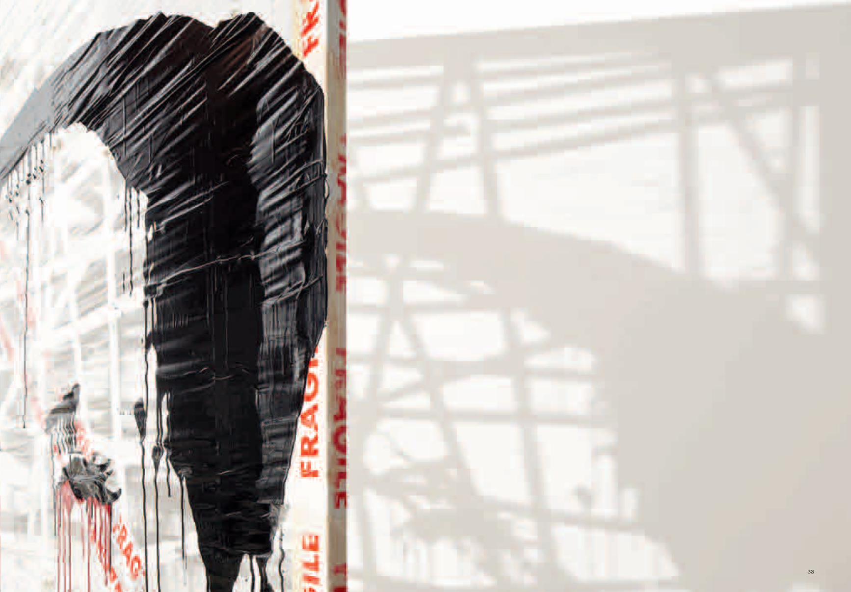
FRAGILE 03140 × 140 cm
33
38
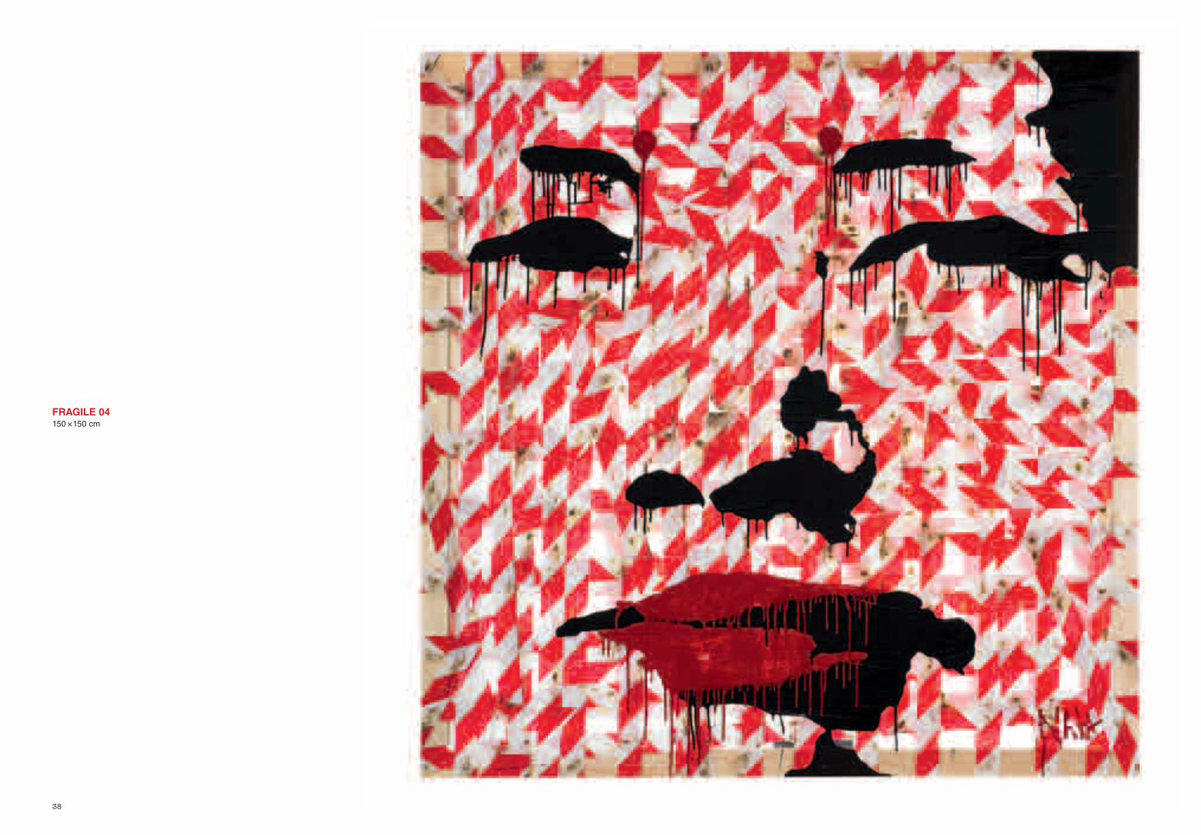
FRAGILE 04150 × 150 cm
43
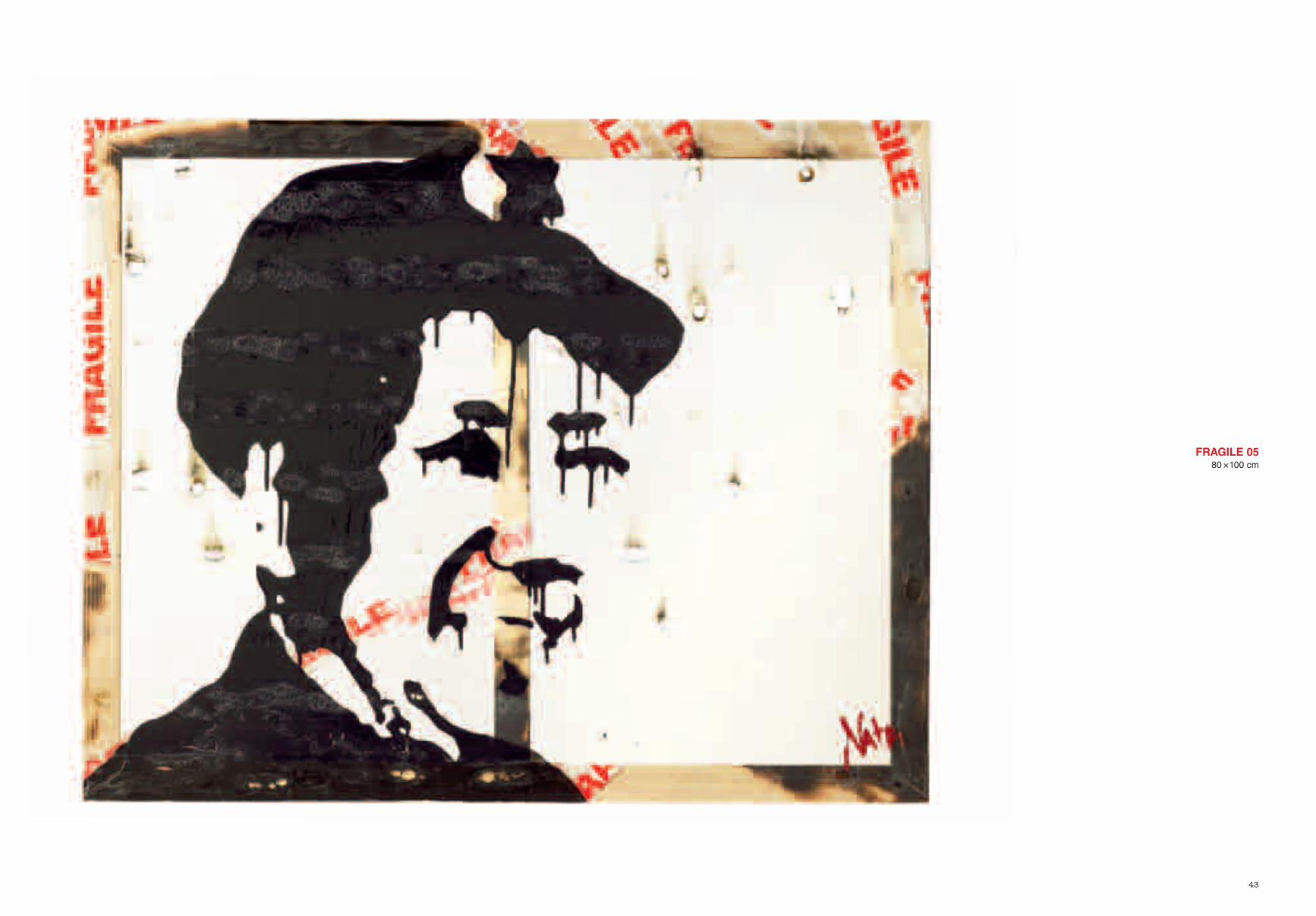
FRAGILE 0580 × 100 cm
46
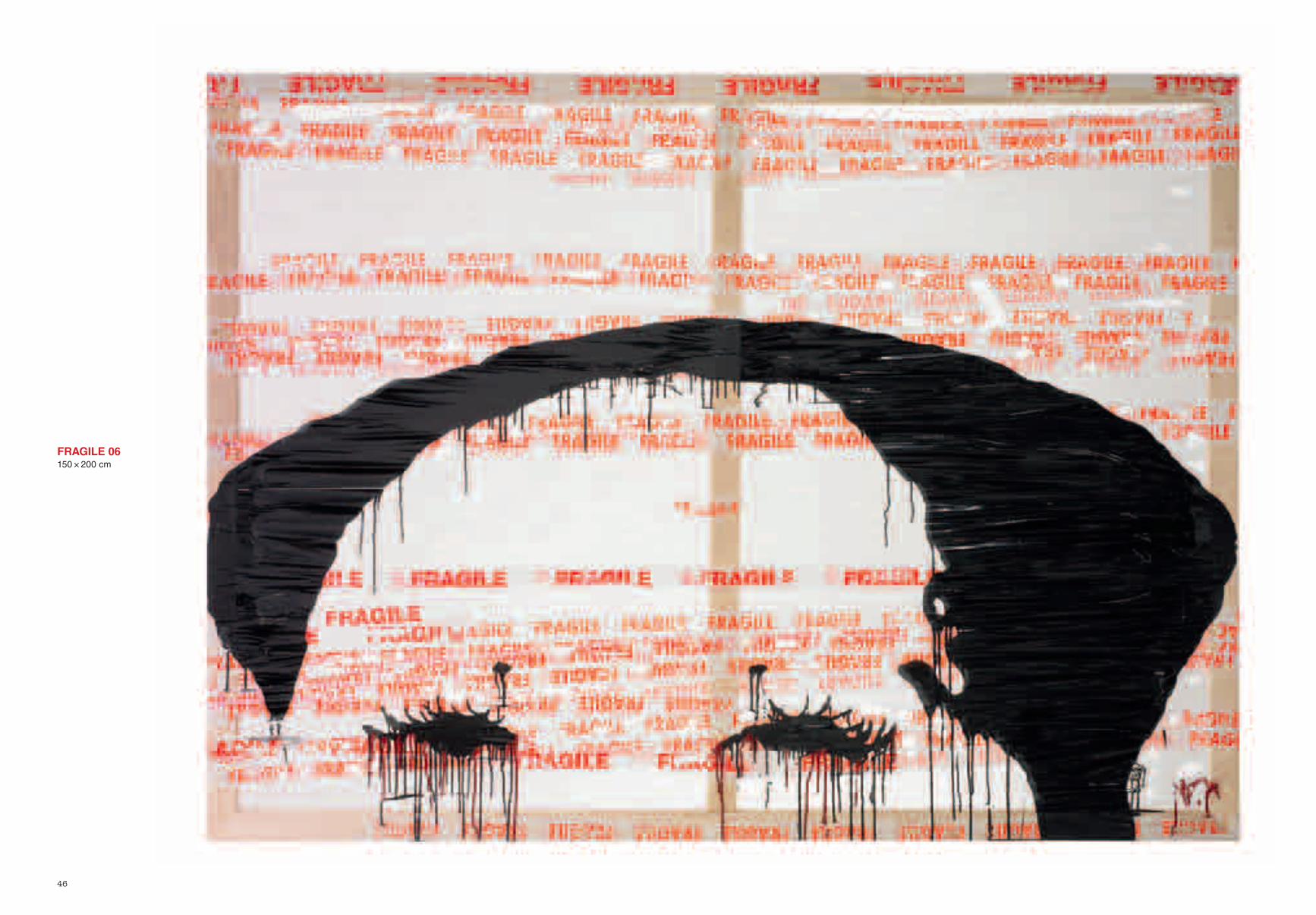
FRAGILE 06150 × 200 cm
50
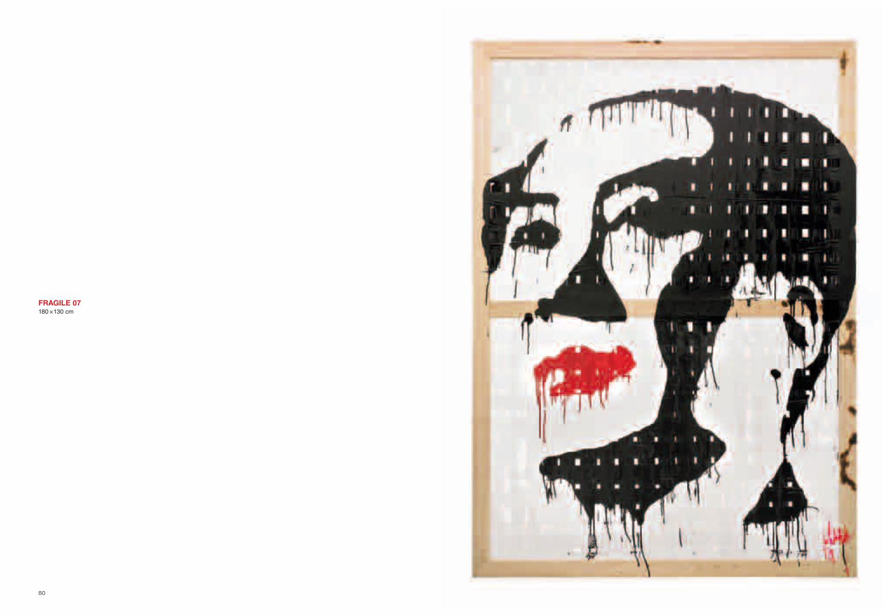
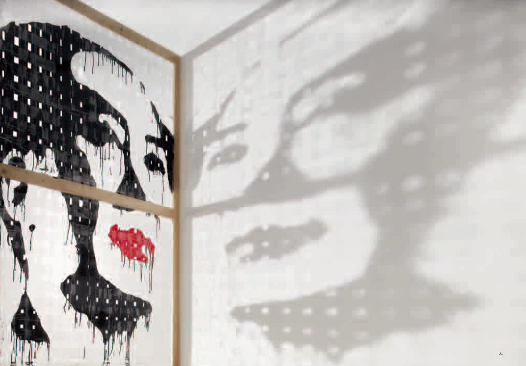
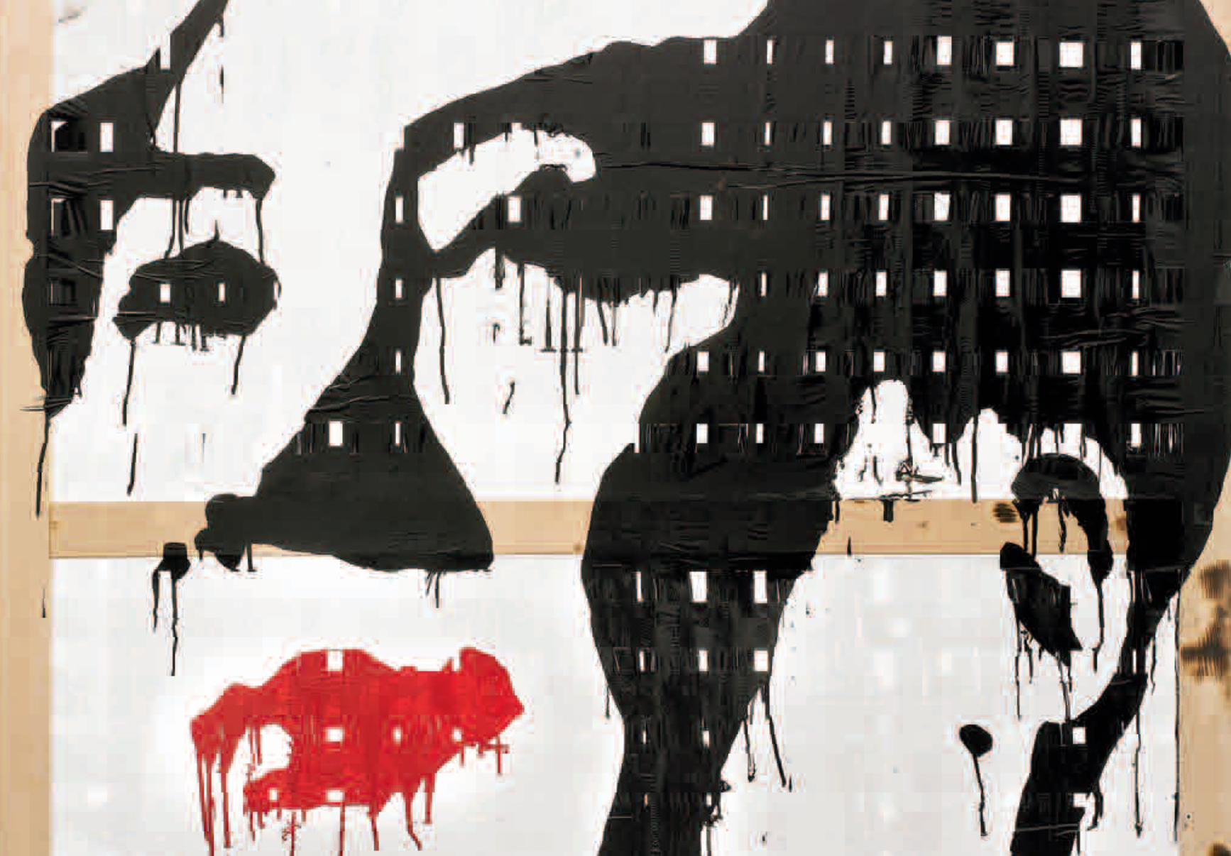
FRAGILE 07180 × 130 cm
51
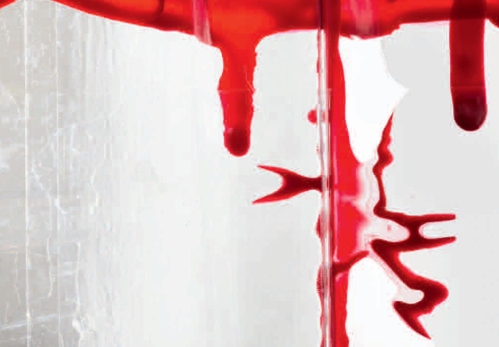
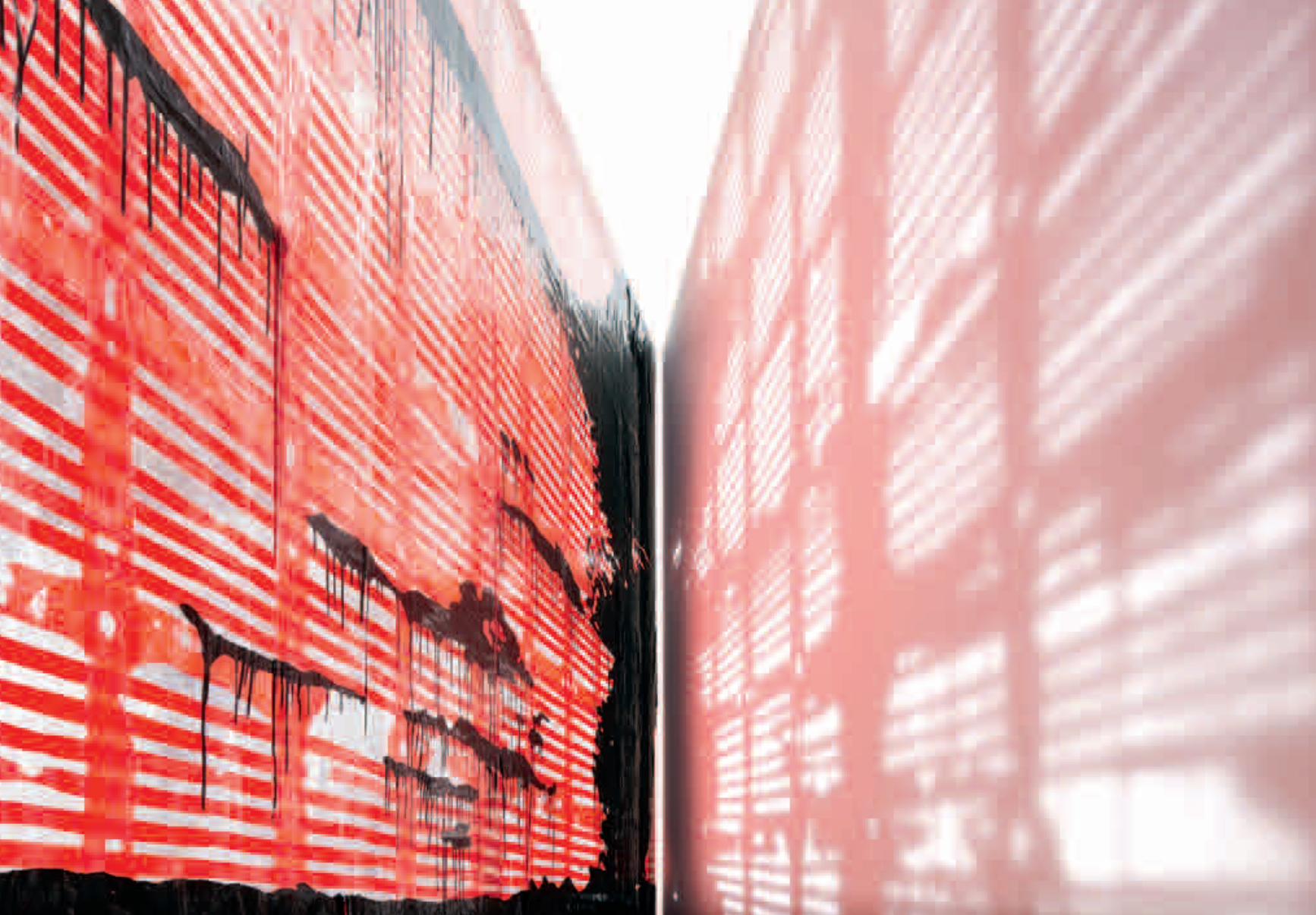
59
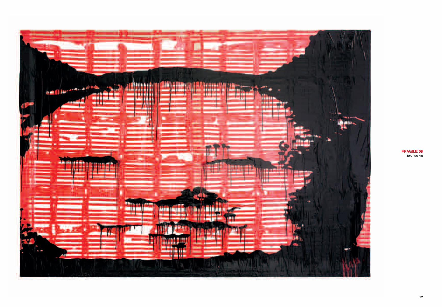
FRAGILE 08140 × 200 cm
63
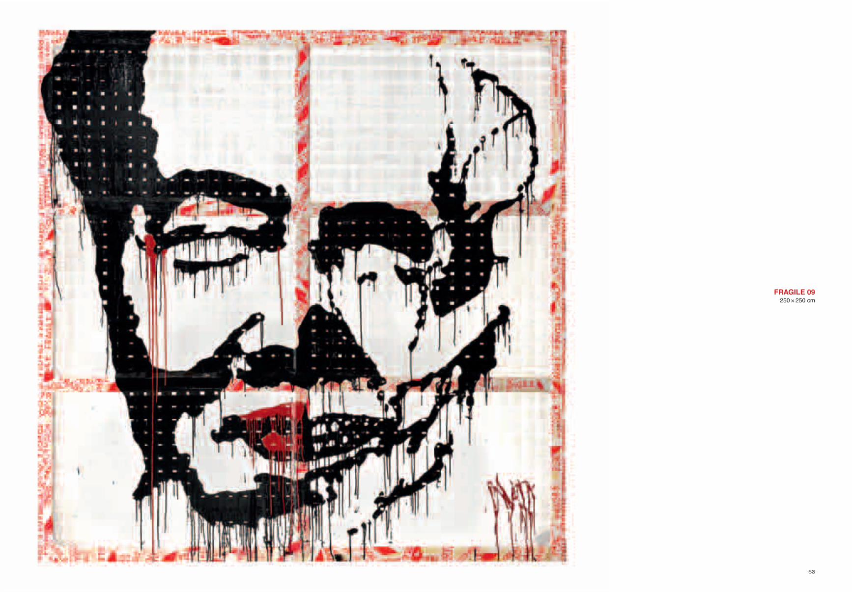
FRAGILE 09250 × 250 cm
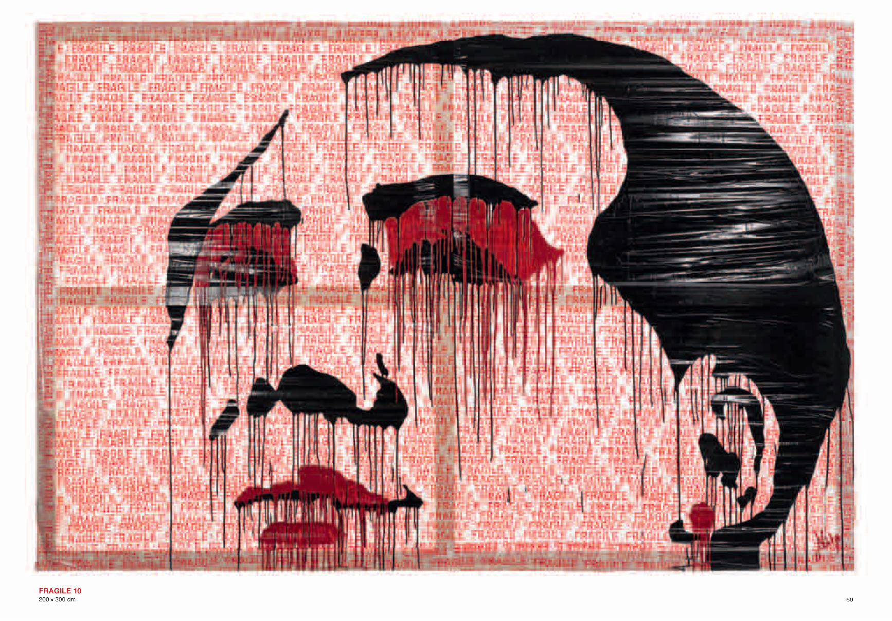
69FRAGILE 10200 × 300 cm
75
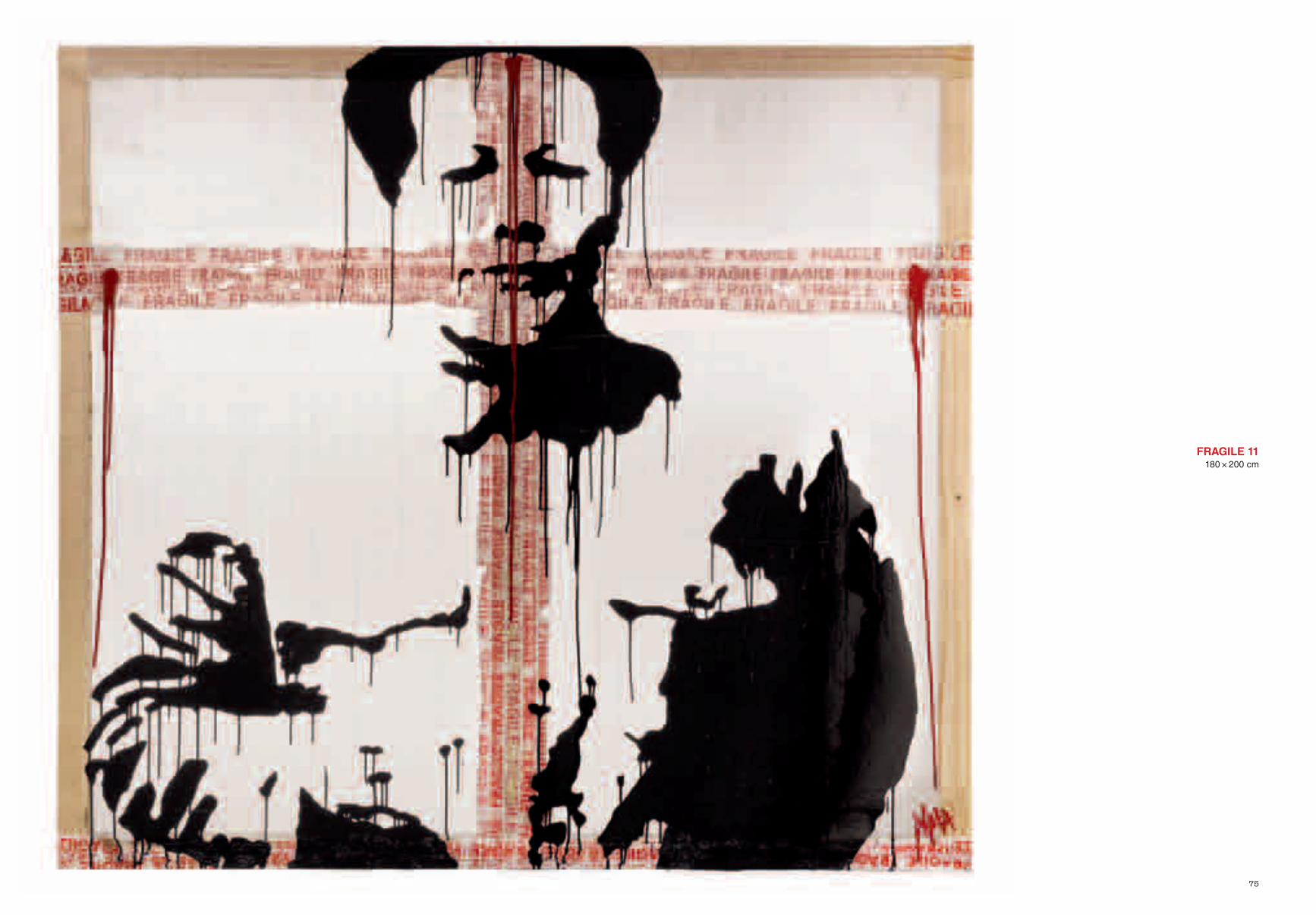
FRAGILE 11180 × 200 cm
80
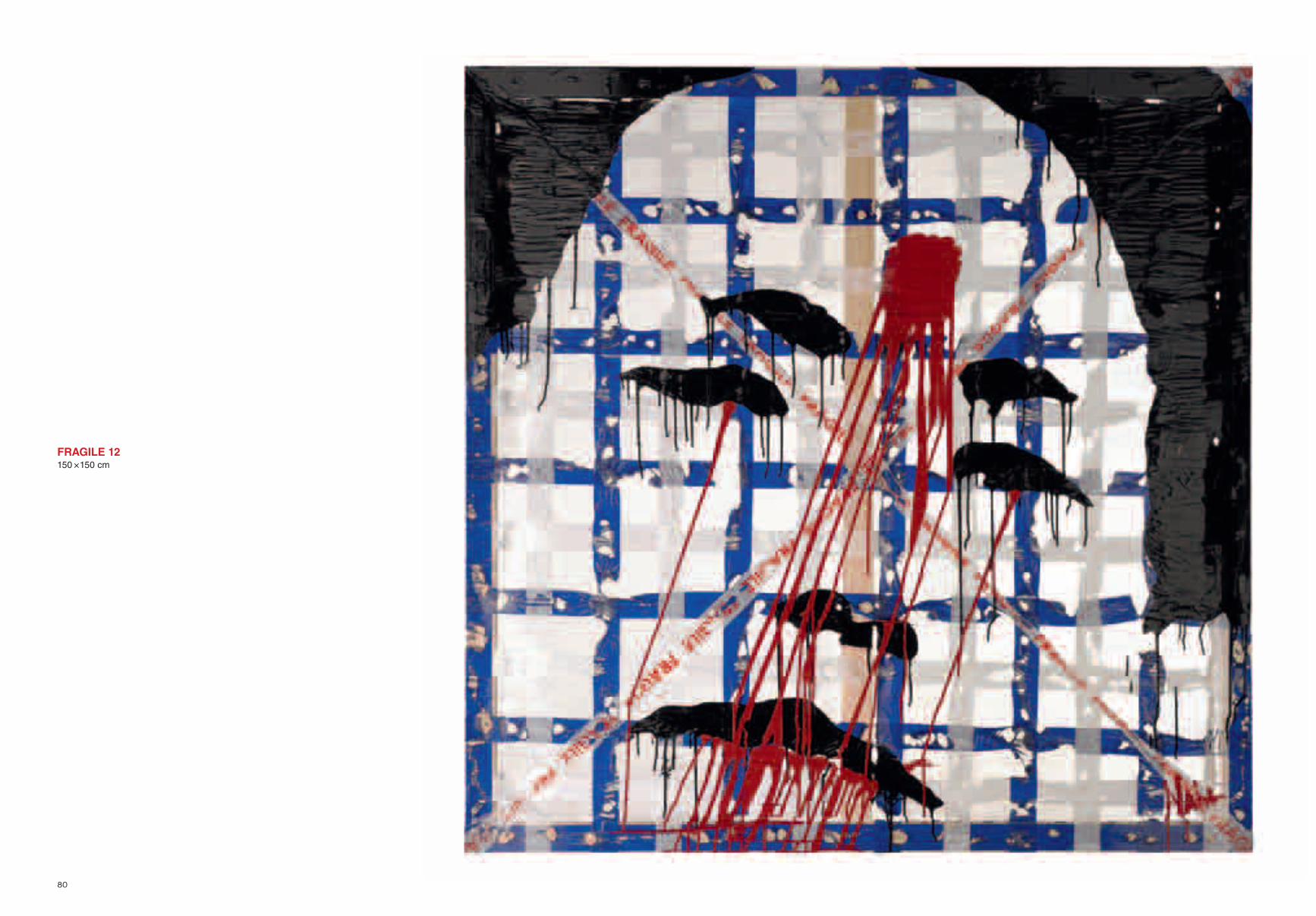
FRAGILE 12150 × 150 cm
86
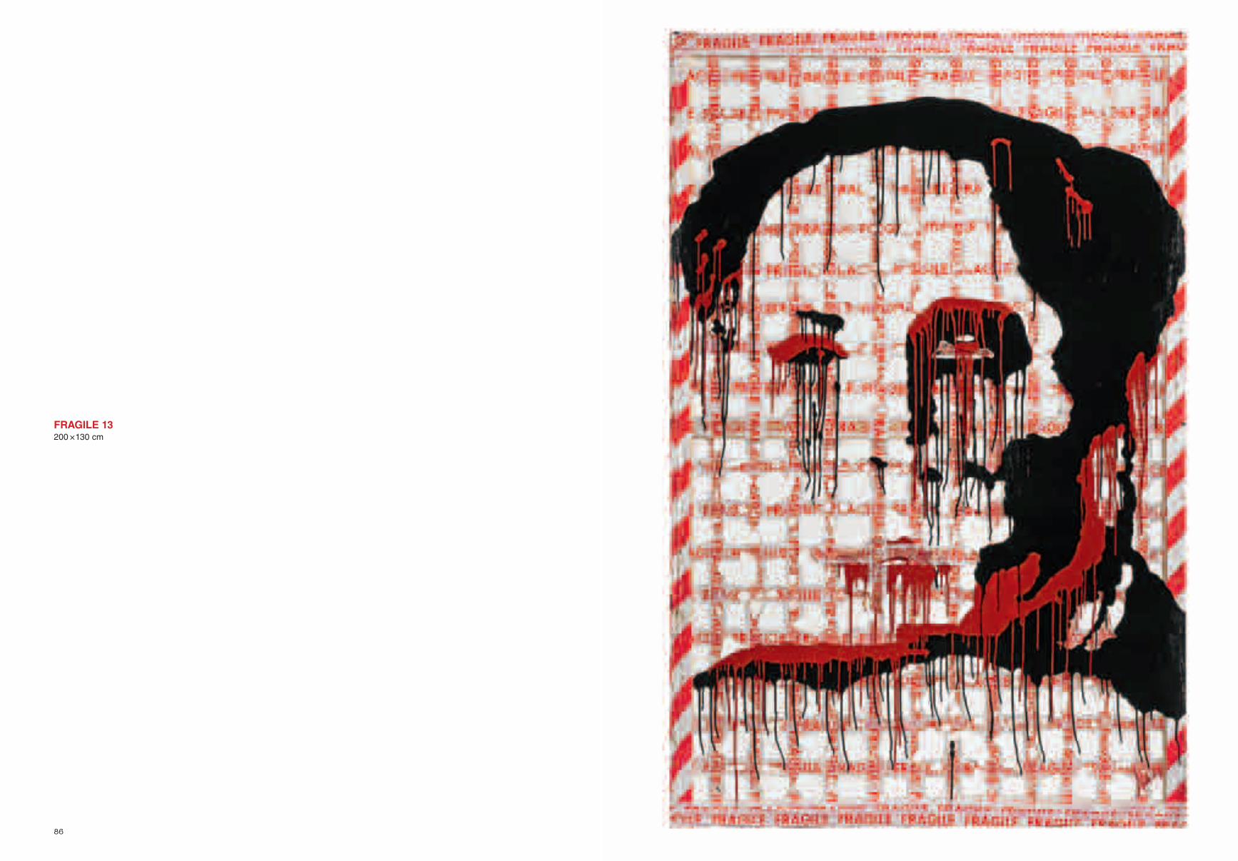
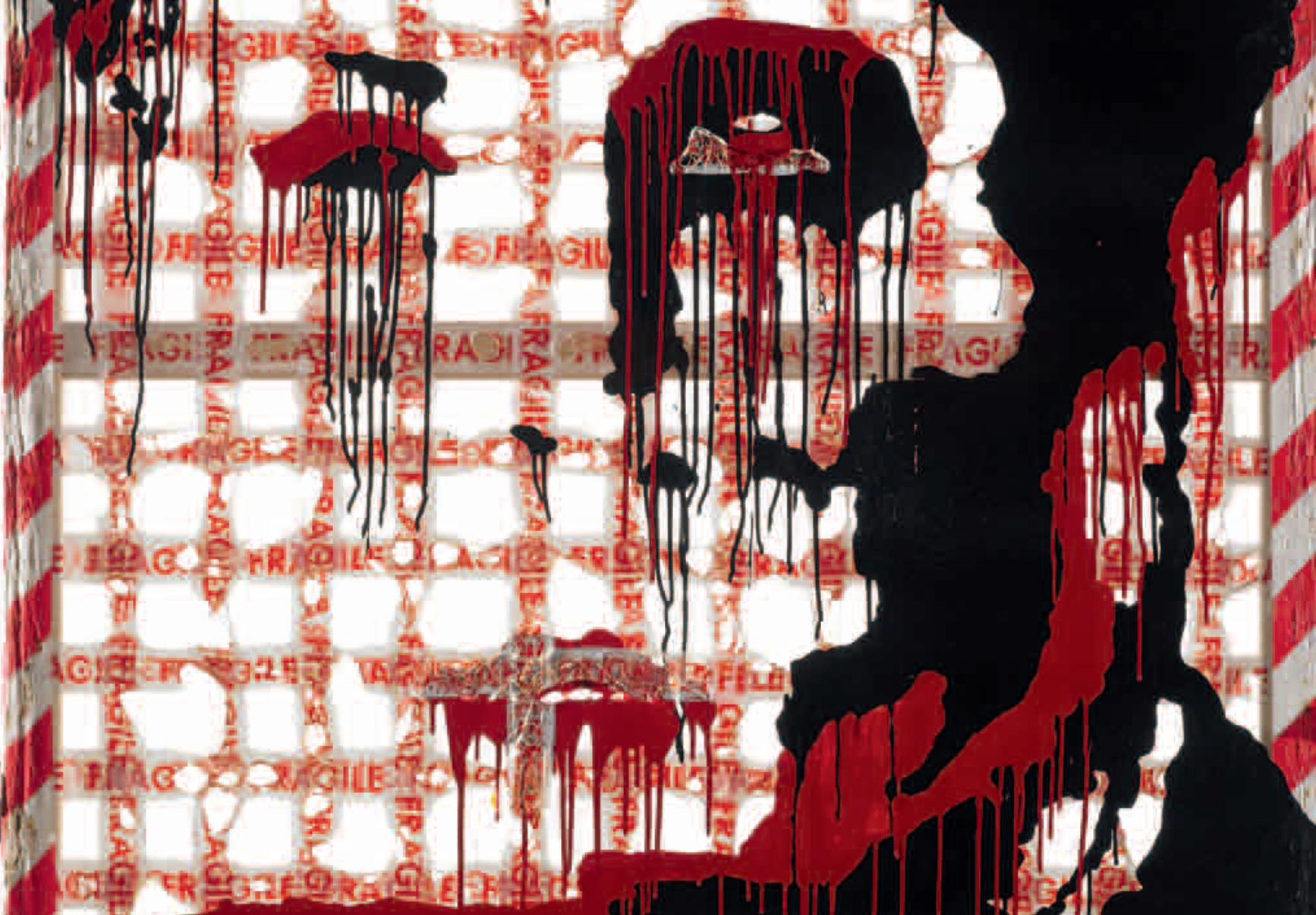
FRAGILE 13200 × 130 cm
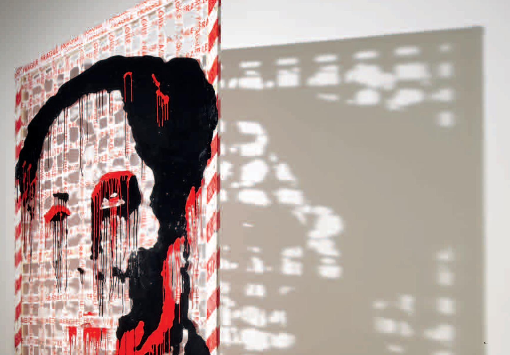
91
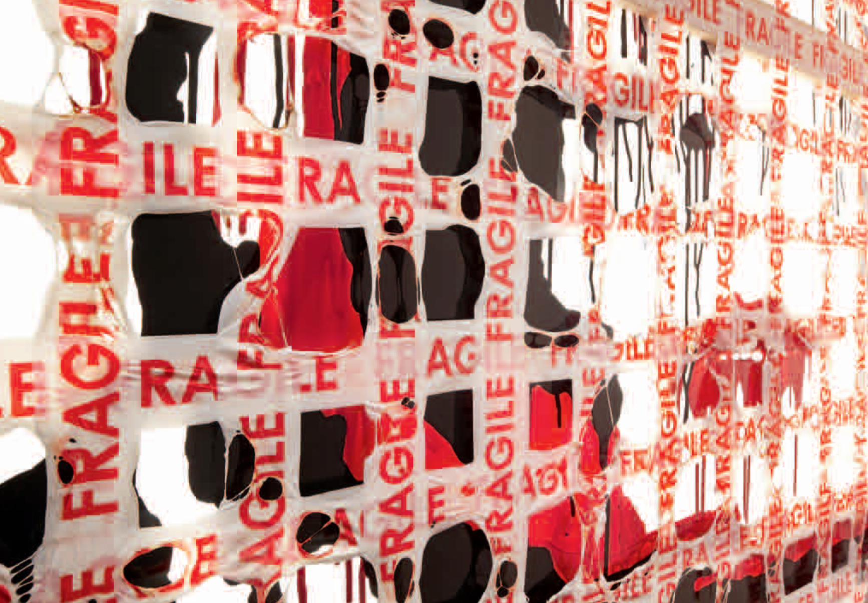
95
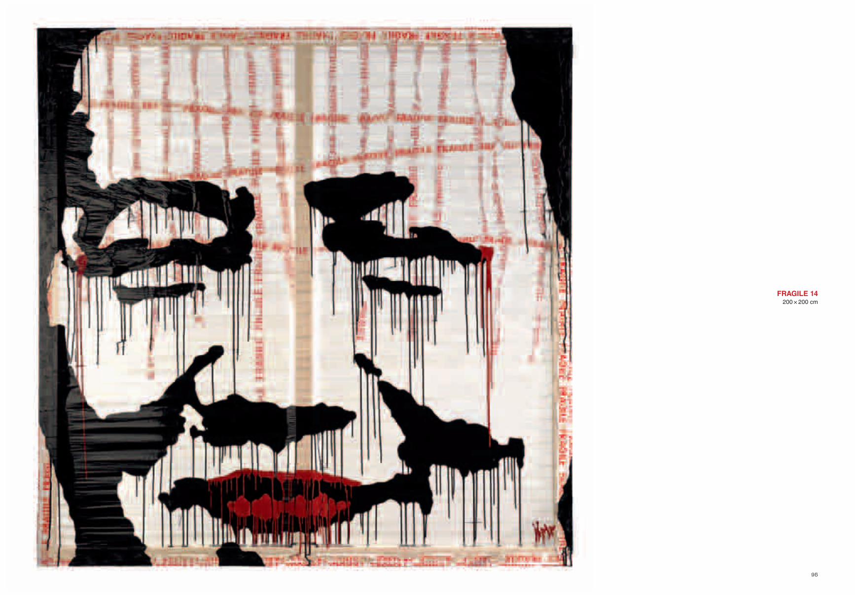
FRAGILE 14200 × 200 cm
98
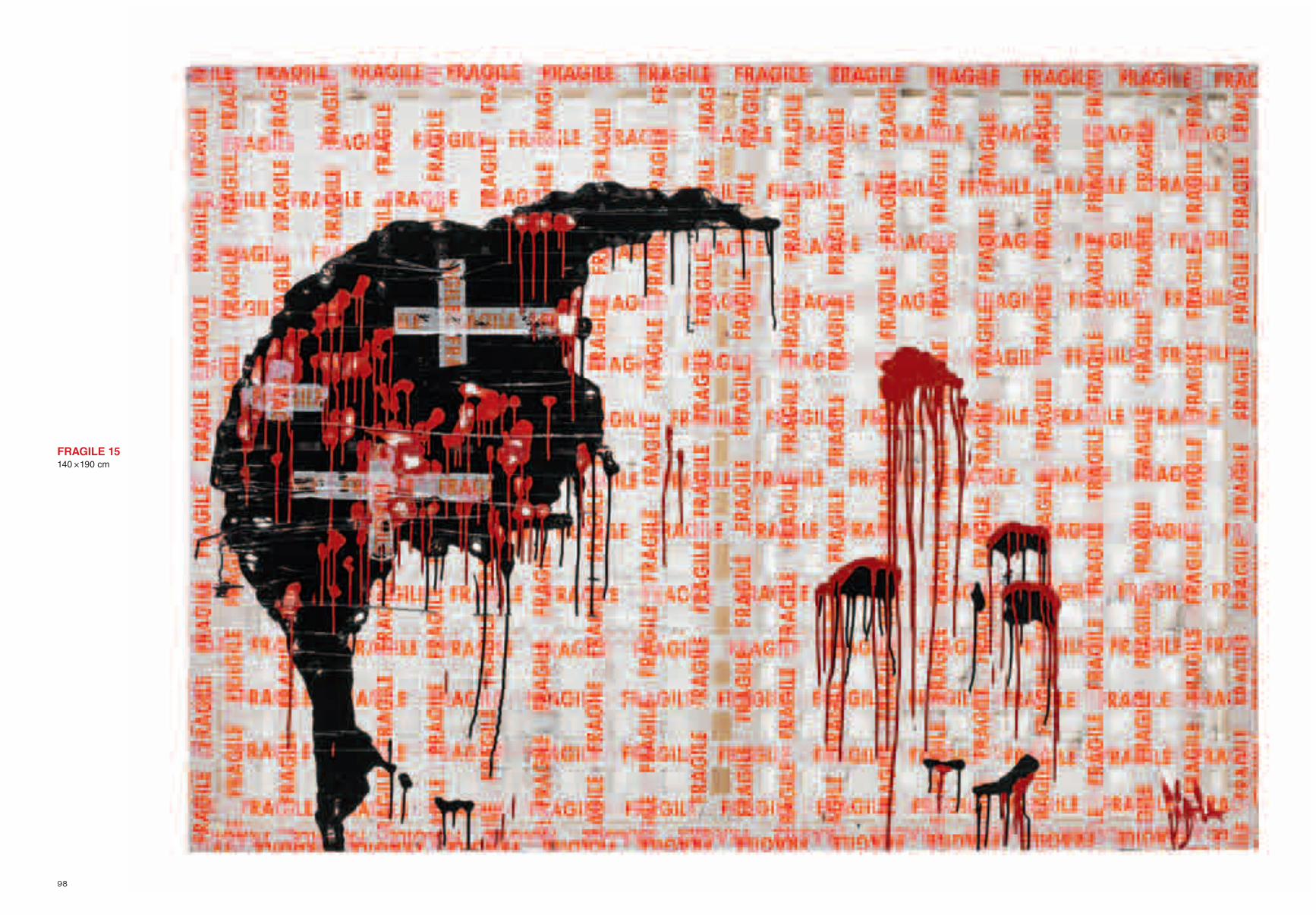
FRAGILE 15140 × 190 cm
101
103
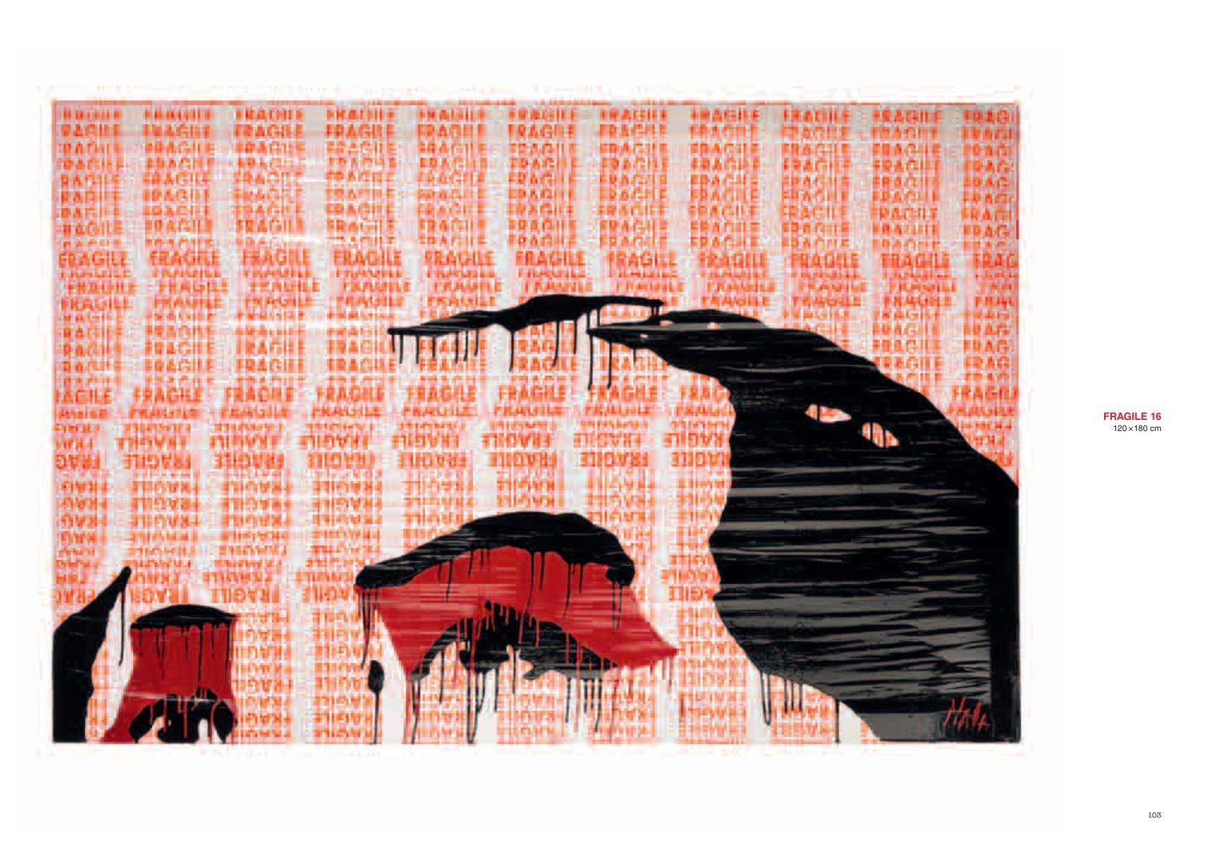
FRAGILE 16120 × 180 cm
107
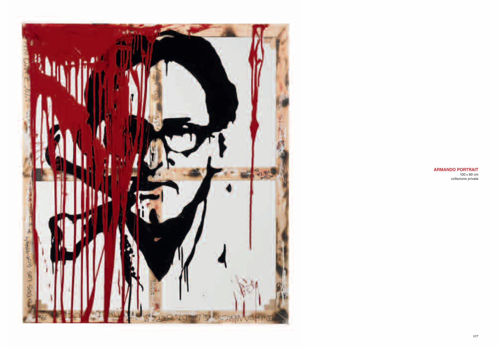
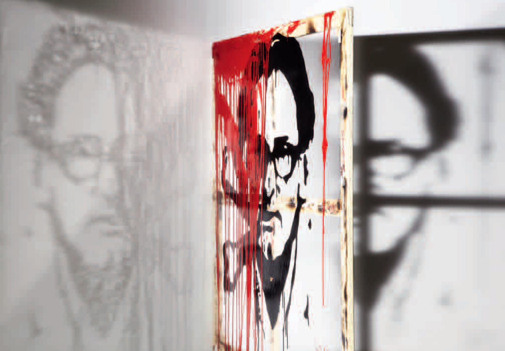
ARMANDO PORTRAIT100 × 90 cm
collezione privata
110
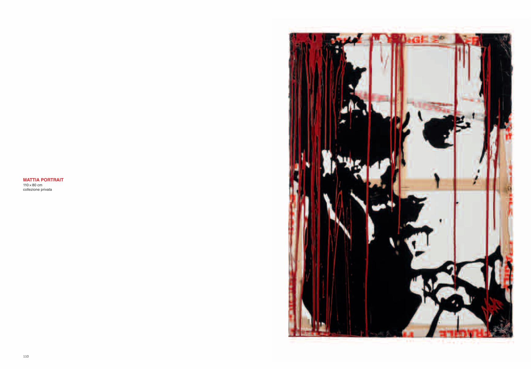
MATTIA PORTRAIT110 × 80 cmcollezione privata

Finito di stampare nel mese di agosto 2012presso Blueprint S.r.l., Bernate Ticino (MI)