luminosità e - lablog · di ottenere una visuale diretta tra le finestre one floor with another....
5
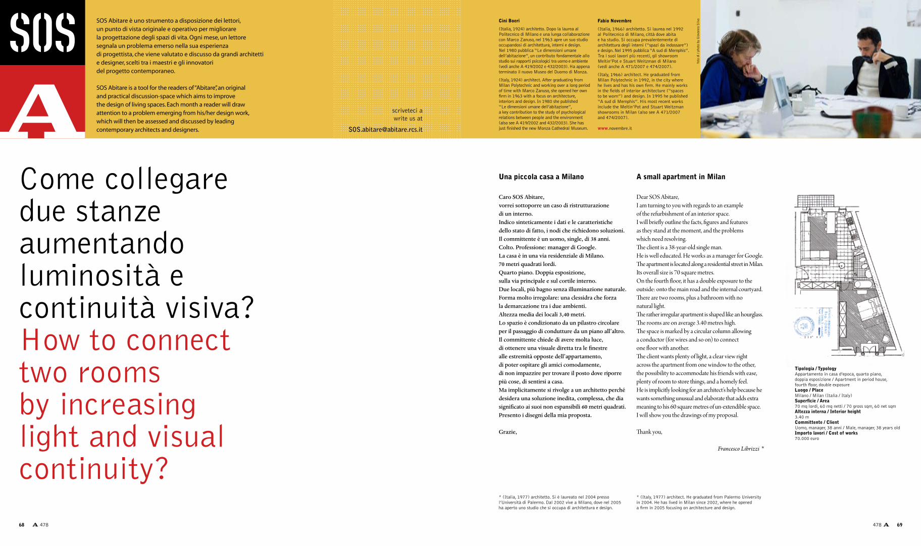
scriveteci a write us at [email protected] SOS Abitare è uno strumento a disposizione dei lettori, un punto di vista originale e operativo per migliorare la progettazione degli spazi di vita. Ogni mese, un lettore segnala un problema emerso nella sua esperienza di progettista, che viene valutato e discusso da grandi architetti e designer, scelti tra i maestri e gli innovatori del progetto contemporaneo. SOS Abitare is a tool for the readers of “Abitare” , an original and practical discussion-space which aims to improve the design of living spaces. Each month a reader will draw attention to a problem emerging from his/her design work, which will then be assessed and discussed by leading contemporary architects and designers. Caro SOS Abitare, vorrei sottoporre un caso di ristrutturazione di un interno. Indico sinteticamente i dati e le caratteristiche dello stato di fatto, i nodi che richiedono soluzioni. Il committente è un uomo, single, di 38 anni. Colto. Professione: manager di Google. La casa è in una via residenziale di Milano. 70 metri quadrati lordi. Quarto piano. Doppia esposizione, sulla via principale e sul cortile interno. Due locali, più bagno senza illuminazione naturale. Forma molto irregolare: una clessidra che forza la demarcazione tra i due ambienti. Altezza media dei locali 3,40 metri. Lo spazio è condizionato da un pilastro circolare per il passaggio di condutture da un piano all’altro. Il committente chiede di avere molta luce, di ottenere una visuale diretta tra le finestre alle estremità opposte dell’appartamento, di poter ospitare gli amici comodamente, di non impazzire per trovare il posto dove riporre più cose, di sentirsi a casa. Ma implicitamente si rivolge a un architetto perché desidera una soluzione inedita, complessa, che dia significato ai suoi non espansibili 60 metri quadrati. Presento i disegni della mia proposta. Grazie, Dear SOS Abitare, I am turning to you with regards to an example of the refurbishment of an interior space. I will briefly outline the facts, figures and features as they stand at the moment, and the problems which need resolving. e client is a 38-year-old single man. He is well educated. He works as a manager for Google. e apartment is located along a residential street in Milan. Its overall size is 70 square metres. On the fourth floor, it has a double exposure to the outside: onto the main road and the internal courtyard. ere are two rooms, plus a bathroom with no natural light. e rather irregular apartment is shaped like an hourglass. e rooms are on average 3.40 metres high. e space is marked by a circular column allowing a conductor (for wires and so on) to connect one floor with another. e client wants plenty of light, a clear view right across the apartment from one window to the other, the possibility to accommodate his friends with ease, plenty of room to store things, and a homely feel. He is implicitly looking for an architect’s help because he wants something unusual and elaborate that adds extra meaning to his 60 square metres of un-extendible space. I will show you the drawings of my proposal. ank you, Francesco Librizzi * Una piccola casa a Milano Cini Boeri (Italia, 1924) architetto. Dopo la laurea al Politecnico di Milano e una lunga collaborazione con Marco Zanuso, nel 1963 apre un suo studio occupandosi di architettura, interni e design. Nel 1980 pubblica “Le dimensioni umane dell’abitazione”, un contributo fondamentale allo studio sui rapporti psicologici tra uomo e ambiente (vedi anche A 419/2002 e 432/2003). Ha appena terminato il nuovo Museo del Duomo di Monza. (Italy, 1924) architect. After graduating from Milan Polytechnic and working over a long period of time with Marco Zanuso, she opened her own firm in 1963 with a focus on architecture, interiors and design. In 1980 she published “Le dimensioni umane dell’abitazione”, a key contribution to the study of psychological relations between people and the environment (also see A 419/2002 and 432/2003). She has just finished the new Monza Cathedral Museum. Come collegare due stanze aumentando luminosità e continuità visiva? How to connect two rooms by increasing light and visual continuity? Tipologia / Typology Appartamento in casa d’epoca, quarto piano, doppia esposizione / Apartment in period house, fourth floor, double exposure Luogo / Place Milano / Milan (Italia / Italy) Superficie / Area 70 mq lordi, 60 mq netti / 70 gross sqm, 60 net sqm Altezza interna / Interior height 3.40 m Committente / Client Uomo, manager, 38 anni / Male, manager, 38 years old Importo lavori / Cost of works 70.000 euro * (Italy, 1977) architect. He graduated from Palermo University in 2004. He has lived in Milan since 2002, where he opened a firm in 2005 focusing on architecture and design. A small apartment in Milan * (Italia, 1977) architetto. Si è laureato nel 2004 presso l’Università di Palermo. Dal 2002 vive a Milano, dove nel 2005 ha aperto uno studio che si occupa di architettura e design. foto di / photo by Giovanna Silva Fabio Novembre (Italia, 1966) architetto. Si laurea nel 1992 al Politecnico di Milano, città dove abita e ha studio. Si occupa prevalentemente di architettura degli interni (“spazi da indossare”) e design. Nel 1995 pubblica “A sud di Memphis”. Tra i suoi lavori più recenti, gli showroom Meltin’Pot e Stuart Weitzman di Milano (vedi anche A 471/2007 e 474/2007). (Italy, 1966) architect. He graduated from Milan Polytechnic in 1992, in the city where he lives and has his own firm. He mainly works in the fields of interior architecture (“spaces to be worn”) and design. In 1995 he published “A sud di Memphis”. His most recent works include the Meltin’Pot and Stuart Weitzman showrooms in Milan (also see A 471/2007 and 474/2007). www.novembre.it 68 478 69 478
Transcript of luminosità e - lablog · di ottenere una visuale diretta tra le finestre one floor with another....
scriveteci awrite us at
SOS Abitare è uno strumento a disposizione dei lettori, un punto di vista originale e operativo per migliorare la progettazione degli spazi di vita. Ogni mese, un lettore segnala un problema emerso nella sua esperienza di progettista, che viene valutato e discusso da grandi architetti e designer, scelti tra i maestri e gli innovatori del progetto contemporaneo.
SOS Abitare is a tool for the readers of “Abitare”, an original and practical discussion-space which aims to improve the design of living spaces. Each month a reader will draw attention to a problem emerging from his/her design work, which will then be assessed and discussed by leading contemporary architects and designers.
Caro SOS Abitare,vorrei sottoporre un caso di ristrutturazione di un interno.Indico sinteticamente i dati e le caratteristiche dello stato di fatto, i nodi che richiedono soluzioni.Il committente è un uomo, single, di 38 anni. Colto. Professione: manager di Google.La casa è in una via residenziale di Milano. 70 metri quadrati lordi.Quarto piano. Doppia esposizione, sulla via principale e sul cortile interno. Due locali, più bagno senza illuminazione naturale.Forma molto irregolare: una clessidra che forza la demarcazione tra i due ambienti.Altezza media dei locali 3,40 metri.Lo spazio è condizionato da un pilastro circolare per il passaggio di condutture da un piano all’altro.Il committente chiede di avere molta luce, di ottenere una visuale diretta tra le finestre alle estremità opposte dell’appartamento, di poter ospitare gli amici comodamente, di non impazzire per trovare il posto dove riporre più cose, di sentirsi a casa.Ma implicitamente si rivolge a un architetto perché desidera una soluzione inedita, complessa, che dia significato ai suoi non espansibili 60 metri quadrati.Presento i disegni della mia proposta.
Grazie,
Dear SOS Abitare, I am turning to you with regards to an example of the refurbishment of an interior space.I will briefly outline the facts, figures and features as they stand at the moment, and the problems which need resolving. The client is a 38-year-old single man.He is well educated. He works as a manager for Google.The apartment is located along a residential street in Milan. Its overall size is 70 square metres. On the fourth floor, it has a double exposure to the outside: onto the main road and the internal courtyard.There are two rooms, plus a bathroom with no natural light. The rather irregular apartment is shaped like an hourglass.The rooms are on average 3.40 metres high. The space is marked by a circular column allowing a conductor (for wires and so on) to connect one floor with another. The client wants plenty of light, a clear view right across the apartment from one window to the other, the possibility to accommodate his friends with ease, plenty of room to store things, and a homely feel. He is implicitly looking for an architect’s help because he wants something unusual and elaborate that adds extra meaning to his 60 square metres of un-extendible space.I will show you the drawings of my proposal.
Thank you,
Francesco Librizzi *
Una piccola casa a Milano
Cini Boeri
(Italia, 1924) architetto. Dopo la laurea al Politecnico di Milano e una lunga collaborazione con Marco Zanuso, nel 1963 apre un suo studio occupandosi di architettura, interni e design. Nel 1980 pubblica “Le dimensioni umane dell’abitazione”, un contributo fondamentale allo studio sui rapporti psicologici tra uomo e ambiente (vedi anche A 419/2002 e 432/2003). Ha appena terminato il nuovo Museo del Duomo di Monza.
(Italy, 1924) architect. After graduating from Milan Polytechnic and working over a long period of time with Marco Zanuso, she opened her own firm in 1963 with a focus on architecture, interiors and design. In 1980 she published “Le dimensioni umane dell’abitazione”, a key contribution to the study of psychological relations between people and the environment (also see A 419/2002 and 432/2003). She has just finished the new Monza Cathedral Museum.
Come collegare due stanzeaumentando luminosità econtinuità visiva?How to connect two rooms by increasing light and visual continuity?
Tipologia / Typology Appartamento in casa d’epoca, quarto piano, doppia esposizione / Apartment in period house, fourth floor, double exposureLuogo / PlaceMilano / Milan (Italia / Italy)Superficie / Area 70 mq lordi, 60 mq netti / 70 gross sqm, 60 net sqmAltezza interna / Interior height3.40 mCommittente / ClientUomo, manager, 38 anni / Male, manager, 38 years oldImporto lavori / Cost of works70.000 euro
* (Italy, 1977) architect. He graduated from Palermo University in 2004. He has lived in Milan since 2002, where he opened a firm in 2005 focusing on architecture and design.
A small apartment in Milan
* (Italia, 1977) architetto. Si è laureato nel 2004 presso l’Università di Palermo. Dal 2002 vive a Milano, dove nel 2005 ha aperto uno studio che si occupa di architettura e design.
foto
di /
pho
to b
y G
iova
nna
Silv
aFabio Novembre
(Italia, 1966) architetto. Si laurea nel 1992 al Politecnico di Milano, città dove abita e ha studio. Si occupa prevalentemente di architettura degli interni (“spazi da indossare”) e design. Nel 1995 pubblica “A sud di Memphis”. Tra i suoi lavori più recenti, gli showroom Meltin’Pot e Stuart Weitzman di Milano (vedi anche A 471/2007 e 474/2007).
(Italy, 1966) architect. He graduated from Milan Polytechnic in 1992, in the city where he lives and has his own firm. He mainly works in the fields of interior architecture (“spaces to be worn”) and design. In 1995 he published “A sud di Memphis”. His most recent works include the Meltin’Pot and Stuart Weitzman showrooms in Milan (also see A 471/2007 and 474/2007).
www.novembre.it
68 478 69478
180°
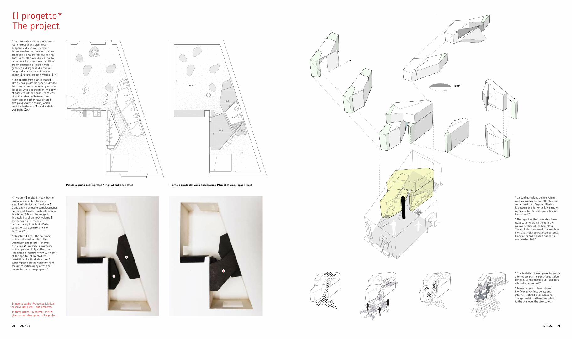
“La planimetria dell’appartamento ha la forma di una clessidra: lo spazio è diviso naturalmente in due ambienti attraversati da una diagonale visiva che congiunge una finestra all’altra alle due estremità della casa. Le ‘zone d’ombra ottica’ tra un ambiente e l’altro hanno generato il disegno di due volumi poligonali che ospitano il locale bagno (1) e una cabina-armadio (2)”.
“The apartment’s plan is shaped like an hourglass: the space is divided into two rooms cut across by a visual diagonal which connects the windows at each end of the house. The ‘areas of optical shadow’ between one room and the other have created two polygonal structures, which hold the bathroom (1) and walk-in wardrobe (2).”
“Il volume 1 ospita il locale bagno, diviso in due ambienti, lavabo e sanitari più doccia. Il volume 2 è una cabina-armadio completamente apribile sul fronte. Il notevole spazio in altezza, 340 cm, ha suggerito la possibilità di un terzo volume 3 sovrapposto ai precedenti, per ospitare gli impianti d’aria condizionata e creare un vano accessorio”.
“Structure 1 hosts the bathroom, which is divided into two: the washbasin and toilets + shower. Structure 2 is a walk-in wardrobe which opens up fully at the front. The notable internal height (340 cm) of the apartment created the possibility of a third structure 3 superimposed on the others to hold the air conditioning systems and create further storage space.”
“La configurazione dei tre volumi crea un gruppo denso nella strettoia della clessidra. L’esploso illustra la costruzione dei volumi, le singole componenti, i cinematismi e le parti trasparenti”.
“The layout of the three structures leads to a tightly knit unit in the narrow section of the hourglass. The exploded axonometric shows how the structures, separate components, kinematics and transparent parts are constructed.”
“Due tentativi di scomporre lo spazio a terra, per punti e per triangolazioni definite. La geometria può estendersi alla pelle dei volumi”.
“Two attempts to break down the floor space into points and into well-defined triangulations. The geometric pattern can extend to the skin over the structures.”
Il progetto*The project
1
2
3
In queste pagine Francesco Librizzi descrive per punti il suo progetto.
In these pages, Francesco Librizzi gives a short description of his project.
Pianta a quota dell’ingresso / Plan at entrance level Pianta a quota del vano accessorio / Plan at storage-space level
70 478 71478

Cini Boeri Devo dire che questi giovani sono bravissimi, disegnano in una maniera stupenda, con il computer sono dei maghi. Complimenti all’architetto, che sa giocare con i volumi. Glielo direi. Non intervengo molto, perché il suo è un bell’approccio, intelligente e coraggioso. Rispetto al massimo le sue idee, perfezionando qualche allineamento, restringendo un po’ i volumi inseriti al centro dell’appartamento, il che permette anche di inquadrare meglio la finestra della camera da letto. Altri punti della mia ipotesi. Una sola porta, unica
(a parte quella d’ingresso): questo è importante, è il valore aggiunto che propongo. Sposto poi la cucina che, utilizzando un termine un po’ improprio, chiamo “monouso”: intendo dire che al suo interno ci sta solo una persona, mi sembra che per questo committente possa essere una scelta adatta. Colonna-pilastro con arrotolato serpente: un serpente finto va benissimo, poi, se vuole, ne può mettere anche uno vero. Dal pranzo-soggiorno si vede la parte più bella della camera da letto. Al centro dell’appartamento resta una parte ribassata
con vani utilizzabili. La cabina-armadio è ora aperta verso la camera. Con questa soluzione si evita anche che l’ingresso al bagno avvenga direttamente dal soggiorno, e questo è un miglioramento. Per il resto, niente lampade a sospensione, ma tutti LED che proiettano liberamente la loro luce, anche colorata, sulle pareti. Per i materiali provo a dire: resina bianca per pavimento e pareti; soffitto bianco; grigio scurissimo, quasi nero, per i nuovi volumi; e poi si interviene con un bel rosso per poltrone, divani...
La risposta di Cini Boeri
The answer byCini Boeri
Cini Boeri I must say these youngsters are very talented, they design beautifully and are real wizards on the computer. Congratulations to the architect, who knows how to play around with structures, and I ought to tell him so. I do not have very much to add, because he has adopted a really intelligent and brave approach. I have great respect for his ideas, but we might adjust some of the alignments a bit, and make the structures incorporated in the middle of the flat a bit smaller, which would also allow the bedroom window to be framed more effectively.
And I have some other ideas. One door only is needed (apart from the entrance door): this is important, as it brings that extra value I am proposing. Then I would move the kitchen, which, rather inappropriately, I would call “single-use”, in the sense that there is only room in it for one person, which in this client’s case I think would be the right option. A column-pillar with snake wrapped around it would work: a fake snake is fine but, if he likes, a real one could be used. The best part of the bedroom can be seen from the dining and living area.
I would keep a lowered section offering storage space in the middle of the apartment. The walk-in wardrobe should open up to the bedroom. This solution would also prevent the entrance to the bathroom being directly from the living area, which is certainly an improvement. Other than that, no hanging lamps, just LEDs freely projecting even coloured light onto the walls. For the materials I would suggest: white resin for the floor and walls; a white ceiling ; very dark grey, almost black, for the new structures; and then a nice red might be used for the arm chairs, sofas…
Riferimenti / References
foto
di /
pho
to b
y M
ario
Car
rier
i
1. 2. La diagonale visiva / Visual diagonal: appartamento di un collezionista / collector’s apartment, Trump Tower, New York, 1985.3. Interno con serpente / Interior with snake: Divano “Serpentone” / “Serpentone” sofa, Arflex, 1971.
foto
di /
pho
tos
by G
iova
nna
Silv
a
foto
/ ph
oto
Mas
era
foto
di /
pho
to b
y M
ario
Car
rier
i
1 2 3
72 478 73478

Abitare Una prima questione, per rispondere alla domanda di Francesco Librizzi, potrebbe essere: è meglio progettare gli spazi per densità, cioè lavorando sulla parte centrale, oppure considerare i due ambienti laterali? Per organizzare i materiali, per decidere una serie di fasi successive, bisogna considerare come ambito del progetto il bianco o il nero?Fabio Novembre La scelta è stata già fatta. Questi segni sono chiarissimi. Basta guardare l’apertura di quel volume: è macchinosa, quasi una struttura da aereo. Una scelta architettonica forte. Nell’insieme l’idea è interessante, con ragionamenti complessi, in cui nulla è lasciato al caso. L’intervento è questo nucleo di aggregazione di volumi, il resto è volutamente non progettato.
A Certo, questo è un intervento già concluso, risolto. Facendo un passo indietro, la domanda allora è: con questa situazione, con questa pianta senz’altro un po’ anomala, di fronte alla richiesta precisa del committente di preservare una tensione, e anche una visuale, tra i due lati della casa, tra le due fonti di luce naturale, tu come avresti agito? Da cosa saresti partito?FN Questo vuol dire però fare un altro progetto. Questo è un intervento risolto, non mi sento di eccepire. I progetti, poi, possono essere fatti in centomila maniere. Fatto così è corretto. Se cambi i fattori, il prodotto cambia. Ma così com’è è abbastanza un teorema.
A Potresti comunque dare una serie di suggerimenti. Ad esempio sui rivestimenti, che non sono ancora stati pensati: quello dei pavimenti potrebbe risalire e proseguire sui volumi... FN Effettivamente la lettura dei volumi è importante. Ad esempio: qui si chiude il corridoio lasciando aperta la porta della cabina armadio; analogamente, dall’altra parte il corridoio si chiude lasciando aperta la porta del bagno. I volumi così però si spaccano. Quindi: com’è trattata questa porta? A cosa si lega? Fa parte di questo volume, ma quando la si apre, che rapporto ha rispetto a quest’altro volume? Per capire il gioco, i volumi potrebbero essere non monocromatici ma di colori diversi. A meno che, invece, non si decida di trattare le parti aggiunte in legno, mentre tutto il resto è bianco. Allora questo accrocchio potrebbe anche essere rivestito con inclinazioni diverse dell’impiallacciatura. Comunque bisognerebbe entrare nel merito e, secondo me, ci si mette troppo di sé. Sarebbe diverso, più facile, se ci fosse un errore evidente.Se devo proprio dare un consiglio, penso che in bagno sia giusto poter usare contemporaneamente il lavabo e i sanitari, quindi va data la possibilità di chiudere qui; come dovrebbe anche essere possibile utilizzare la doccia mentre si usa il resto del bagno. La doccia è la cosa più privata che ci sia in una casa, non succede mai che un ospite chieda di poterla usare. Quindi è inutile dare un ingresso dall’interno, che blocca la possibilità di usare i sanitari autonomamente. La farei apribile e trasparente verso la camera da letto, con un vetro opalino
Abitare A first question, in response to what Francesco Librizzi asked, might be: is it better to design spaces in terms of density, i.e. working on the central part, or to focus on the two side premises? Should “white” or “black” be taken as the design guideline for organising the materials and deciding upon the successive phases?Fabio Novembre The decision has already been made. The signs of this are very clear. Just look at how that structure opens up: it is complex, almost like the one of an aeroplane. A powerful architectural design. Overall the idea is interesting , bringing in some complex ideas in which nothing is left to chance. The project involves this nucleus of combined structures; the rest is deliberately not planned.
A Yes, of course, this is a finished, completed project. But taking a step back, the question is: with this situation, with this certainly rather anomalous layout, and when faced with the client’s specific request to maintain a certain tension and also a view across both sides of the house, between the two natural light sources, what would you have done? What would you have taken as your starting point?FN But that means working on a different project. This is a finished project and I have no objections to it. After all, projects can be carried out in a hundred thousand different ways. The project is fine as it is. If you change certain factors, the project itself changes. But this project is already a notion in its own right.
A But can you make any suggestions? For example, about the different kinds of covering, which have not been decided upon yet: the floor covering could be raised and extended into the structures...FN It is indeed important to study the structures. For example: in this part the corridor is closed leaving the door to the walk-in wardrobe open, while on the other side the corridor is closed leaving the bathroom door open. But this breaks up the structures. So how is this door treated? What is it attached to? It is part of this structure, but when it opens, how does it relate to this other structure? To understand the interplay, the structures might be in different colours and not single ones. Unless, on the other hand, the extra parts could be covered with wood, leaving all the rest white. In this case, different kinds of veneer could be used for the coatings. But it would need to be studied more carefully and, in my opinion, it would be too personal. It would be different, easier, if some obvious mistake had been made.If I had to give some advice, I think it would be right if the washbasin and toilet could be used at the same time in the bathroom, so there should be some kind of separation here; likewise, you should be able to use the shower and the rest of the bathroom. The shower is the most intimate part of a home, a guest will never ask to use it. So there is no point in having an entrance from the interior, making it impossible to use the toilet separately. I would design it so that it opens and is transparent towards the bedroom, with opaline or sandblasted glass near the toilet facilities. It makes more sense that way.Returning to the overall design, Librizzi plans to put spotlights here, in these cuts. This is a good idea: he wants that extra structures could be clearly perceived within the box holding them.
La risposta diFabio Novembre
The answer byFabio Novembre
o sabbiato verso i sanitari. Ha molto più senso. Tornando a una visione d’insieme, Librizzi vuole mettere i faretti qui dietro, in questi tagli. È un gesto corretto: vuole far leggere i volumi aggiunti rispetto alla scatola che li contiene.
A Questo stacco lo faresti anche a terra? Faresti un gradino per mantenere la coerenza della scatola staccata dal muro?FN No, un gradino non lo farei. Credo che per creare lo stacco possano bastare i materiali della pavimentazione, o anche annegare una striscia di un altro materiale per marcare in maniera forte, far sentire la separazione tra le due scatole. Ma… il pilastro qui in mezzo? Dovessi veramente fare una critica, direi che è stato tralasciato questo elemento che invece è molto importante. Non si può far finta che non ci sia. Per esempio, quando ho progettato lo “Shu” ho dovuto fare i conti con due enormi pilastri che si trovavano al centro della sala ristorante. Pensavo: di questi pilastri non potrò mai liberarmi perché reggono i sette piani sovrastanti, e quel “reggere”, per me, in quel caso è diventato far scolpire attorno ai pilastri delle braccia che reggevano il peso dei piani superiori. Qui, il pilastro è una braga di collegamento tra i piani, una specie di arteria principale di comunicazione. Teoricamente la farei trasparente, vorrei che si sentisse il far parte di un organismo complesso. C’è un sopra e c’è un sotto, e io sono in mezzo. Credo che in architettura questi ragionamenti non vadano ignorati. Bisogna sentirsi parte di un organismo. C’è tanta vita che scorre qui dentro, l’avrei davvero fatto trasparente, sarebbe diventato un elemento molto forte. Ignorarlo è veramente un errore. Potrebbe persino diventare la punta di compasso intorno a cui si gioca il pranzo, il soggiorno; una cerniera di una serie di funzioni che si relazionano. Le farei partire tutte da qui. Arrivando persino in camera da letto, dando così un altro segno di continuità. Questo sarebbe sicuramente forte, e forse manca. La scelta della cucina è corretta, se vogliamo molto “safe”. Il fatto di non averla caratterizzata in maniera particolare ha una sua logica. Ci si è concentrati su altro. A volte il nostro lavoro è come una mano di poker: in questo caso, per quanto riguarda la cucina, lui aveva una coppia debole su cui non conveniva insistere, e ha deciso di cambiare gioco. Probabilmente il committente, che si occupa di informatica, non è un tipo interessato alla cucina. Altrimenti, in un ambiente così, avrebbe avuto senso organizzare tutto proprio attorno alla cucina. Così è una cucina timida, ma va bene. Era quasi inevitabile metterla qui.
A Tornando a quello che dicevamo all’inizio, se dovessi rifare il progetto partiresti quindi dagli spazi vuoti... FN In effetti, la mia testa non è così. Non avrei mai ragionato su queste scatole. È molto macchinoso. Io sarei partito da qui: avrei sentito il pilastro e il muro inclinato, che a me sembra un grande manifesto su cui scrivere una storia. È raro avere un muro così lungo, vuoto,
A Would you also create some kind of separation from the floor? Would you incorporate a step to match the idea of a box detached from the wall?FN No, I would not put in a step. I think the flooring materials alone are enough to create a sense of detachment. Or a strip of another material might be added to create a stronger sign of this break, to develop the separation between the boxes. But... the column right here in the middle? If I do have a criticism to make, I think this feature has been rather overlooked, but it is very important. You cannot pretend it is not there. For example, when I designed the “Shu” I had to come to terms with two huge columns right in the middle of the restaurant. I thought: I will never be able to get rid of these columns because they hold up the seven floors above, and that “hold up”, for me, meant sculpting giant arms supporting the weight of the upper floors around the columns. Here the column is a sling connecting the different floors, a sort of communications thoroughfare.Theoretically I would like to make it transparent, I would like it to be seen as part of an elaborate organism. There is an above and a below, and I am in the middle. I think this kind of thinking must not be overlooked in architecture. You need to feel part of an organism. There is plenty of life flowing through here, I would really have developed it more, it could have become a very powerful feature. Ignoring it is really a mistake. It might even indicate the focus around which the dining and living areas are set out; a focus for a set of interactive functions. I would make them all begin here. Even reaching as far as the bedroom, thereby creating a further sign of continuity. This would certainly be very powerful, and it is perhaps something which this place lacks.The kitchen design is correct, if rather conservative. The fact that it is not very distinctive has its own logic. Attention has been focused elsewhere. Sometimes our work is like a hand in a game of poker: in this case, as regards the kitchen, he had a weak pair which it was not worth holding onto, so he decided to change his game plan. The client, who works in computing , is probably not very interested in the kitchen. Otherwise, in a setting like this, it would have made more sense to organise everything around the kitchen. This is a rather shy kitchen, but it is fine. It was almost obvious to put it here.
foto
di /
pho
tos
by A
nna
Fop
pian
o
74 478 75478

La soluzione “soft” (sopra) e quella “hard” (in alto a destra) di Fabio Novembre.
“Soft” solution (above) and “hard” solution (top right) by Fabio Novembre.
aree generate / generated areas
antibagno separato / separated area
vetro opalino / opaline glass
ingresso doccia dalla camera / access to shower from bedroom
in un semplice appartamento. L’avrei reso un’opportunità lasciandolo libero, liberando la visuale. Avrei lavorato sulla sua matericità.
A Il muro è un altro elemento di tensione nello spazio, oltre alle luci naturali ai due lati?FN La tensione “è” il muro. Il committente, in effetti, questo lo ha percepito. Allora, tensione di questo spazio è il muro vuoto; punta di questo spazio è il pilastro al centro che, proprio per la sua “randomicità”, ne diventa il fulcro.
A Forse potremmo allora suggerirgli di trattare questi volumi come una sorta di estrusione del muro?FN No, non vale la pena. Per come è stato affrontato il progetto, è più giusto considerarli delle superfetazioni. Sono delle scatole aggiunte, come aver ammucchiato i bagagli. Hai ammucchiato le scatole e hai fatto posto, una sensazione che non mi dispiace. Rispettando il progetto, che non mantiene la tensione del muro, sarebbe giusto mantenere almeno la punta di compasso, perché può aiutare a risolvere altre parti essenziali. C’è molto spazio libero. Alcune delle funzioni che inevitabilmente saranno richieste dovrebbero partire proprio da questo.
A Questi sono studi sui rivestimenti, a terra e sui volumi. Forse, nella tua visione, è ancora dal pilastro che potrebbe generarsi, come da un fulcro, il disegno del rivestimento? FN Dipende sempre come le leggi, le cose. A me questo gioco di scatole sembra neoplasticista, quindi il rivestimento ipotizzato sembra non funzioni, non vedo una grande coerenza tra questo e quel gioco. Lo sovraccarica e lo indebolisce. In merito ai rivestimenti si possono anche evitare campiture diverse per ogni scatola, si può ridurre l’impatto visivo cambiando esclusivamente l’inclinazione di un unico rivestimento su ogni superficie.Quello che ho indicato è per far leggere chiaramente come tutto parta da qui, con dei movimenti legati. Anche il rivestimento dovrebbe nascere da qui ed espandersi con cambiamenti di tono: darei delle nuances diverse, attirerei molta luce da fuori attutendola al centro partendo con toni molto chiari che si scuriscono intorno al pilastro.In più devo dire che cercherei di fare dialogare il soffitto con pavimento e pareti, un tema che mi è sempre molto interessato. Qui abbiamo una scatola in cui sono state messe delle scatole. Io ho sempre cercato di dribblare il problema della differenza dei materiali, perché da sempre penso che sarebbe bello poter camminare liberamente su tutte le superfici. Non mi piacerebbe che, entrando qui dentro, pavimento, soffitto e pareti fossero distinti. Bisogna “sentire” la scatola, così questo gioco di volumi al suo interno ne esce amplificato. In questo progetto sarebbero vietate, ad esempio, le lampade a sospensione, perché fanno sentire la gravità. Si possono usare appliques a parete, a soffitto, persino a pavimento per far percepire che tutto è “insieme”. La gravità sarebbe bello dimenticarla.
A So going back to what we said at the start, if you had to redesign the project you would start from the empty spaces...FN Actually that is not how my brain works. I would never have worked on these boxes. It is over-onvolved. I would have started here: I would have looked to the column and oblique wall, which to me looked like a giant poster for writing a story on. It is unusual to have such a long , blank wall in a simple apartment. I would have taken the chance to leave it free, opening up the view. I would have worked on its material substance.
A The wall is another feature creating tension in space, other than the natural light on both sides?FN The tension “is” the wall. The client has actually realised this. So the tension in this space is the blank wall; the focal point of this space is the column in the middle, which, due to its “random nature”, becomes the linchpin.
A Perhaps we might suggest he treats these structures like a sort of extrusion from the wall?FN No, it is not worth it. Considering how this project has been tackled, it is more appropriate to treat them like additions. They are added boxes, like luggage lumped together. He has piled up the boxes and created some space, a feeling I rather like. Conforming to this project, which has not maintained the wall tension, it would be right to at least hold onto the main focus, because it can help solve other key parts. There is plenty of free space here. Some of the functions which will of course be needed later should start from here.
A These are the research into the coverings, on the floor and the main structures. Perhaps, as you see things, the design of the covering might once again start from the column, as a sort of linchpin? FN It always depends how you read things. For me this interplay of boxes looks neo-plasticist, so this planned coating does not work, I do not see how all the interplay fits together. It overloads and weakens everything. As regards the coatings, there is no need to colour all the boxes, the visual impact could be reduced by just changing the angle of one single coating on all the surfaces.What I have said clearly shows out how everything begins here, through closely linked movements. The coating , too, should begin here and spread through changes in shade: I would use different tones, I would draw in plenty of light from outside, toning it down in the middle and starting with very clear shades gradually darkening around the column.Plus, I must say I would try and make the ceiling interact with the floor and walls: something which has always interested me a great deal. Here we have a box with other boxes placed inside it. I have usually tried to avoid the issue of differences in materials, because I have always thought it would be great to be able to wander freely across all surfaces. I do not like the idea of entering here only to find that the floor, ceiling and walls are all quite distinct. You need to “feel” the box, so that the interplay of structures inside is enhanced. For example, in this project there could be no hanging lamps, because they create a sense of gravity. You could have wall and ceiling spots, or even floor spots, to make everything feel as part of a “whole”. It would be a good idea to forget all about gravity.
foto
di /
pho
tos
by A
lber
to F
erre
ro
1. La colonna come sostegno / Column as a support: Shu Cafe, Milano / Milan, 1999. 2. Il fulcro / The linchpin: Showroom Bisazza, Berlino / Berlin, 2003.3. La colonna come flusso / Column as a flux: Showroom Bisazza, Barcellona / Barcelona, 2001.4. La doccia estroversa / The extroverted shower: Casa-studio / Study-house, Milano / Milan, 2004.
cucina / kitchen
bagno / bathroom
armadio / walk-in wardrobe
convertitore di flussi verticali in onde concentriche / converter of vertical flux into concetric waves
Riferimenti / References1 2 3 4
76 478 77478