Concordia style guide - Concordia University Wisconsin › facultystaff › _assets ›...
35
1 Concordia style guide Wisconsin
Transcript of Concordia style guide - Concordia University Wisconsin › facultystaff › _assets ›...
1
Concordia style guideWisconsin
2CONTENTS
3 Voice
6 Best practices
10 Typography
12 Color
15 Photography
20 Live Uncommon wordmark
22 Logos
31 Swag & apparel standards
33 Email signatures
35 Contact us
3VOICE
Voice
4VOICE
Concordia’s best self
There is something quite different about Concordia University. What sets us apart is that our ordinary university is attached to the extraordinary Word of God and connected to His promises. The promise of God’s grace through His son Jesus Christ brings hope for the ever after and meaning to the every day. It’s what makes Concordia University uncommon.
Because of this, Concordia is confidently committed to education, faith, and personal growth—really, all three are intertwined. Concordia is not a place to churn out degrees. Concordia is there to support, there to rely upon, and there to fulfill.
Brand voice
Our tone of voice provides another way for the world to recognize the Concordia brand. It guides what we say and how we say it, and it comes through in all brand language, from internal communications to how we welcome and guide students through a campus tour, and how they experience our brand as they become part of the Concordia family. But there is a distinctive tone alive on each campus. Like siblings raised in the same home, we are together but set apart.
In its essence, a brand is the concise distillation of the promise that an organization makes to its constituents consistently, dramatically, and repeatedly. It’s not simply a catch-phrase.
Concordia is
Friendly | Honest | Supportive | Down-to-earth | Active | Welcoming | Selfless | Compassionate | Faithful | Ernest | Kind | Sincere | Trustworthy
Concordia is not
Preachy | Dull | Typical | Narrow | Snobby | Flowery | Aloof | Exclusory | Passive | Cliché
5VOICE
The road to Live Uncommon
Authenticity at every point of contact is the goal of successful, comprehensive brand work. Organizations can only fully achieve their missions when they are able to say and share exactly who they are and why they exist.
The following statements have been crafted and distilled from 18 months of research, conversations, focus groups, and testing to help our entire Concordia community clearly understand and articulate the Concordia University Wisconsin and Ann Arbor story.
Mission
Concordia University is a Lutheran higher education community committed to helping students develop in mind, body, and spirit for service to Christ in the Church and the world.
Brand promise
We are a learning community at the junction of knowledge and Christian faith, where students are developed to lead uncommon lives of higher professional purpose for the betterment of self and community.
Value proposition
We provide distinctive Christian higher education that develops the whole student, intentionally nurturing alignment of mind, body, and spirit in a vibrant, caring community. As a result our graduates are empowered to achieve their highest potentials: to think, communicate, lead, and serve with integrity and compassion, wherever their careers, vocations, and lives lead.
Position statement
For values-oriented, relationally driven students, Concordia University delivers a distinctive Christian higher education, where faith and knowledge intertwine, linking disciplinary content and liberal arts learning to faith and values in a supportive, friendly community that develops students holistically to achieve their God-given potentials.

6BEST PRACTICES
Best practices
7BEST PRACTICES
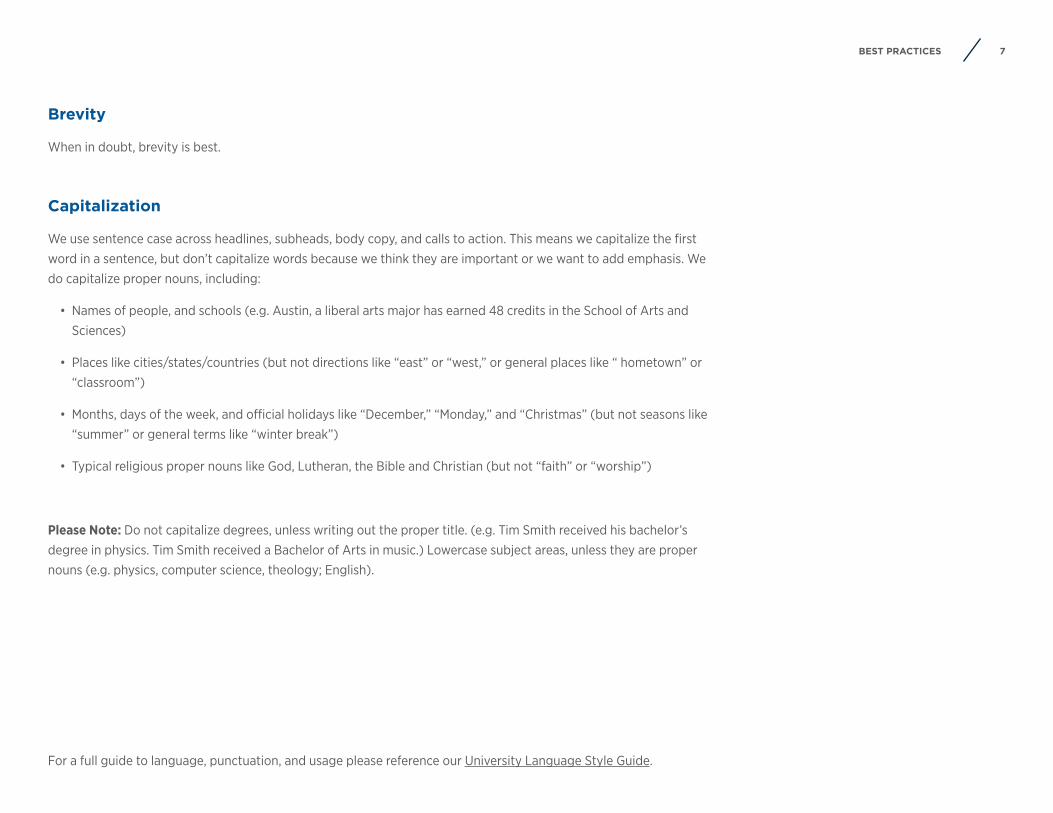
Brevity
When in doubt, brevity is best.
Capitalization
We use sentence case across headlines, subheads, body copy, and calls to action. This means we capitalize the first word in a sentence, but don’t capitalize words because we think they are important or we want to add emphasis. We do capitalize proper nouns, including:
• Names of people, and schools (e.g. Austin, a liberal arts major has earned 48 credits in the School of Arts and Sciences)
• Places like cities/states/countries (but not directions like “east” or “west,” or general places like “ hometown” or “classroom”)
• Months, days of the week, and official holidays like “December,” “Monday,” and “Christmas” (but not seasons like “summer” or general terms like “winter break”)
• Typical religious proper nouns like God, Lutheran, the Bible and Christian (but not “faith” or “worship”)
Please Note: Do not capitalize degrees, unless writing out the proper title. (e.g. Tim Smith received his bachelor’s degree in physics. Tim Smith received a Bachelor of Arts in music.) Lowercase subject areas, unless they are proper nouns (e.g. physics, computer science, theology; English).
For a full guide to language, punctuation, and usage please reference our University Language Style Guide.
8BEST PRACTICES
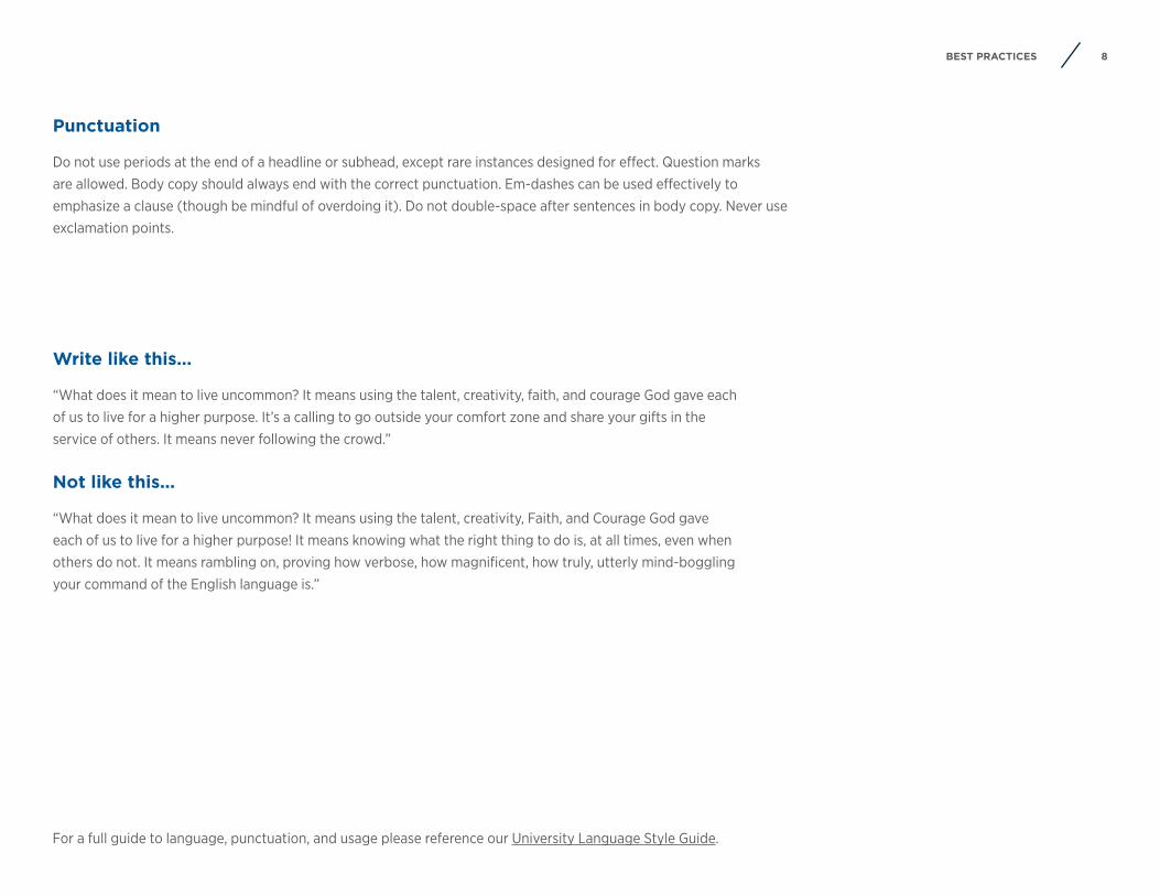
Punctuation
Do not use periods at the end of a headline or subhead, except rare instances designed for effect. Question marks are allowed. Body copy should always end with the correct punctuation. Em-dashes can be used effectively to emphasize a clause (though be mindful of overdoing it). Do not double-space after sentences in body copy. Never use exclamation points.
Write like this...
“What does it mean to live uncommon? It means using the talent, creativity, faith, and courage God gave eachof us to live for a higher purpose. It’s a calling to go outside your comfort zone and share your gifts in theservice of others. It means never following the crowd.”
Not like this...
“What does it mean to live uncommon? It means using the talent, creativity, Faith, and Courage God gaveeach of us to live for a higher purpose! It means knowing what the right thing to do is, at all times, even whenothers do not. It means rambling on, proving how verbose, how magnificent, how truly, utterly mind-bogglingyour command of the English language is.”
For a full guide to language, punctuation, and usage please reference our University Language Style Guide.
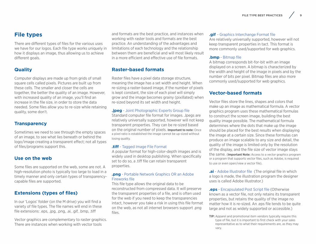
9FILE TYPE BEST PRACTICES
and formats are the best practice, and instances when working with raster tools and formats are the best practice. An understanding of the advantages and limitations of each technology and the relationship between them are beneficial and will most likely result in a more efficient and effective use of file formats.
Raster-based formats
Raster files have a pixel data storage structure, meaning the image has a set width and height. When re-sizing a raster-based image, if the number of pixels is kept constant, the size of each pixel will simply grow and the image becomes grainy (pixillated) when re-sized beyond its set width and height.
.jpeg - Joint Photographic Experts Group file Standard computer file format for images. Jpegs are relatively universally supported, however will not keep transparent properties. They can be re-sized based on the original number of pixels. Important to note: Once a pixel ratio is established the image cannot be up-sized without losing quality.
.tiff - Tagged Image File Format A popular format for high-color-depth images and is widely used in desktop publishing. When specifically set to do so, a .tiff file can retain transparent properties.
.png - Portable Network Graphics OR an Adobe Fireworks file This file type allows the original data to be reconstructed from compressed data. It will preserve the transparent properties of a file, and is often used for the web if you need to keep the transparencies intact, however you take a risk in using this file format on the web, as not all internet browsers support .png files.
.gif - Graphics Interchange Format file Are relatively universally supported, however will not keep transparent properties in tact. This format is more commonly used/supported for web graphics.
.bmp - Bitmap file A bitmap corresponds bit-for-bit with an image displayed on a screen. A bitmap is characterized by the width and height of the image in pixels and by the number of bits per pixel. Bitmap files are also more commonly used/supported for web graphics.
Vector-based formats
Vector files store the lines, shapes and colors that make up an image as mathematical formula. A vector graphics program uses these mathematical formulas to construct the screen image, building the best quality image possible. The mathematical formula determines where the dots that make up the image should be placed for the best results when displaying the image at a certain size. Since these formulas can produce an image scalable to any size and detail, the quality of the image is limited only by the resolution of the display, and the file size of vector image stays the same. (Important Note: Access to a vector graphics program or a program that supports vector files, such as Adobe, is required to use or even open/view a vector file).
.ai - Adobe Illustrator file (The original file in which a logo is made, the illustration program the designer uses is called Adobe Illustrator.)
.eps - Encapsulated Post Script file (Otherwise known as a vector file, not only retains its transparent properties, but retains the quality of the image no matter how it is re-sized. An .eps file tends to be quite large and not as widely supported or accessible.)
TIP: Apparel and promotional item vendors typically require this type of file, but it is important to first check with your sales representative as to what their requirements are, as they may vary.
File typesThere are different types of files for the various uses we have for our logos. Each file type works uniquely in how it displays an image, thus allowing us to achieve different goals.
Quality
Computer displays are made up from grids of small square cells called pixels. Pictures are built up from these cells. The smaller and closer the cells are together, the better the quality of an image. However, with increased quality of an image, you’ll find an increase in the file size, in order to store the data needed. Some files allow you to re-size while retaining quality, some don’t.
Transparency
Sometimes we need to see through the empty spaces of an image, to see what lies beneath or behind the logo/image creating a transparent effect; not all types of files/programs support this.
Use on the web
Some files are supported on the web, some are not. A high-resolution photo is typically too large to load in a timely manner and only certain types of transparency-capable files are supported.
Extensions (types of files)
In our ‘Logos’ folder (on the M drive) you will find a variety of file types. The file names will end in these file extensions: .eps, .jpg, .png, .ai, .gif, .bmp, .tiff
Vector graphics are complementary to raster graphics. There are instances when working with vector tools

10
Typography
TYPOGRAPHY
11TYPOGRAPHY
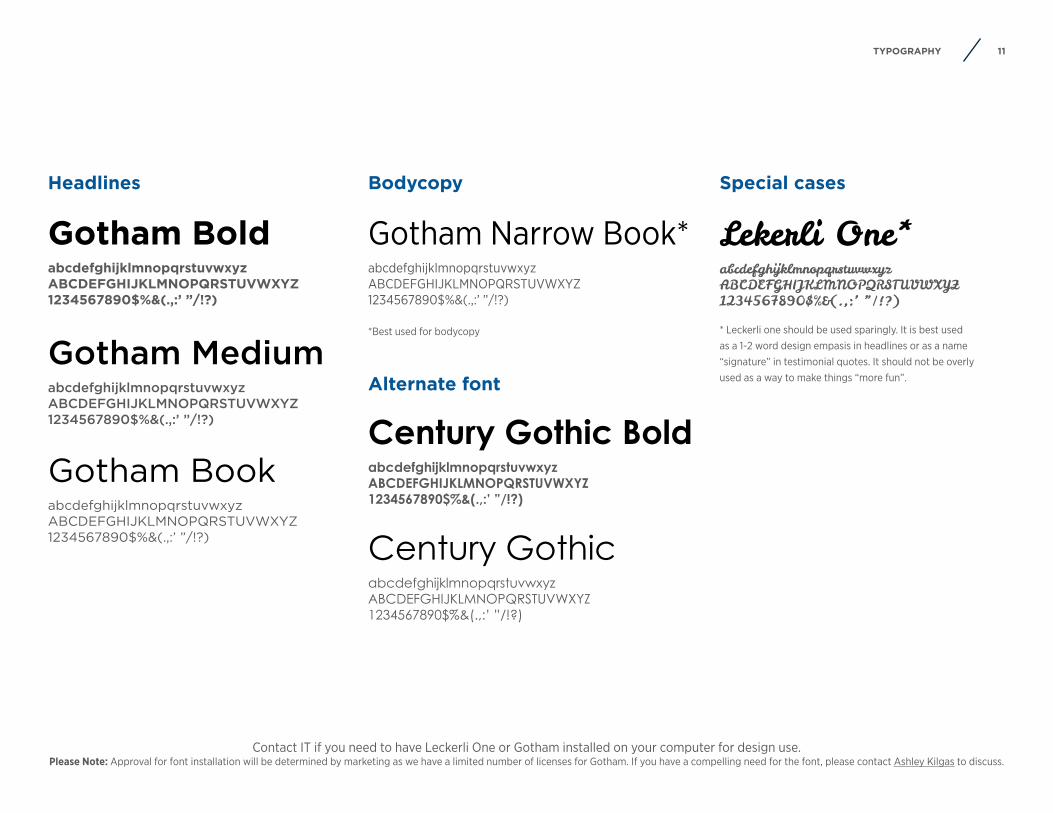
Gotham BoldabcdefghijklmnopqrstuvwxyzABCDEFGHIJKLMNOPQRSTUVWXYZ1234567890$%&(.,:’ ”/!?)
Gotham MediumabcdefghijklmnopqrstuvwxyzABCDEFGHIJKLMNOPQRSTUVWXYZ1234567890$%&(.,:’ ”/!?)
Gotham BookabcdefghijklmnopqrstuvwxyzABCDEFGHIJKLMNOPQRSTUVWXYZ1234567890$%&(.,:’ ”/!?)
Gotham Narrow Book*abcdefghijklmnopqrstuvwxyzABCDEFGHIJKLMNOPQRSTUVWXYZ1234567890$%&(.,:’ ”/!?)
*Best used for bodycopy
Lekerli One*abcdefghijklmnopqrstuvwxyzABCDEFGHIJKLMNOPQRSTUVWXYZ1234567890$%&(.,:’ ”/!?)
* Leckerli one should be used sparingly. It is best used as a 1-2 word design empasis in headlines or as a name “signature” in testimonial quotes. It should not be overly used as a way to make things “more fun”.
Headlines Bodycopy Special cases
Contact IT if you need to have Leckerli One or Gotham installed on your computer for design use. Please Note: Approval for font installation will be determined by marketing as we have a limited number of licenses for Gotham. If you have a compelling need for the font, please contact Ashley Kilgas to discuss.
Century Gothic BoldabcdefghijklmnopqrstuvwxyzABCDEFGHIJKLMNOPQRSTUVWXYZ1234567890$%&(.,:’ ”/!?)
Century GothicabcdefghijklmnopqrstuvwxyzABCDEFGHIJKLMNOPQRSTUVWXYZ1234567890$%&(.,:’ ”/!?)
Alternate font

12COLOR PALETTE
Color palette
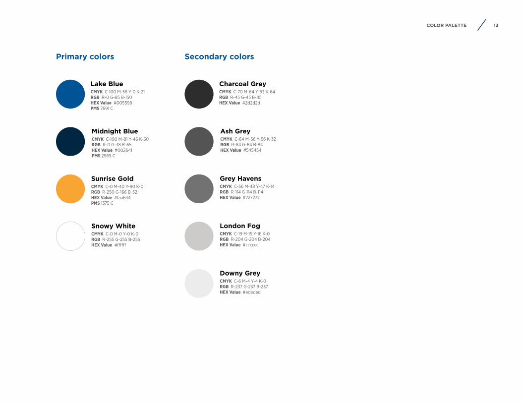
13COLOR PALETTE
Lake BlueCMYK C-100 M-58 Y-0 K-21RGB R-0 G-85 B-150HEX Value #005596PMS 7691 C
Midnight BlueCMYK C-100 M-81 Y-46 K-50RGB R-0 G-38 B-65HEX Value #002641PMS 2965 C
Sunrise GoldCMYK C-0 M-40 Y-90 K-0RGB R-250 G-166 B-52HEX Value #faa634PMS 1375 C
Snowy WhiteCMYK C-0 M-0 Y-0 K-0RGB R-255 G-255 B-255HEX Value #ffffff
Charcoal GreyCMYK C-70 M-64 Y-63 K-64RGB R-45 G-45 B-45HEX Value #2d2d2d
Ash GreyCMYK C-64 M-56 Y-56 K-32RGB R-84 G-84 B-84HEX Value #545454
Grey HavensCMYK C-56 M-48 Y-47 K-14RGB R-114 G-114 B-114HEX Value #727272
London FogCMYK C-19 M-15 Y-16 K-0RGB R-204 G-204 B-204HEX Value #cccccc
Downy GreyCMYK C-6 M-4 Y-4 K-0RGB R-237 G-237 B-237HEX Value #ededed
Primary colors Secondary colors
14COLOR ACCESSIBILITY
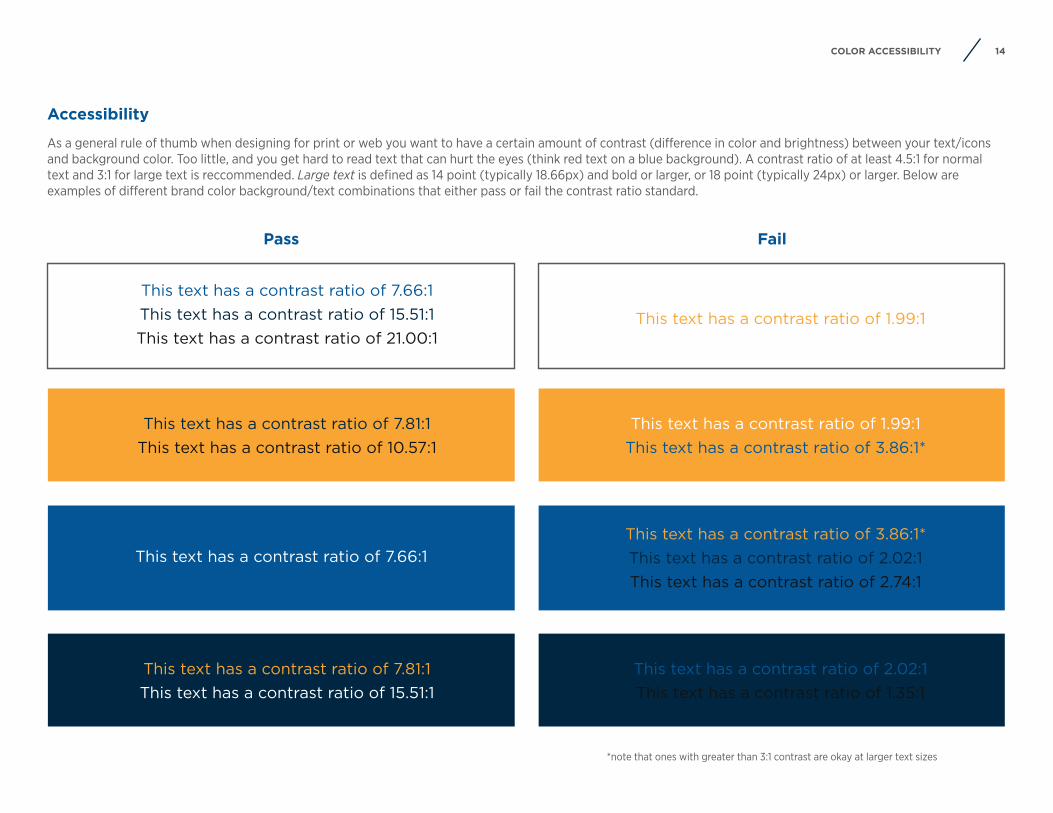
This text has a contrast ratio of 7.81:1This text has a contrast ratio of 15.51:1
This text has a contrast ratio of 7.66:1
This text has a contrast ratio of 7.81:1 This text has a contrast ratio of 10.57:1
This text has a contrast ratio of 7.66:1This text has a contrast ratio of 15.51:1 This text has a contrast ratio of 21.00:1
This text has a contrast ratio of 2.02:1This text has a contrast ratio of 1.35:1
This text has a contrast ratio of 3.86:1* This text has a contrast ratio of 2.02:1This text has a contrast ratio of 2.74:1
This text has a contrast ratio of 1.99:1This text has a contrast ratio of 3.86:1*
This text has a contrast ratio of 1.99:1
Pass Fail
*note that ones with greater than 3:1 contrast are okay at larger text sizes
Accessibility
As a general rule of thumb when designing for print or web you want to have a certain amount of contrast (difference in color and brightness) between your text/icons and background color. Too little, and you get hard to read text that can hurt the eyes (think red text on a blue background). A contrast ratio of at least 4.5:1 for normal text and 3:1 for large text is reccommended. Large text is defined as 14 point (typically 18.66px) and bold or larger, or 18 point (typically 24px) or larger. Below are examples of different brand color background/text combinations that either pass or fail the contrast ratio standard.

15PHOTOGRAPHY
Photography
16PHOTOGRAPHY
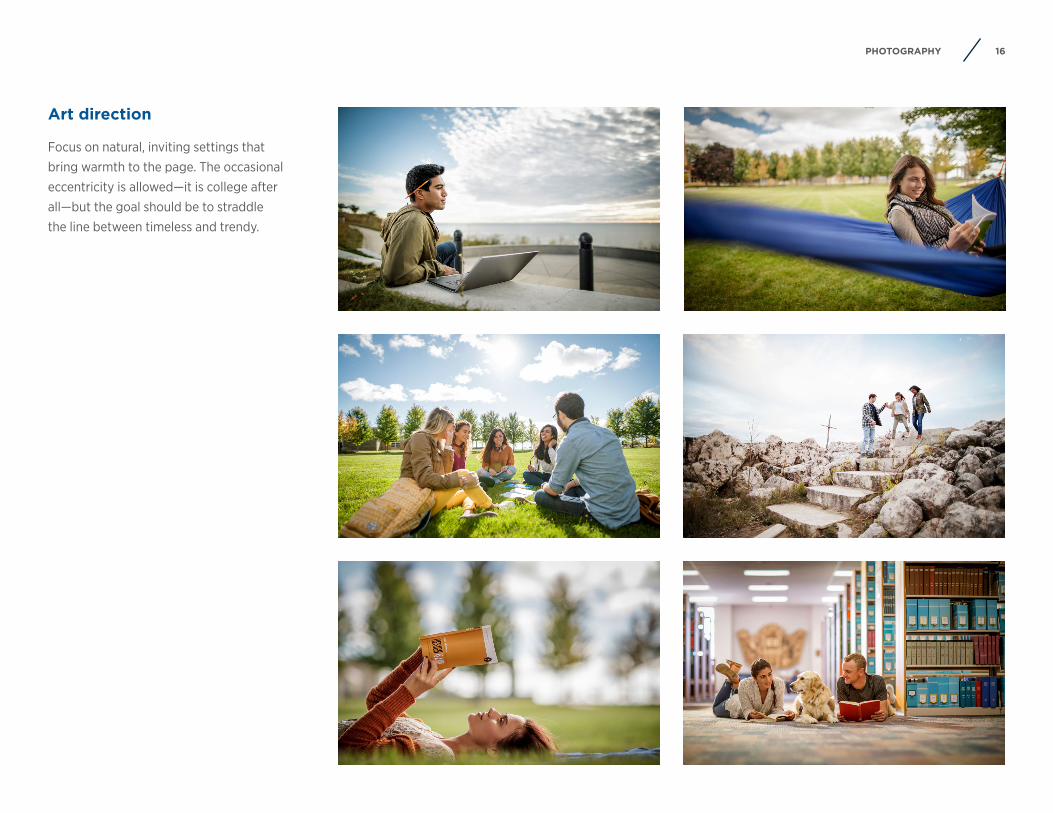
Art direction
Focus on natural, inviting settings thatbring warmth to the page. The occasionaleccentricity is allowed—it is college afterall—but the goal should be to straddlethe line between timeless and trendy.
17PHOTOGRAPHY
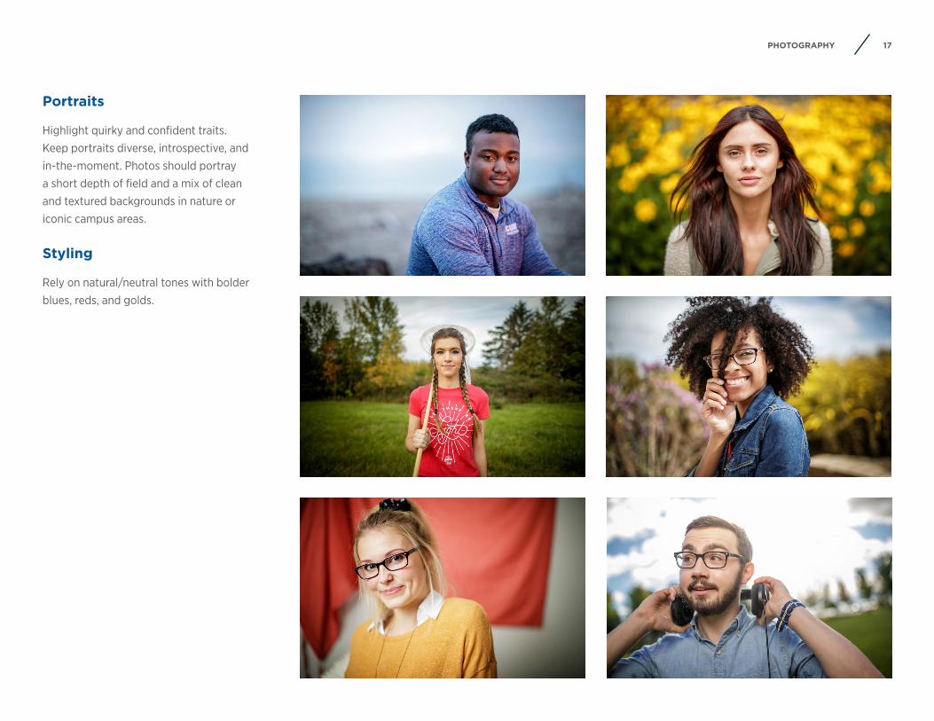
Portraits
Highlight quirky and confident traits.Keep portraits diverse, introspective, andin-the-moment. Photos should portraya short depth of field and a mix of cleanand textured backgrounds in nature oriconic campus areas.
Styling
Rely on natural/neutral tones with bolderblues, reds, and golds.
18PHOTOGRAPHY
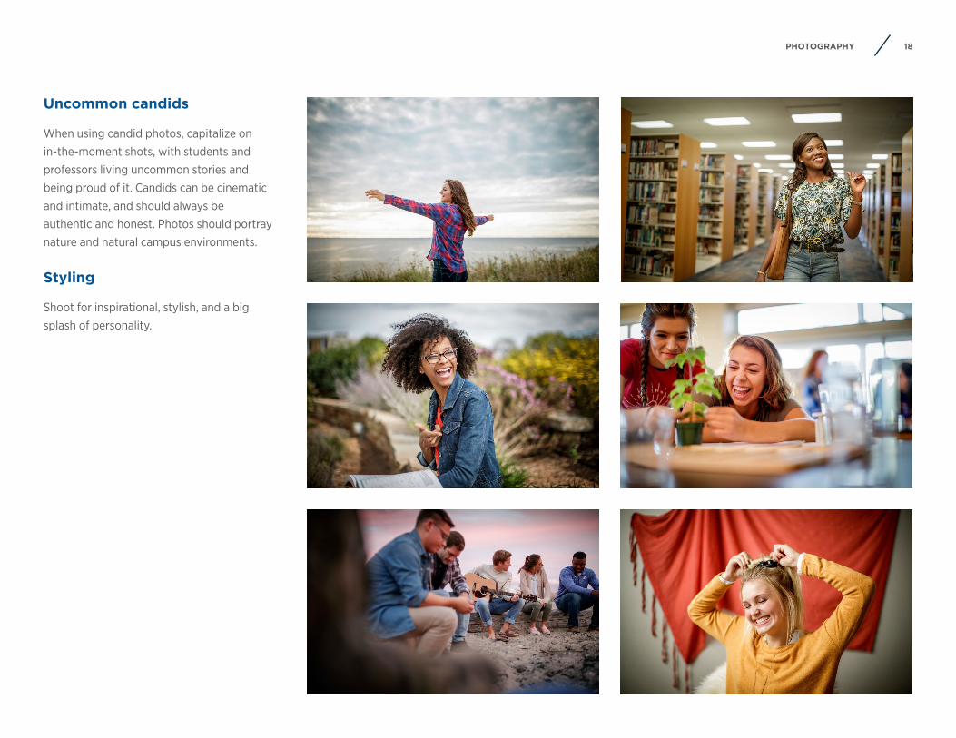
Uncommon candids
When using candid photos, capitalize on in-the-moment shots, with students and professors living uncommon stories and being proud of it. Candids can be cinematic and intimate, and should always be authentic and honest. Photos should portray nature and natural campus environments.
Styling
Shoot for inspirational, stylish, and a bigsplash of personality.
19PHOTOGRAPHY
Photo permission
Reproduction and publication of photographs or video, either edited or unedited, in brochures, advertisements, or other promotional media need to have the consent of the subjects featured in them. Meaning if you are taking your own photos of events, gatherings, etc. (natural or posed) with students/faculty/staff/alumni/general public/etc. you must have them sign a Photo/Video/Voice Consent Form*. This states that the subject grants Concordia University Wisconsin the right to use their photo/video/voice/likeness without making any payment (of any form).
Likewise, photos you plan to use that you did not take/purchase must have the written or verbal consent of the photographer to use their property.
*This form can be found on the M drive.
Online photo library
Many great photos exist already (with rights secured) on our online Photoshelter library that can be accessed at cuwaa.photoshelter.com/. You can use Single Sign On (SSO) to login to the university photo library and search for specific photos using keywords (e.x. CIT, 2018, bluffs, chapel, etc.) These pictures vary from scenery and buildings to students and faculty in action. There are even a few folders filled with old black/white photos from CUW’s history that have been scanned in from various archives.
Stock photography
In the rare case that you can’t find an existing CUW photo or don’t have the opportunity to take/get photos of your specific need, we do have a stock photo account with Getty Images. There are hundreds of thousands of photos available through Getty Images, so you’ll be sure to find one that is a perfect fit for your needs.
For more details on obtaining online stock photography, contact Ashley Kilgas in Marketing.
20LIVE UNCOMMON WORDMARK
Live Uncommon wordmark
21LIVE UNCOMMON WORDMARK
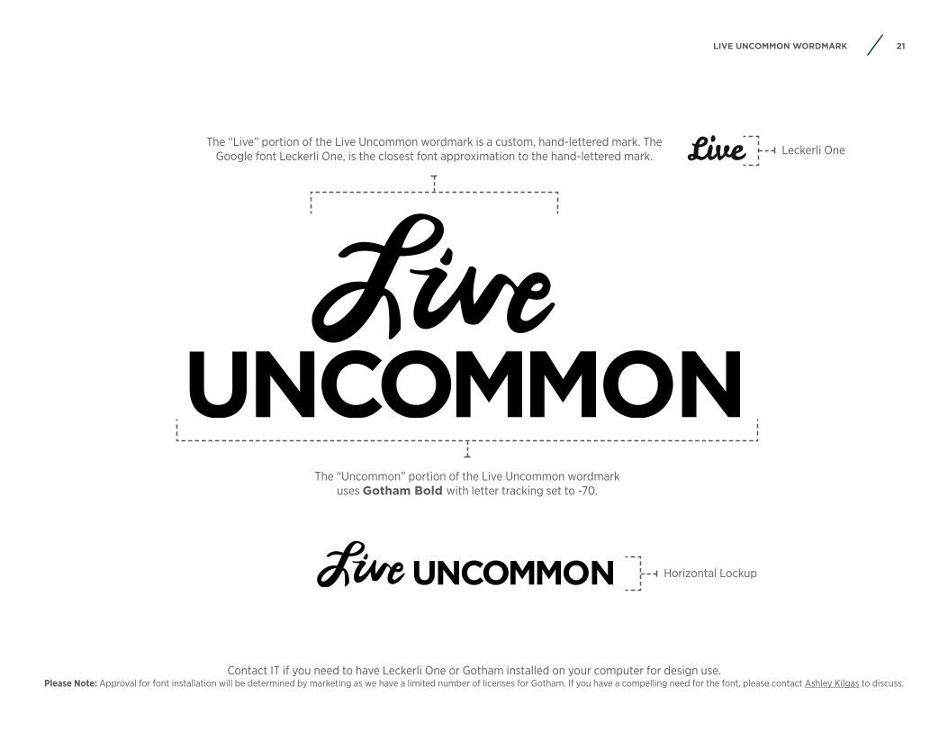
Live Leckerli One
Horizontal Lockup
The “Uncommon” portion of the Live Uncommon wordmark uses Gotham Bold with letter tracking set to -70.
The “Live” portion of the Live Uncommon wordmark is a custom, hand-lettered mark. The Google font Leckerli One, is the closest font approximation to the hand-lettered mark.
Contact IT if you need to have Leckerli One or Gotham installed on your computer for design use. Please Note: Approval for font installation will be determined by marketing as we have a limited number of licenses for Gotham. If you have a compelling need for the font, please contact Ashley Kilgas to discuss.
22LOGOS
Logos

23LOGO BASICS
Name
Name Name
Shield
Note: The Concordia logomark should never be re-drawn or re-constructed. ONLY use final, electronic artwork, accessible on the M drive.
24LOGO CONFIGURATIONS
Ho
rizo
ntal
C
ente
red
Stac
ked
C
ente
red
Ho
rizo
ntal
Fl
ush
Left
Stac
ked
Fl
ush
Left
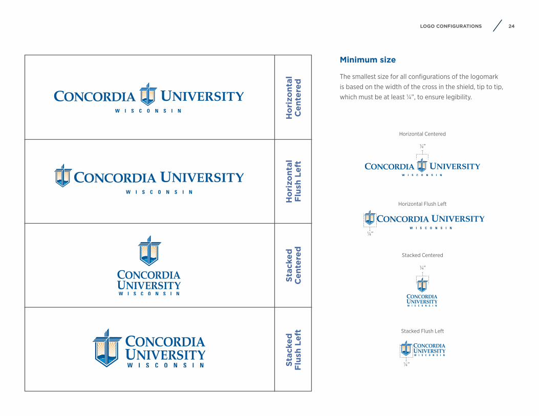
Minimum size
The smallest size for all configurations of the logomark is based on the width of the cross in the shield, tip to tip, which must be at least ¼”, to ensure legibility.
¼”
Horizontal Centered
¼”
Stacked Flush Left
Stacked Centered
¼”
Horizontal Flush Left
¼”
25LOGO CLEAR SPACE
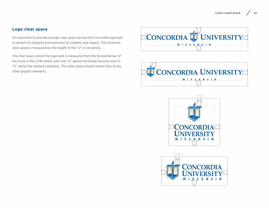
Logo clear space
It’s important to provide enough clear space around the Coccordia logomark to protect its integrity and maximize its visibility and impact. The minimum clear space is measured by the height of the “U” in University.
The clear space above the logomark is measured from the horizontal bar of the cross in the CUW shield, with one “U” above horizontal versions and 1½ “U” above the stacked variations. This clear space should remain free of any other graphic elements.
26JOINT LOGO
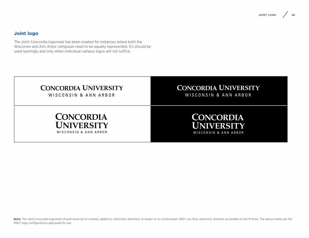
Note: The Joint Concordia logomark should never be re-colored, added to, stretched, distorted, re-drawn or re-constructed. ONLY use final, electronic artwork, accessible on the M drive. The above marks are the ONLY logo configurations approved for use.
Joint logo
The Joint Concordia logomark has been created for instances where both the Wisconsin and Ann Arbor campuses need to be equally represented. It’s should be used sparingly and only when individual campus logos will not suffice.
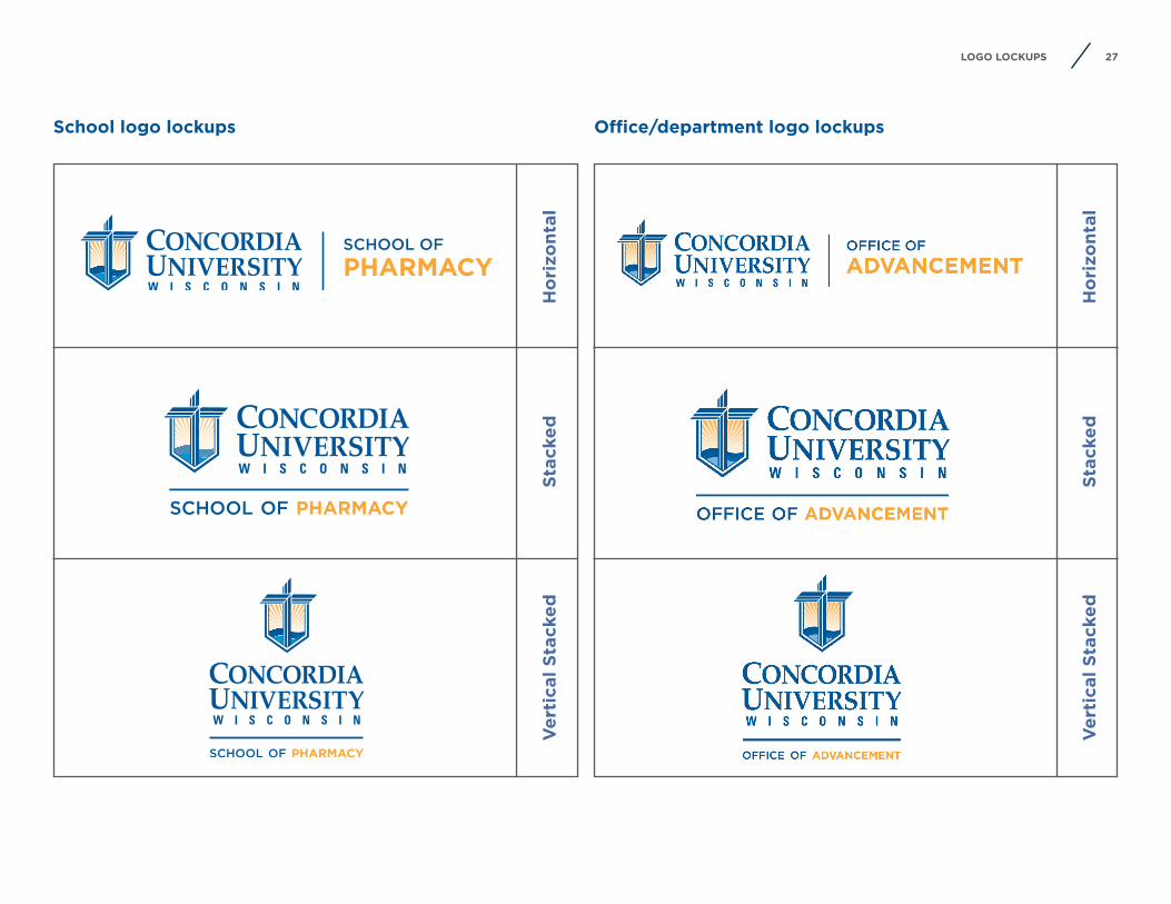
27LOGO LOCKUPS
Ho
rizo
ntal
Ho
rizo
ntal
Ver
tica
l Sta
cked
Ver
tica
l Sta
cked
Stac
ked
Stac
ked
School logo lockups Office/department logo lockups
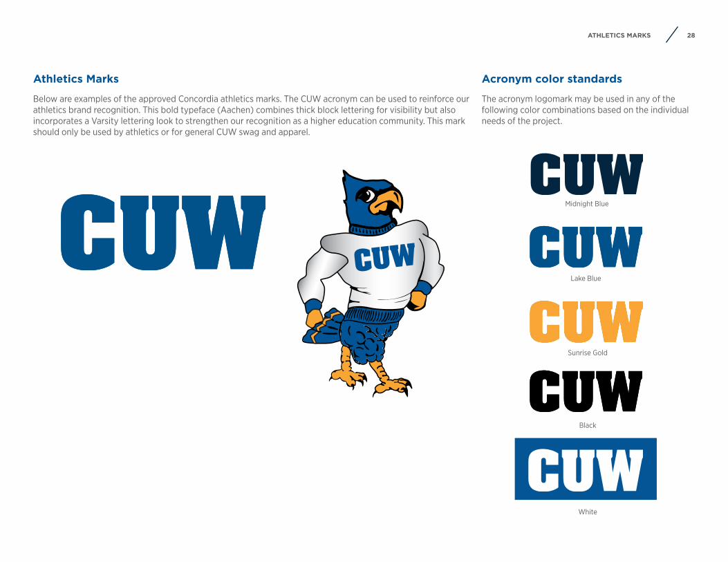
28ATHLETICS MARKS
Athletics Marks
Below are examples of the approved Concordia athletics marks. The CUW acronym can be used to reinforce our athletics brand recognition. This bold typeface (Aachen) combines thick block lettering for visibility but also incorporates a Varsity lettering look to strengthen our recognition as a higher education community. This mark should only be used by athletics or for general CUW swag and apparel.
Acronym color standards
The acronym logomark may be used in any of the following color combinations based on the individual needs of the project.
White
Lake Blue
Black
Midnight Blue
Sunrise Gold
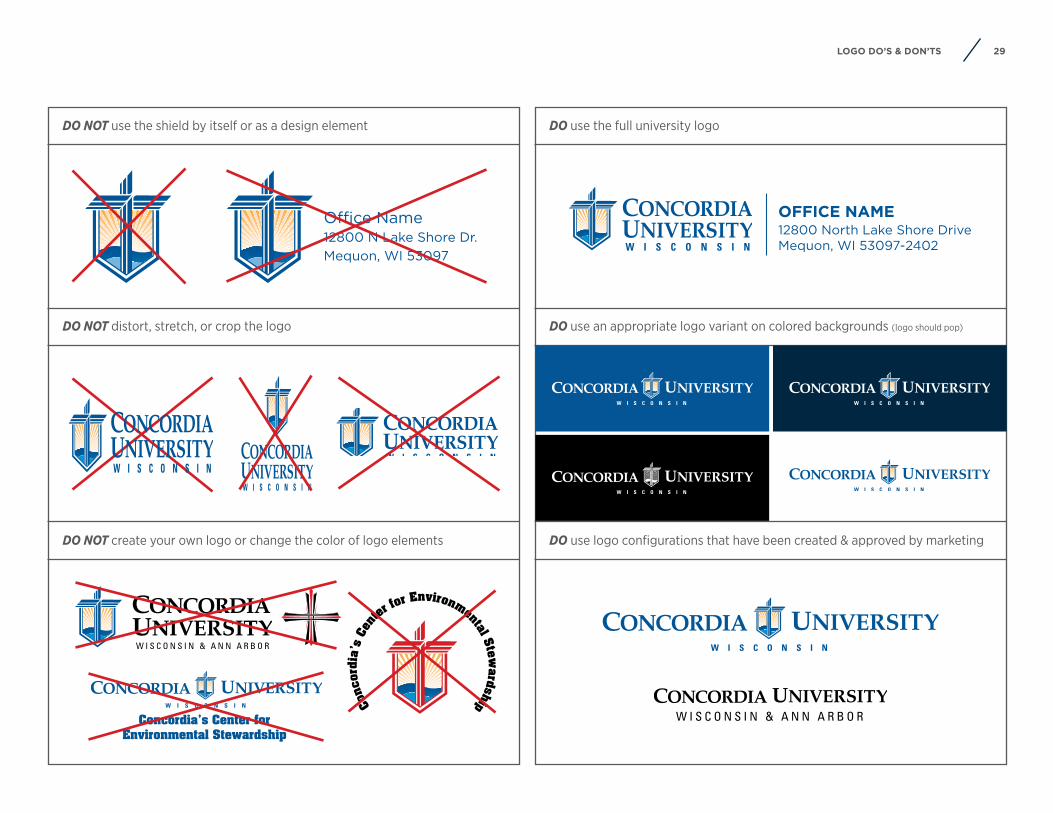
29LOGO DO’S & DON’TS
DO NOT use the shield by itself or as a design element DO use the full university logo
DO NOT distort, stretch, or crop the logo DO use an appropriate logo variant on colored backgrounds (logo should pop)
DO NOT create your own logo or change the color of logo elements DO use logo configurations that have been created & approved by marketing
Office Name12800 N Lake Shore Dr.Mequon, WI 53097
Co
ncor
dia’
s Ce
nter
for Environmental Stewardship
Concordia’s Center for Environmental Stewardship
OFFICE NAME12800 North Lake Shore DriveMequon, WI 53097-2402
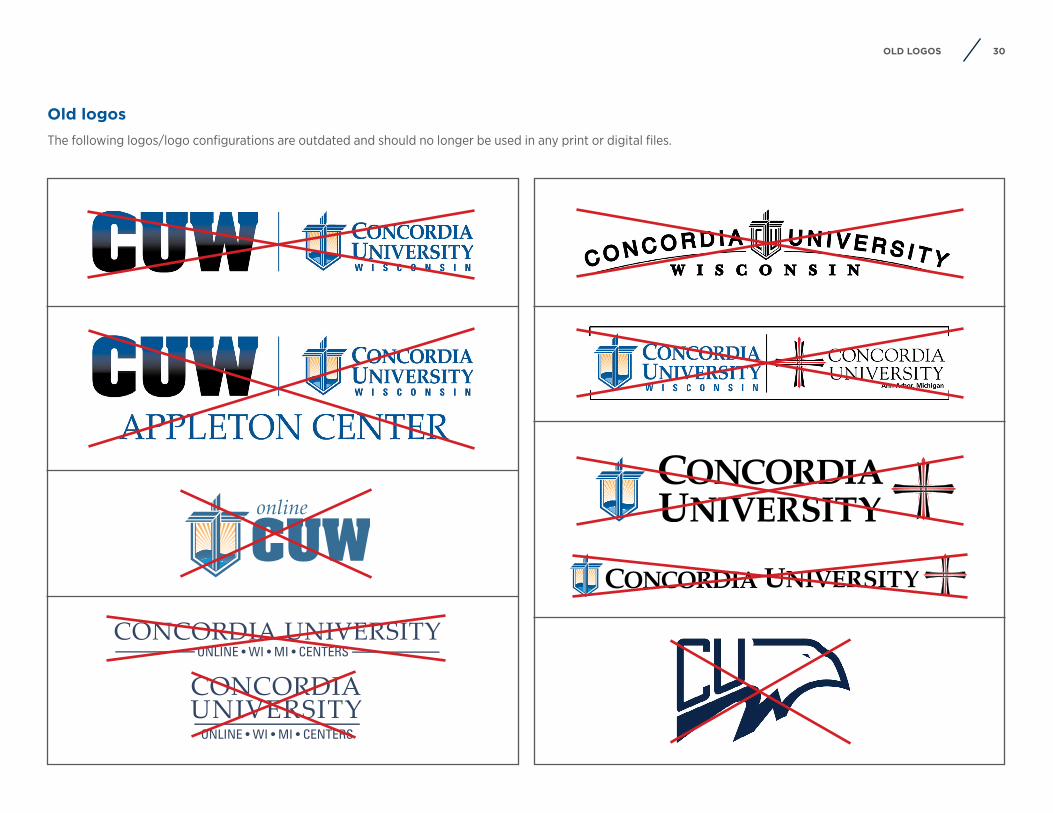
30OLD LOGOS
Old logosThe following logos/logo configurations are outdated and should no longer be used in any print or digital files.
31SWAG & APPAREL
Swag & apparel
32SWAG & APPAREL STANDARDS
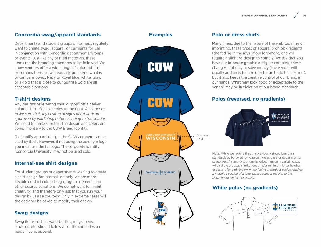
Concordia swag/apparel standards
Departments and student groups on campus regularly want to create swag, apparel, or garments for use in conjunction with Concordia departments/groups or events. Just like any printed materials, these items require branding standards to be followed. We know vendors offer a wide range of color options or combinations, so we regularly get asked what is or can be allowed. Navy or Royal blue, white, gray, or a gold that is close to our Sunrise Gold are all acceptable options.
T-shirt designsAny designs or lettering should “pop” off a darker colored shirt. See examples to the right. Also, please make sure that any custom designs or artwork are approved by Marketing before sending to the vendor. We need to make sure that the design and colors are complimentary to the CUW Brand Identity.
To simplify apparel design, the CUW acronym can be used by itself. However, if not using the acronym logo you must use the full logo. The corporate identity ‘Concordia University’ may not be used solo.
Internal-use shirt designs
For student groups or departments wishing to create a shirt design for internal use only, we are more flexible on shirt color, design, logo placement, and other desired variations. We do not want to inhibit creativity, and therefore only ask that you run your design by us as a courtesy. Only in extreme cases will the designer be asked to modify their design.
Swag designs
Swag items such as waterbottles, mugs, pens, lanyards, etc. should follow all of the same design guidelines as apparel.
White polos (no gradients)
Examples
Note: While we require that the previously stated branding standards be followed for logo configurations (for departments/schools/etc.) some exceptions have been made in certain cases when there are space limitations and/or minimum letter heights, especially for embroidery. If you feel your product choice requires a modified version of a logo, please contact the Marketing Department for further details.
Polo or dress shirts
Many times, due to the nature of the embroidering or imprinting, these types of apparel prohibit gradients (the fading in the rays of our logomark) and will require a slight re-design to comply. We ask that you have our in-house graphic designer complete these changes, not only to save money (the vendor will usually add an extensive up-charge to do this for you), but it also keeps the creative control of our brand in our hands. What may look good or acceptable to the vendor may be in violation of our brand standards.
Polos (reversed, no gradients)
CONCORDIA UNIVERSITY
WISCONSINGotham Bold

33EMAIL SIGNATURES
Email signatures
34EMAIL SIGNATURES
Email signatures
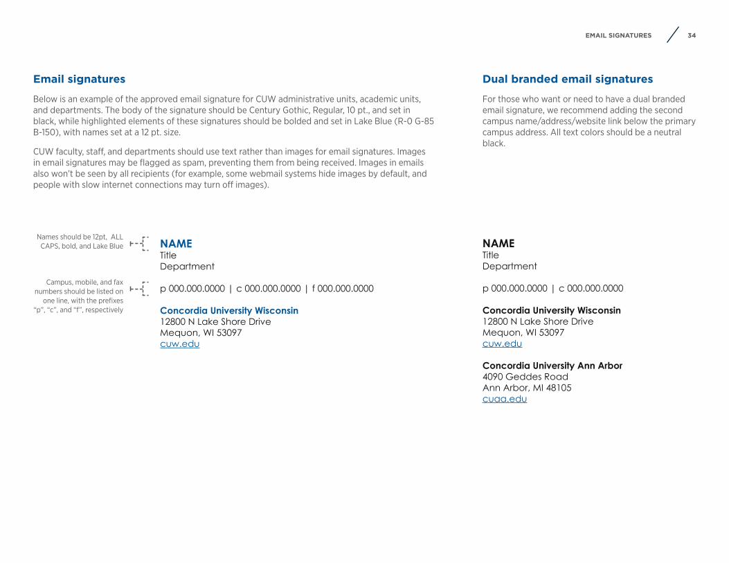
Below is an example of the approved email signature for CUW administrative units, academic units, and departments. The body of the signature should be Century Gothic, Regular, 10 pt., and set in black, while highlighted elements of these signatures should be bolded and set in Lake Blue (R-0 G-85 B-150), with names set at a 12 pt. size.
CUW faculty, staff, and departments should use text rather than images for email signatures. Images in email signatures may be flagged as spam, preventing them from being received. Images in emails also won’t be seen by all recipients (for example, some webmail systems hide images by default, and people with slow internet connections may turn off images).
Dual branded email signatures
For those who want or need to have a dual branded email signature, we recommend adding the second campus name/address/website link below the primary campus address. All text colors should be a neutral black.
NAMETitleDepartment
p 000.000.0000 | c 000.000.0000
Concordia University Wisconsin12800 N Lake Shore DriveMequon, WI 53097cuw.edu
Concordia University Ann Arbor4090 Geddes RoadAnn Arbor, MI 48105cuaa.edu
NAMETitleDepartment
p 000.000.0000 | c 000.000.0000 | f 000.000.0000
Concordia University Wisconsin12800 N Lake Shore DriveMequon, WI 53097cuw.edu
Names should be 12pt, ALL CAPS, bold, and Lake Blue
Campus, mobile, and fax numbers should be listed on
one line, with the prefixes “p”, “c”, and “f”, respectively
35CONTACT US
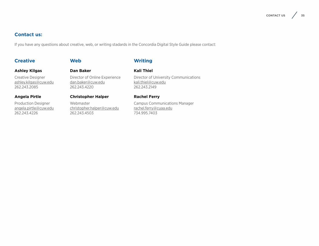
Creative
Ashley Kilgas
Creative [email protected]
Angela Pirtle
Production [email protected]
Contact us:
If you have any questions about creative, web, or writing stadards in the Concordia Digital Style Guide please contact:
Web
Dan Baker
Director of Online [email protected]
Christopher Halper
Writing
Kali Thiel
Director of University [email protected]
Rachel Ferry
Campus Communications [email protected]