CARATTERE UNIVERSALE INNOVAZIONE SENZA STILE … Universale. Innovazione... · scenario – Prima...
8
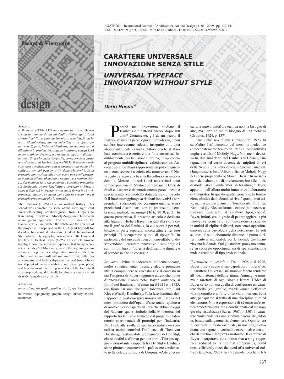
137 P erché mai dovremmo studiare il Bauhaus e dibattervi ancora dopo 100 anni? Certamente, già da un pezzo, il Funzionalismo ha perso ogni autorevolezza, e non sembra interessante, adesso, inseguire un’utopia abbondantemente esaurita. Allora perché il Bau- haus continua a esercitare una forte attrattiva? In- dubbiamente, per la visione sinottica, un approccio al progetto multidisciplinare, caleidoscopico. An- cora oggi il Bauhaus rappresenta un polo magneti- co di conoscenze e tecniche che attraversano il No- vecento e stanno alla base della cultura visiva occi- dentale. Mentre i nostri Corsi universitari sono sempre più Corsi di Studio e sempre meno Corsi di Studi e il sapere è sistematicamente parcellizzato e specializzato (sul modello statunitense), un secolo fa il Bauhaus raggiungeva risultati innovativi e sor- prendenti sperimentando coraggiosamente, senza preclusioni disciplinari, con «a practise still em- bracing multiple meaning» (Toth, 2018, p. 2). In questa prospettiva, il presente articolo è dedicato alla figura di Herbert Bayer, passato alla storia co- me il-grafico-del-Bauhaus, la cui opera è per noi, benché in parte superata, ancora attuale nei suoi principi. Ci occuperemo quindi di tipografia, in particolare del suo controverso mono-alfabeto, de- scrivendone il carattere innovativo, i suoi pregi e i suoi limiti, fino all’odierna declinazione digitale e al paradosso che ne consegue. Scenario – Prima di addentrarci nel tema occorre, molto sinteticamente, tracciare alcune premesse utili a comprendere le circostanze e il contesto in cui l’impresa di Bayer raggiunse autentiche punte d’innovazione. Com’è noto, Bayer, austriaco, si formò nel Bauhaus di Weimar tra il 1921 e il 1923, con figure carismatiche quali Johannes Itten, Paul Klee e Wassily Kandinsky. Fu la fase dominata dal- l’approccio mistico-espressionista all’insegna del mito romantico dell’opera d’arte totale: qualcosa di molto diverso rispetto all’idea che abbiamo oggi del Bauhaus quale simbolo della Modernità, del rapporto tra le nuove tecniche e il progetto e labo- ratorio sperimentale di prototipi per l’industria. Nel 1923, alla svolta di tipo funzionalistico-razio- nalista molto contribuì l’influenza di Theo van Doesburg, l’instancabile propugnatore del De Stijl, che si trasferì a Weimar per due anni 1 . Tale passag- gio – nonostante i rapporti tra De Stijl e Bauhaus siano piuttosto controversi – può essere condensa- to nella celebre formula di Gropius: «Arte e tecni- AbSTRAcT Il bauhaus (1919-1933) ha segnato la storia. Questa scuola fu animata da alcuni degli artisti-progettisti più rilevanti del Novecento, da Gropius a Kandinskij, da It- ten a Moholy-Nagy, non riconducibili a un approccio univoco. Eppure, l’idea del bauhaus, che ha innervato il dibattito e la pratica del progetto in Europa e negli USA (e non solo) per decenni, si è risolta in una sorta di Inter- national Style che, nella tipografia, corrisponde al carat- tere Universal di Herbert bayer (1925). Il presente arti- colo mira a evidenziare come il carattere universale, che raffigura per noi oggi lo ‘stile’ della Modernità, fu in principio innovazione allo stato puro: una configurazio- ne volta all’effetto, al massimo risultato col minimo sfor- zo, dal punto di vista sia economico e tecnico-produttivo sia funzionale ovvero leggibilità e percezione visiva; e come il dato più interessante non sia la forma in sé – ri- proposta, uguale a se stessa, per quasi un secolo – ma il principio progettuale che la sottende. The Bauhaus (1919-1933) has marked history. This school was animated by some of the most significant Twentieth-century artist-designers, from Gropius to Kandinskij, from Itten to Moholy-Nagy, not related to an unambiguous approach. However, the idea of the Bauhaus, which innervated the debate and the practice of the project in Europe and in the USA (and beyond) for decades, has resulted into some kind of International Style which, in typography, corresponds to the Universal typeface of Herbert Bayer (1925). This article aims to highlight how the universal typeface, that today repre- sents the ‘style’ of Modernity, was in the beginning inno- vation in its purest: a configuration aimed at effect, to achieve maximum result with minimum effort, both from an economic and technical-productive, and from a func- tional point of view, readability and visual perception; and how the most interesting aspect is not the form itself – re-proposed, equal to itself, for almost a century – but its underlying design principle. KEYWORdS innovazione, tipografia, grafica, storia, sperimentazione innovation, typography, graphic design, history, experi- mentation ca: una nuova unità! La tecnica non ha bisogno di arte, ma l’arte ha molto bisogno di una tecnica» (Gropius, 1924, p. 137). Una delle novità più rilevanti del 1923 fu senz’altro l’affidamento del corso propedeutico (precedentemente tenuto da Itten) al costruttivista ungherese László Moholy-Nagy. Non meno decisi- va fu, due anni dopo, nel Bauhaus di Dessau, l’in- tegrazione nel corpo docente dei migliori allievi della Scuola una volta divenuti ‘giovani maestri’ (Jungmeister): Josef Albers affiancò Moholy-Nagy nel corso propedeutico; Marcel Breuer fu messo a capo del Laboratorio di arredamento; Joost Schmidt, di modellistica; Gunta Stölzl, di tessitura; e Bayer, appunto, dell’allora molto innovativo Laboratorio di tipografia. In questo quadro generale, la forma- zione olistica della Scuola si rivelò quanto mai uti- le, inclusi gli insegnamenti ‘fondamentali’ di Itten, Kandinskij e Klee su forma e colore (non necessa- riamente finalizzati al carattere tipografico) 2 . Bayer, infatti, era in grado di padroneggiare le più innovative tecniche di comunicazione, spaziando in ambiti disciplinari diversi, non senza approfon- dimenti sulla psicologia della percezione. In soli sei mesi, il suo Laboratorio divenne un punto di ri- ferimento irrinunciabile per le aziende che finan- ziavano la Scuola. Qui gli studenti potevano conta- re su concrete opportunità sia di sperimentazione nuda e cruda sia di tipo professionale. Il carattere universale – Tra il 1925 e il 1926, Bayer mise a segno il suo capolavoro tipografico: il carattere Universal, un mono-alfabeto tendente all’idea platonica della scrittura, l’immagine mini- ma e rarefatta di ogni singola lettera. L’idea di Bayer certo non era quella di configurare un carat- tere ‘bello’ (calligrafico) ma visivamente efficace: «La tipografia è un’arte di servizio, non una bella arte, per quanto si tratta di una disciplina pura ed elementare. Non è espressione di sé entro un’este- tica predeterminata, ma è condizionata dal messag- gio che visualizza» (Bayer, 1967, p. 350). Il carat- tere ‘universale’ era una scrittura essenziale, ridot- ta, basata sulla geometria elementare. Ogni lettera fu costruita in modo razionale, su una griglia qua- drata, con segmenti verticali e orizzontali e con ar- chi di cerchio e larghezza uniforme. Il carattere di Bayer incorporava «the notion that a single type- face, reduced to its minimal components, could most efficiently meet the need of a universal cul- ture» (Lupton, 2006). In altre parole, poiché le let- ISSN: 2464-9309 (print) - ISSN: 2532-683X (online) - DOI: 10.19229/2464-9309/5152019 Dario Russo a CARATTERE UNIVERSALE INNOVAZIONE SENZA STILE UNIVERSAL TYPEFACE INNOVATION WITHOUT STYLE AGATHÓN – International Journal of Architecture, Art and Design | n. 05 | 2019 | pp. 137-144
-
Upload
nguyenhuong -
Category
Documents
-
view
216 -
download
0
Transcript of CARATTERE UNIVERSALE INNOVAZIONE SENZA STILE … Universale. Innovazione... · scenario – Prima...
137
Perché mai dovremmo studiare ilBauhaus e dibattervi ancora dopo 100anni? Certamente, già da un pezzo, il
Funzionalismo ha perso ogni autorevolezza, e nonsembra interessante, adesso, inseguire un’utopiaabbondantemente esaurita. Allora perché il Bau-haus continua a esercitare una forte attrattiva? In-dubbiamente, per la visione sinottica, un approccioal progetto multidisciplinare, caleidoscopico. An-cora oggi il Bauhaus rappresenta un polo magneti-co di conoscenze e tecniche che attraversano il No-vecento e stanno alla base della cultura visiva occi-dentale. Mentre i nostri Corsi universitari sonosempre più Corsi di Studio e sempre meno Corsi diStudi e il sapere è sistematicamente parcellizzato especializzato (sul modello statunitense), un secolofa il Bauhaus raggiungeva risultati innovativi e sor-prendenti sperimentando coraggiosamente, senzapreclusioni disciplinari, con «a practise still em-bracing multiple meaning» (Toth, 2018, p. 2). Inquesta prospettiva, il presente articolo è dedicatoalla figura di Herbert Bayer, passato alla storia co-me il-grafico-del-Bauhaus, la cui opera è per noi,benché in parte superata, ancora attuale nei suoiprincipi. Ci occuperemo quindi di tipografia, inparticolare del suo controverso mono-alfabeto, de-scrivendone il carattere innovativo, i suoi pregi e isuoi limiti, fino all’odierna declinazione digitale eal paradosso che ne consegue.
scenario – Prima di addentrarci nel tema occorre,molto sinteticamente, tracciare alcune premesseutili a comprendere le circostanze e il contesto incui l’impresa di Bayer raggiunse autentiche punted’innovazione. Com’è noto, Bayer, austriaco, siformò nel Bauhaus di Weimar tra il 1921 e il 1923,con figure carismatiche quali Johannes Itten, PaulKlee e Wassily Kandinsky. Fu la fase dominata dal-l’approccio mistico-espressionista all’insegna delmito romantico dell’opera d’arte totale: qualcosadi molto diverso rispetto all’idea che abbiamo oggidel Bauhaus quale simbolo della Modernità, delrapporto tra le nuove tecniche e il progetto e labo-ratorio sperimentale di prototipi per l’industria.Nel 1923, alla svolta di tipo funzionalistico-razio-nalista molto contribuì l’influenza di Theo vanDoesburg, l’instancabile propugnatore del De Stijl,che si trasferì a Weimar per due anni1. Tale passag-gio – nonostante i rapporti tra De Stijl e Bauhaussiano piuttosto controversi – può essere condensa-to nella celebre formula di Gropius: «Arte e tecni-
AbstrActIl bauhaus (1919-1933) ha segnato la storia. Questascuola fu animata da alcuni degli artisti-progettisti piùrilevanti del Novecento, da Gropius a Kandinskij, da It-ten a Moholy-Nagy, non riconducibili a un approcciounivoco. Eppure, l’idea del bauhaus, che ha innervato ildibattito e la pratica del progetto in Europa e negli UsA(e non solo) per decenni, si è risolta in una sorta di Inter-national style che, nella tipografia, corrisponde al carat-tere Universal di Herbert bayer (1925). Il presente arti-colo mira a evidenziare come il carattere universale, cheraffigura per noi oggi lo ‘stile’ della Modernità, fu inprincipio innovazione allo stato puro: una configurazio-ne volta all’effetto, al massimo risultato col minimo sfor-zo, dal punto di vista sia economico e tecnico-produttivosia funzionale ovvero leggibilità e percezione visiva; ecome il dato più interessante non sia la forma in sé – ri-proposta, uguale a se stessa, per quasi un secolo – ma ilprincipio progettuale che la sottende.The Bauhaus (1919-1933) has marked history. Thisschool was animated by some of the most significantTwentieth-century artist-designers, from Gropius toKandinskij, from Itten to Moholy-Nagy, not related to anunambiguous approach. However, the idea of theBauhaus, which innervated the debate and the practice ofthe project in Europe and in the USA (and beyond) fordecades, has resulted into some kind of InternationalStyle which, in typography, corresponds to the Universaltypeface of Herbert Bayer (1925). This article aims tohighlight how the universal typeface, that today repre-sents the ‘style’ of Modernity, was in the beginning inno-vation in its purest: a configuration aimed at effect, toachieve maximum result with minimum effort, both froman economic and technical-productive, and from a func-tional point of view, readability and visual perception;and how the most interesting aspect is not the form itself– re-proposed, equal to itself, for almost a century – butits underlying design principle.
KEywordsinnovazione, tipografia, grafica, storia, sperimentazioneinnovation, typography, graphic design, history, experi-mentation
ca: una nuova unità! La tecnica non ha bisogno diarte, ma l’arte ha molto bisogno di una tecnica»(Gropius, 1924, p. 137).
Una delle novità più rilevanti del 1923 fusenz’altro l’affidamento del corso propedeutico(precedentemente tenuto da Itten) al costruttivistaungherese László Moholy-Nagy. Non meno decisi-va fu, due anni dopo, nel Bauhaus di Dessau, l’in-tegrazione nel corpo docente dei migliori allievidella Scuola una volta divenuti ‘giovani maestri’(Jungmeister): Josef Albers affiancò Moholy-Nagynel corso propedeutico; Marcel Breuer fu messo acapo del Laboratorio di arredamento; Joost Schmidt,di modellistica; Gunta Stölzl, di tessitura; e Bayer,appunto, dell’allora molto innovativo Laboratoriodi tipografia. In questo quadro generale, la forma-zione olistica della Scuola si rivelò quanto mai uti-le, inclusi gli insegnamenti ‘fondamentali’ di Itten,Kandinskij e Klee su forma e colore (non necessa-riamente finalizzati al carattere tipografico)2.Bayer, infatti, era in grado di padroneggiare le piùinnovative tecniche di comunicazione, spaziandoin ambiti disciplinari diversi, non senza approfon-dimenti sulla psicologia della percezione. In solisei mesi, il suo Laboratorio divenne un punto di ri-ferimento irrinunciabile per le aziende che finan-ziavano la Scuola. Qui gli studenti potevano conta-re su concrete opportunità sia di sperimentazionenuda e cruda sia di tipo professionale.
Il carattere universale – Tra il 1925 e il 1926,Bayer mise a segno il suo capolavoro tipografico:il carattere Universal, un mono-alfabeto tendenteall’idea platonica della scrittura, l’immagine mini-ma e rarefatta di ogni singola lettera. L’idea diBayer certo non era quella di configurare un carat-tere ‘bello’ (calligrafico) ma visivamente efficace:«La tipografia è un’arte di servizio, non una bellaarte, per quanto si tratta di una disciplina pura edelementare. Non è espressione di sé entro un’este-tica predeterminata, ma è condizionata dal messag-gio che visualizza» (Bayer, 1967, p. 350). Il carat-tere ‘universale’ era una scrittura essenziale, ridot-ta, basata sulla geometria elementare. Ogni letterafu costruita in modo razionale, su una griglia qua-drata, con segmenti verticali e orizzontali e con ar-chi di cerchio e larghezza uniforme. Il carattere diBayer incorporava «the notion that a single type-face, reduced to its minimal components, couldmost efficiently meet the need of a universal cul-ture» (Lupton, 2006). In altre parole, poiché le let-
ISSN: 2464-9309 (print) - ISSN: 2532-683X (online) - DOI: 10.19229/2464-9309/5152019
Dario Russo a
CARATTERE UNIVERSALE
INNOVAZIONE SENZA STILE
UNIVERSAL TYPEFACE
INNOVATION WITHOUT STYLE
AGATHÓN – International Journal of Architecture, Art and Design | n. 05 | 2019 | pp. 137-144
138
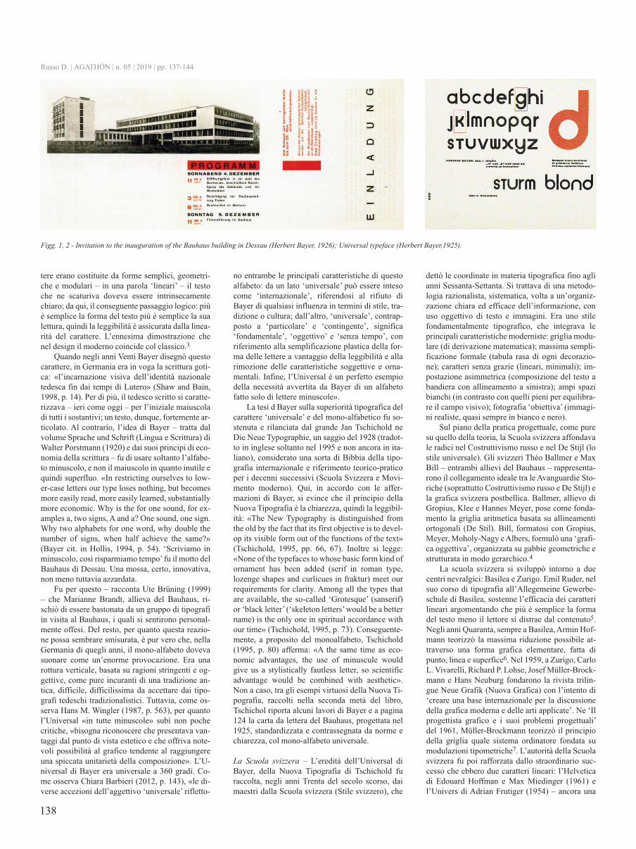
tere erano costituite da forme semplici, geometri-che e modulari – in una parola ‘lineari’ – il testoche ne scaturiva doveva essere intrinsecamentechiaro; da qui, il conseguente passaggio logico: piùè semplice la forma del testo più è semplice la sualettura, quindi la leggibilità è assicurata dalla linea-rità del carattere. L’ennesima dimostrazione chenel design il moderno coincide col classico.3
Quando negli anni Venti Bayer disegnò questocarattere, in Germania era in voga la scrittura goti-ca: «l’incarnazione visiva dell’identità nazionaletedesca fin dai tempi di Lutero» (Shaw and Bain,1998, p. 14). Per di più, il tedesco scritto si caratte-rizzava – ieri come oggi – per l’iniziale maiuscoladi tutti i sostantivi; un testo, dunque, fortemente ar-ticolato. Al contrario, l’idea di Bayer – tratta dalvolume Sprache und Schrift (Lingua e Scrittura) diWalter Porstmann (1920) e dai suoi principi di eco-nomia della scrittura – fu di usare soltanto l’alfabe-to minuscolo, e non il maiuscolo in quanto inutile equindi superfluo. «In restricting ourselves to low-er-case letters our type loses nothing, but becomesmore easily read, more easily learned, substantiallymore economic. Why is the for one sound, for ex-amples a, two signs, A and a? One sound, one sign.Why two alphabets for one word, why double thenumber of signs, when half achieve the same?»(Bayer cit. in Hollis, 1994, p. 54). ‘Scriviamo inminuscolo, così risparmiamo tempo’ fu il motto delBauhaus di Dessau. Una mossa, certo, innovativa,non meno tuttavia azzardata.
Fu per questo – racconta Ute Brüning (1999)– che Marianne Brandt, allieva del Bauhaus, ri-schiò di essere bastonata da un gruppo di tipografiin visita al Bauhaus, i quali si sentirono personal-mente offesi. Del resto, per quanto questa reazio-ne possa sembrare smisurata, è pur vero che, nellaGermania di quegli anni, il mono-alfabeto dovevasuonare come un’enorme provocazione. Era unarottura verticale, basata su ragioni stringenti e og-gettive, come pure incuranti di una tradizione an-tica, difficile, difficilissima da accettare dai tipo-grafi tedeschi tradizionalistici. Tuttavia, come os-serva Hans M. Wingler (1987, p. 563), per quantol’Universal «in tutte minuscole» subì non pochecritiche, «bisogna riconoscere che presentava van-taggi dal punto di vista estetico e che offriva note-voli possibilità al grafico tendente al raggiungereuna spiccata unitarietà della composizione». L’U-niversal di Bayer era universale a 360 gradi. Co-me osserva Chiara Barbieri (2012, p. 143), «le di-verse accezioni dell’aggettivo ‘universale’ rifletto-
no entrambe le principali caratteristiche di questoalfabeto: da un lato ‘universale’ può essere intesocome ‘internazionale’, riferendosi al rifiuto diBayer di qualsiasi influenza in termini di stile, tra-dizione o cultura; dall’altro, ‘universale’, contrap-posto a ‘particolare’ e ‘contingente’, significa‘fondamentale’, ‘oggettivo’ e ‘senza tempo’, conriferimento alla semplificazione plastica della for-ma delle lettere a vantaggio della leggibilità e allarimozione delle caratteristiche soggettive e orna-mentali. Infine, l’Universal è un perfetto esempiodella necessità avvertita da Bayer di un alfabetofatto solo di lettere minuscole».
La tesi d Bayer sulla superiorità tipografica delcarattere ‘universale’ e del mono-alfabetico fu so-stenuta e rilanciata dal grande Jan Tschichold neDie Neue Typographie, un saggio del 1928 (tradot-to in inglese soltanto nel 1995 e non ancora in ita-liano), considerato una sorta di Bibbia della tipo-grafia internazionale e riferimento teorico-praticoper i decenni successivi (Scuola Svizzera e Movi-mento moderno). Qui, in accordo con le affer-mazioni di Bayer, si evince che il principio dellaNuova Tipografia è la chiarezza, quindi la leggibil-ità: «The New Typography is distinguished fromthe old by the fact that its first objective is to devel-op its visible form out of the functions of the text»(Tschichold, 1995, pp. 66, 67). Inoltre si legge:«None of the typefaces to whose basic form kind ofornament has been added (serif in roman type,lozenge shapes and curlicues in fraktur) meet ourrequirements for clarity. Among all the types thatare available, the so-called ‘Grotesque’ (sanserif)or ‘black letter’ (‘skeleton letters’ would be a bettername) is the only one in spiritual accordance withour time» (Tschichold, 1995, p. 73). Conseguente-mente, a proposito del monoalfabeto, Tschichold(1995, p. 80) afferma: «A the same time as eco-nomic advantages, the use of minuscule wouldgive us a stylistically fautless letter, so scientificadvantage would be combined with aesthetic».Non a caso, tra gli esempi virtuosi della Nuova Ti-pografia, raccolti nella seconda metà del libro,Tschichol riporta alcuni lavori di Bayer e a pagina124 la carta da lettera del Bauhaus, progettata nel1925, standardizzata e contrassegnata da norme echiarezza, col mono-alfabeto universale.
La scuola svizzera – L’eredità dell’Universal diBayer, della Nuova Tipografia di Tschichold furaccolta, negli anni Trenta del secolo scorso, daimaestri dalla Scuola svizzera (Stile svizzero), che
dettò le coordinate in materia tipografica fino aglianni Sessanta-Settanta. Si trattava di una metodo-logia razionalista, sistematica, volta a un’organiz-zazione chiara ed efficace dell’informazione, conuso oggettivo di testo e immagini. Era uno stilefondamentalmente tipografico, che integrava leprincipali caratteristiche moderniste: griglia modu-lare (di derivazione matematica); massima sempli-ficazione formale (tabula rasa di ogni decorazio-ne); caratteri senza grazie (lineari, minimali); im-postazione asimmetrica (composizione del testo abandiera con allineamento a sinistra); ampi spazibianchi (in contrasto con quelli pieni per equilibra-re il campo visivo); fotografia ‘obiettiva’ (immagi-ni realiste, quasi sempre in bianco e nero).
Sul piano della pratica progettuale, come puresu quello della teoria, la Scuola svizzera affondavale radici nel Costruttivismo russo e nel De Stijl (lostile universale). Gli svizzeri Théo Ballmer e MaxBill – entrambi allievi del Bauhaus – rappresenta-rono il collegamento ideale tra le Avanguardie Sto-riche (soprattutto Costruttivismo russo e De Stijl) ela grafica svizzera postbellica. Ballmer, allievo diGropius, Klee e Hannes Meyer, pose come fonda-mento la griglia aritmetica basata su allineamentiortogonali (De Stil). Bill, formatosi con Gropius,Meyer, Moholy-Nagy e Albers, formulò una ‘grafi-ca oggettiva’, organizzata su gabbie geometriche estrutturata in modo gerarchico.4
La scuola svizzera si sviluppò intorno a duecentri nevralgici: Basilea e Zurigo. Emil Ruder, nelsuo corso di tipografia all’Allegemeine Gewerbe-schule di Basilea, sostenne l’efficacia dei caratterilineari argomentando che più è semplice la formadel testo meno il lettore si distrae dal contenuto5.Negli anni Quaranta, sempre a Basilea, Armin Hof-mann teorizzò la massima riduzione possibile at-traverso una forma grafica elementare, fatta dipunto, linea e superfice6. Nel 1959, a Zurigo, CarloL. Vivarelli, Richard P. Lohse, Josef Müller-Brock-mann e Hans Neuburg fondarono la rivista trilin-gue Neue Grafik (Nuova Grafica) con l’intento di‘creare una base internazionale per la discussionedella grafica moderna e delle arti applicate’. Ne ‘Ilprogettista grafico e i suoi problemi progettuali’del 1961, Müller-Brockmann teorizzò il principiodella griglia quale sistema ordinatore fondata sumodulazioni tipometriche7. L’autorità della Scuolasvizzera fu poi rafforzata dallo straordinario suc-cesso che ebbero due caratteri lineari: l’Helveticadi Edouard Hoffman e Max Miedinger (1961) el’Univers di Adrian Frutiger (1954) – ancora una
Russo D. | AGATHÓN | n. 05 | 2019 | pp. 137-144
Figg. 1, 2 - Invitation to the inauguration of the bauhaus building in dessau (Herbert bayer, 1926); Universal typeface (Herbert bayer,1925).
139
volta la precisa intenzione di affermare un carattereuniversale, valido sempre e ovunque, come baseoggettiva della tipografia. Negli anni Sessanta-Set-tanta, i postulati della Scuola svizzera furono messiin discussione.
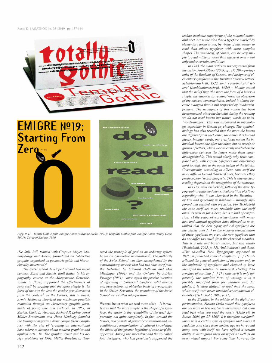
si legge meglio quel che leggiamo più spesso – Èproprio vero che più è semplice la forma di un ca-rattere e più è semplice la leggibilità del testo? Aquanto pare, non del tutto o non fino in fondo. In-torno agli anni Sessanta, infatti, in un clima dicontestazione generale e riorganizzazione incon-dizionata dello scibile culturale, il diktat dellamaggiore leggibilità dei caratteri lineari vennemeno. Tra gli specialisti e i cosiddetti font desi-gner, che precedentemente avevano sostenuto lasuperiorità tecno-estetica del mono-alfabeto linea-re, si fece strada l’idea che un carattere contrasse-gnato da forme elementari non sia, in forza di ciò,più semplice da leggere di altri caratteri dalle for-me più complesse. I caratteri lineari (senza gra-zie), certo, possono essere molto semplici da leg-gere – come e più di quelli romani (con grazie) –ma soltanto a determinate condizioni.
Nel 1963, la critica maggiore fu mossa dal-l’interno. Josef Albers (2009, pp. 19, 20) – prota-gonista del Bauhaus di Dessau e anche lui, neglianni Venti, progettista di caratteri tipografici ele-mentari (‘lettere stencil’ Schablonenschrift, 1923,e ‘lettere combinatorie’ Kombinationsschrift, 1926)– affermò senza mezzi termini che la convinzioneper la quale ‘più la forma di una lettera è sempli-ce, più è semplice la sua lettura’ «era un’ossessio-ne del costruttivismo nascente, anzi divenne quasiun dogma che tuttora viene rispettato dai tipografi‘modernisti’. Si è dimostrata l’erroneità di questanozione, dal momento che durante la lettura noinon leggiamo lettere ma parole, parole comeunità, ‘parole-immagini’. Lo si è scoperto in psi-cologia, in particolar modo nella psicologia dellaGestalt. L’oftalmologia ha inoltre rivelato che piùle lettere sono diverse le une dalle altre, più sem-plice è la loro lettura». In altre parole, il nostro oc-chio mette a fuoco non le singole lettere una dopol’altra ma parole o gruppi di lettere, che riusciamoa leggere facilmente quando le differenze tra lelettere li rendono facilmente distinguibili. Ciòchiarirebbe come mai i testi composti soltanto concaratteri maiuscoli siano oggettivamente difficilida leggere: per via dell’eguale altezza delle lette-re. Conseguentemente, secondo Albers, i caratterilineari sono più difficili da leggere di quelli roma-ni, perché «producono ‘parole-immagini’ scaden-ti». Ecco perché «una lettura chiara dipende dal ri-conoscimento del contesto».
Nel 1975, perfino Tschichold, padre della Nuo-va Tipografia, ribadì la posizione critica di Albersrispetto a quanto negli anni Venti teorizzato – da luie nel Bauhaus – abbondantemente caldeggiato eapplicato con precisione. Per Tschichold i caratterilineari sono più leggibili di quelli romani. Comequella di Albers, la sua è una specie di confessione:«Cinquant’anni di sperimentazione con molti ca-ratteri nuovi e inusuali hanno permesso di stabilireche i migliori caratteri tipografici sono quelli clas-sici […] oppure la reincarnazione moderna di que-sti caratteri o, ancora, i nuovi caratteri che non sidifferenziano troppo da i moduli classici. Questa èuna lezione tardiva e pagata a caro prezzo, ma pursempre valida» (Tschichold, 2003, p. 13). E non fi-nisce qua. «La cosiddetta Nuova Tipografia appar-
ve nel 1925: predicava semplicità radicale. […] At-tribuì la confusione generale del settore solamentealla moltitudine dei caratteri e pretese di aver indi-viduato la soluzione nel carattere senza grazie,eleggendolo a carattere del nostro tempo. […] Ilcarattere lineare e solo apparentemente la forma discrittura più semplice: è una forma forzatamentesemplificata per i bambini e, per gli adulti, è piùdifficile da leggere del carattere romano, le cui gra-zie non sono mai state intese come elementi orna-mentali» (Tschichold, 2003, p. 15).
Negli anni Ottanta, in piena sperimentazionedigitale, Zuzana Licko affermò che i caratteri tipo-grafici non sono molto o poco leggibili di per sé,ma «you read best what you read the most» (Lickocit. in Russo, 2006, pp. 27, 120)8. È dunque la no-stra familiarità con un certo tipo di carattere a ren-derlo leggibile. E siccome abbiamo letto molti testicon caratteri romani fin dalla più tenera età, abbia-mo affinato una certa capacità di distinguerli sullacarta come pure su ogni supporto visivo. Già daqualche tempo, però, la lettura dei testi si svolgesempre più su schermi che altrove; e qui si trovanosoprattutto caratteri lineari, da Wikipedia ai socialnetwork. Il primato della leggibilità dei caratteriromani sembra allora essere, ancora una volta, se-gnato. Che cosa accadrà – e sta già accadendo –quando i testi più largamente letti nell’intero globoterracqueo saranno i post su Facebook o altro gene-re d’interconnessione social?
conclusioni – Un tema interessante che il mono-al-fabeto porta con sé è poi quello della ‘universalità’,da cui il nome Universal. L’universalità del caratte-re di Bayer non consiste soltanto nelle forme ridot-te all’osso e quindi immediatamente accessibili.L’universalità è anche – e soprattutto – la precisaintenzione di mettere a segno una forma di scritturadavvero democratica, non caratterizzata da nazio-nalismi e status: il contrario, negli anni Venti, delgotico – Black Letter – intimamente legato allaGermania e ai Paesi nordeuropei. Per cogliere lo
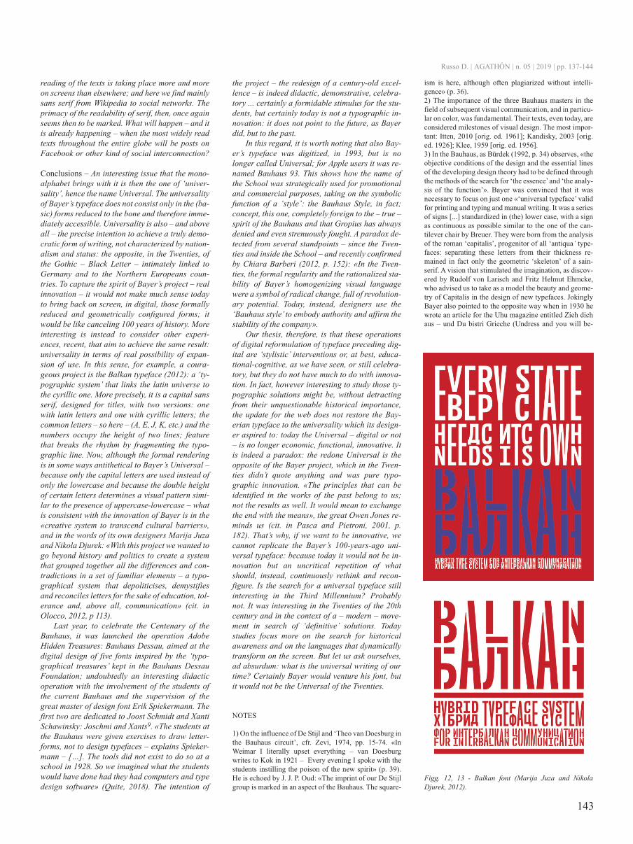
spirito del progetto di Bayer – la vera innovazione– non avrebbe oggi molto senso ricondurre suschermo, in digitale, quelle forme formalmente ri-dotte e geometricamente configurate; sarebbe co-me annullare di colpo 100 anni di storia. Più inte-ressante è invece considerare altre esperienze, re-centi, che mirano a raggiungere lo stesso risultato:l’universalità in termini di reale possibilità diespansione di utilizzo. In questo senso, ad esem-pio, un progetto coraggioso è il carattere Balkan(2012): un ‘sistema tipografico’ che collega l’uni-verso latino a quello cirillico. Più precisamente, sitratta di un sans serif in maiuscolo, pensato per i ti-toli, con due versioni: una con lettere in latino el’altra in cirillico; le lettere comuni – ecco dunque– (A, E, J, K, ecc.) e i numeri occupano l’altezza didue righe; caratteristica che spezza il ritmo fram-mentando la riga tipografica. Ora, benché la resaformale sia per certi versi antitetica all’Universaldi Bayer – perché si usa soltanto il maiuscolo anzi-ché soltanto il minuscolo e perché l’altezza doppiadi certe lettere determina un andamento visivo si-mile alla compresenza di maiuscolo-minuscolo –ciò che è coerente con l’innovazione di Bayer stanel «sistema creativo per trascendere le barriereculturali» e nelle parole dei suoi stessi progettistiMarija Juza e Nikola Djurek: «Con questo progettosiamo voluti andare oltre la storia e la politica percreare un sistema che raggruppasse tutte le diffe-renze e le contraddizioni in un insieme di elementifamiliari – un sistema tipografico che depoliticiz-za, demistifica e riconcilia le lettere per il bene del-l’educazione, della tolleranza e, soprattutto, dellacomunicazione» (cit. in Olocco, 2012, p. 113).
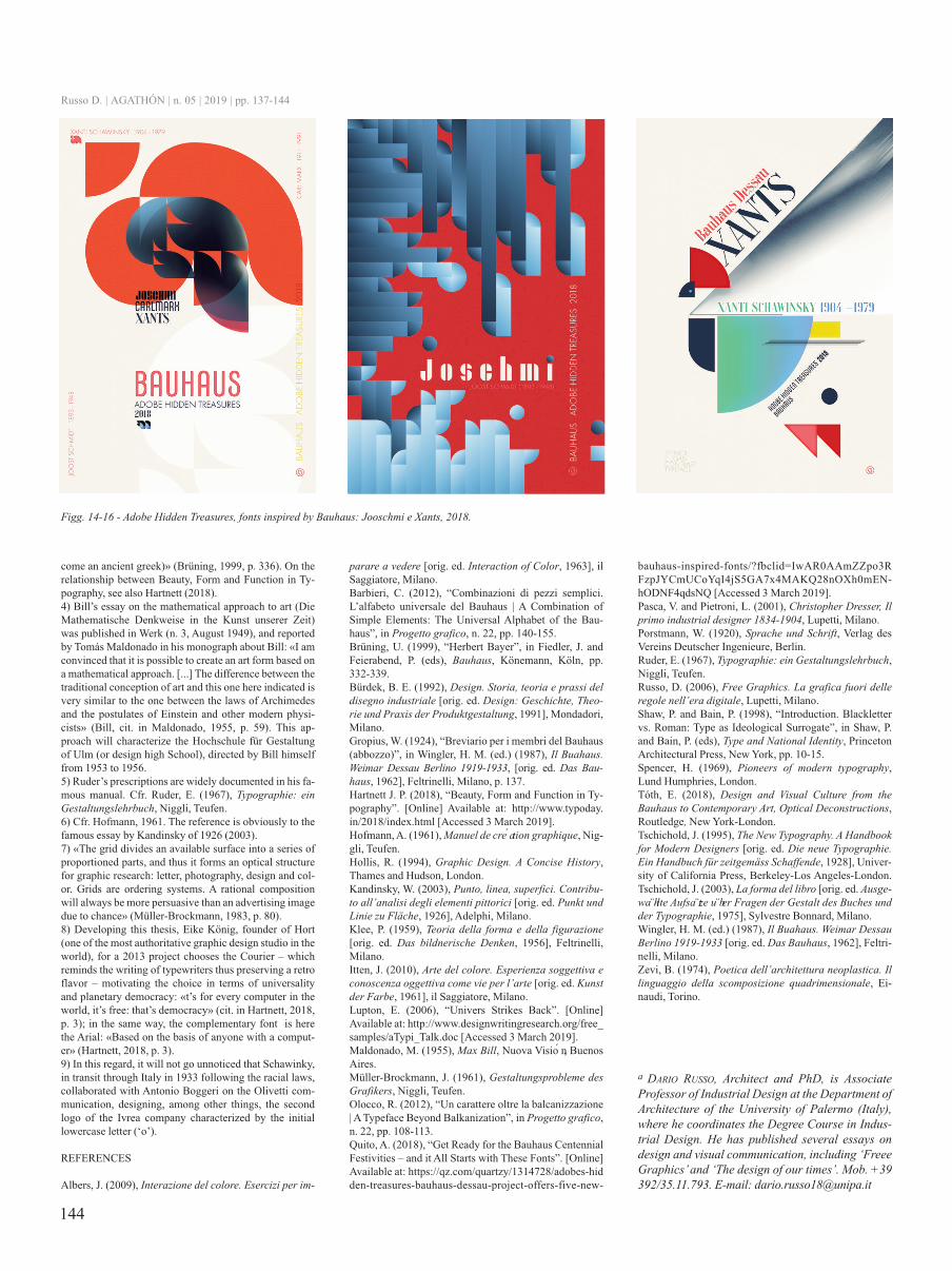
L’anno scorso, per celebrare il Centenario delBauhaus, è stata lanciata l’operazione Adobe Hid-den Treasures: Bauhaus Dessau, volta alla progetta-zione digitale di cinque caratteri ispirati ai ‘tesori ti-pografici’ custoditi nella Bauhaus Dessau Founda-tion; un’operazione didattica indubbiamente inte-ressante con il coinvolgimento degli studenti del-l’attuale Bauhaus e la supervisione del grande mae-stro di font design Erik Spiekermann. I primi duesono dedicati a Joost Schmidt e a Xanti Schawin-sky: Joschmi e Xants9. «The students at the Bau-haus were given exercises to draw letterforms, notto design typefaces – spiega Spiekermann – […].The tools did not exist to do so at a school in 1928.So we imagined what the students would have donehad they had computers and type design software»(Quite, 2018). L’intenzione del progetto – il redesi-gn di una centenaria eccellenza – è appunto didatti-ca, dimostrativa, celebrativa … certamente un for-midabile stimolo per gli studenti, ma non è certooggi un’innovazione tipografica: non punta al futu-ro, come ha fatto Bayer, ma al passato.
A tal proposito, vale la pena di notare che an-che il carattere di Bayer è stato digitalizzato, nel1993, ma non si chiama più Universal; per gli uten-ti della Apple è stato ribattezzato Bauhaus 93. Ciòdimostra come il nome della Scuola sia stato strate-gicamente impiegato a fini promozionali e com-merciali, assumendo la funzione simbolica di uno‘stile’: lo Stile Bauhaus, appunto; concetto, questo,del tutto estraneo allo spirito del Bauhaus – vero –e che Gropius ha sempre negato e anche strenua-mente combattuto. Un paradosso rilevato da piùparti – fin dagli anni Venti e all’interno della Scuola– e ribadito recentemente da Chiara Barberi (2012,p. 152): «Negli anni Venti, la regolarità formale ela stabilità razionalizzata del linguaggio visivo
Russo D. | AGATHÓN | n. 05 | 2019 | pp. 137-144
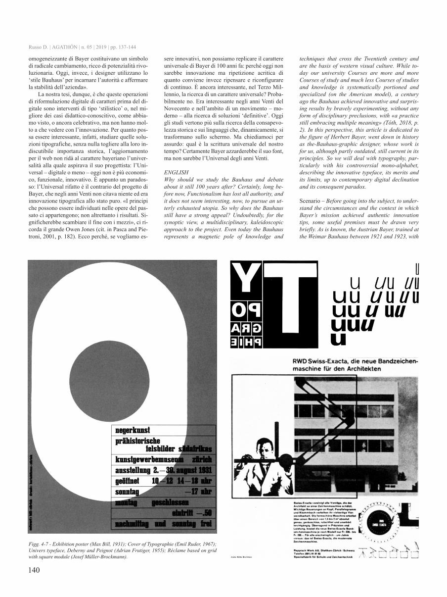
Fig. 3 - Prospectus for die Neue typographie (Jan tschi-chold, 1928).
140
omogeneizzante di Bayer costituivano un simbolodi radicale cambiamento, ricco di potenzialità rivo-luzionaria. Oggi, invece, i designer utilizzano lo‘stile Bauhaus’ per incarnare l’autorità e affermarela stabilità dell’azienda».
La nostra tesi, dunque, è che queste operazionidi riformulazione digitale di caratteri prima del di-gitale sono interventi di tipo ‘stilistico’ o, nel mi-gliore dei casi didattico-conoscitivo, come abbia-mo visto, o ancora celebrativo, ma non hanno mol-to a che vedere con l’innovazione. Per quanto pos-sa essere interessante, infatti, studiare quelle solu-zioni tipografiche, senza nulla togliere alla loro in-discutibile importanza storica, l’aggiornamentoper il web non ridà al carattere bayeriano l’univer-salità alla quale aspirava il suo progettista: l’Uni-versal – digitale o meno – oggi non è più economi-co, funzionale, innovativo. È appunto un parados-so: l’Universal rifatto è il contrario del progetto diBayer, che negli anni Venti non citava niente ed erainnovazione tipografica allo stato puro. «I principiche possono essere individuati nelle opere del pas-sato ci appartengono; non altrettanto i risultati. Si-gnificherebbe scambiare il fine con i mezzi», ci ri-corda il grande Owen Jones (cit. in Pasca and Pie-troni, 2001, p. 182). Ecco perché, se vogliamo es-
sere innovativi, non possiamo replicare il carattereuniversale di Bayer di 100 anni fa: perché oggi nonsarebbe innovazione ma ripetizione acritica diquanto conviene invece ripensare e riconfiguraredi continuo. È ancora interessante, nel Terzo Mil-lennio, la ricerca di un carattere universale? Proba-bilmente no. Era interessante negli anni Venti delNovecento e nell’ambito di un movimento – mo-derno – alla ricerca di soluzioni ‘definitive’. Oggigli studi vertono più sulla ricerca della consapevo-lezza storica e sui linguaggi che, dinamicamente, sitrasformano sullo schermo. Ma chiediamoci perassurdo: qual è la scrittura universale del nostrotempo? Certamente Bayer azzarderebbe il suo font,ma non sarebbe l’Universal degli anni Venti.
ENGLIsHwhy should we study the bauhaus and debateabout it still 100 years after? certainly, long be-fore now, Functionalism has lost all authority, andit does not seem interesting, now, to pursue an ut-terly exhausted utopia. so why does the bauhausstill have a strong appeal? Undoubtedly, for thesynoptic view, a multidisciplinary, kaleidoscopicapproach to the project. Even today the bauhausrepresents a magnetic pole of knowledge and
techniques that cross the twentieth century andare the basis of western visual culture. while to-day our university courses are more and morecourses of study and much less courses of studiesand knowledge is systematically portioned andspecialized (on the American model), a centuryago the bauhaus achieved innovative and surpris-ing results by bravely experimenting, without anyform of disciplinary preclusions, with «a practicestill embracing multiple meaning» (tóth, 2018, p.2). In this perspective, this article is dedicated tothe figure of Herbert bayer, went down in historyas the-bauhaus-graphic designer, whose work isfor us, although partly outdated, still current in itsprinciples. so we will deal with typography, par-ticularly with his controversial mono-alphabet,describing the innovative typeface, its merits andits limits, up to contemporary digital declinationand its consequent paradox.
Scenario – before going into the subject, to under-stand the circumstances and the context in whichbayer’s mission achieved authentic innovationtips, some useful premises must be drawn verybriefly. As is known, the Austrian bayer, trained atthe weimar bauhaus between 1921 and 1923, with
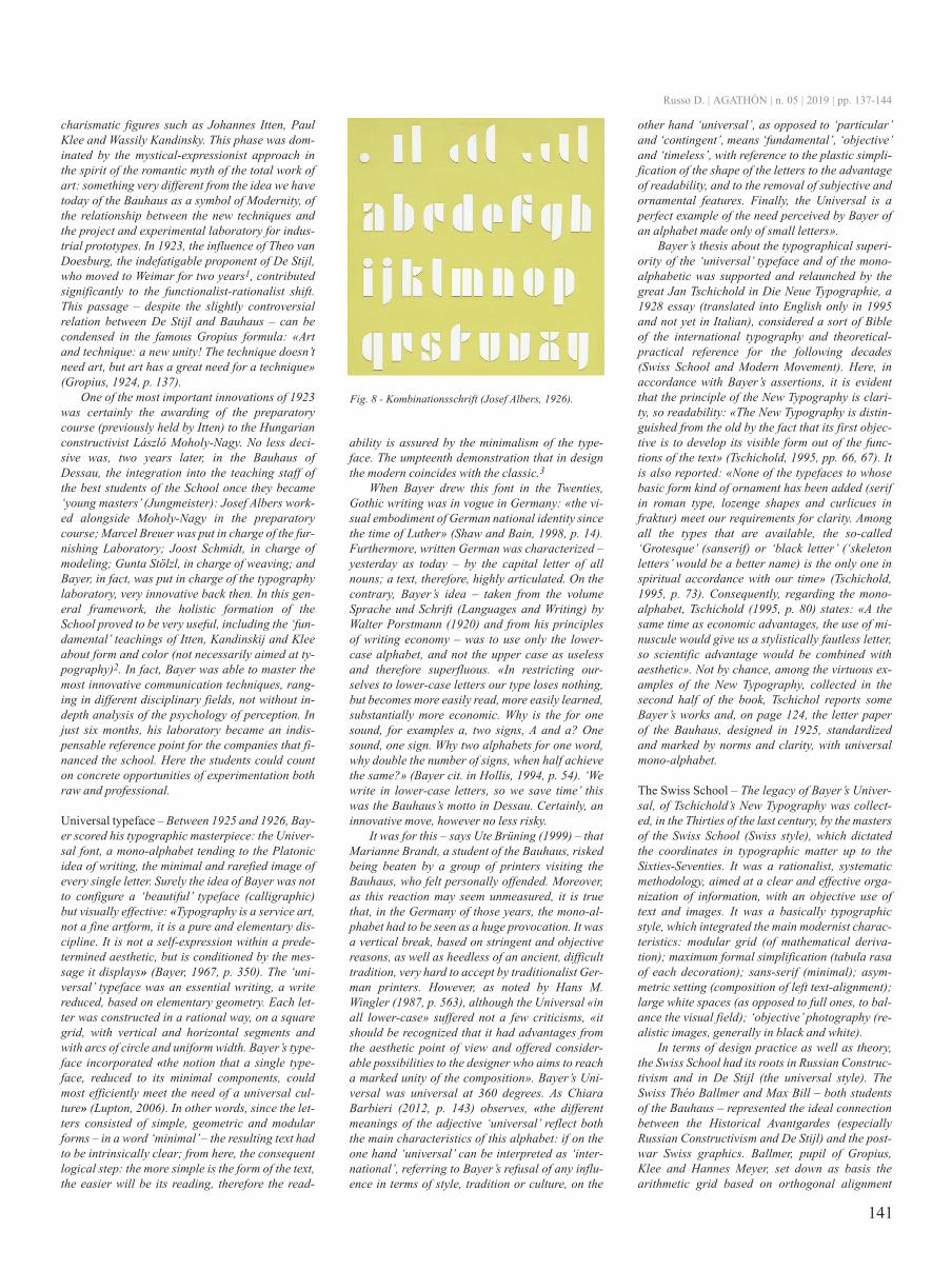
Figg. 4-7 - Exhibition poster (Max bill, 1931); cover of typographie (Emil ruder, 1967);Univers typeface, deberny and Peignot (Adrian Frutiger, 1955); réclame based on gridwith square module (Josef Müller-brockmann).
Russo D. | AGATHÓN | n. 05 | 2019 | pp. 137-144
141
charismatic figures such as Johannes Itten, PaulKlee and wassily Kandinsky. this phase was dom-inated by the mystical-expressionist approach inthe spirit of the romantic myth of the total work ofart: something very different from the idea we havetoday of the bauhaus as a symbol of Modernity, ofthe relationship between the new techniques andthe project and experimental laboratory for indus-trial prototypes. In 1923, the influence of theo vandoesburg, the indefatigable proponent of de stijl,who moved to weimar for two years1, contributedsignificantly to the functionalist-rationalist shift.this passage – despite the slightly controversialrelation between de stijl and bauhaus – can becondensed in the famous Gropius formula: «Artand technique: a new unity! the technique doesn’tneed art, but art has a great need for a technique»(Gropius, 1924, p. 137).
one of the most important innovations of 1923was certainly the awarding of the preparatorycourse (previously held by Itten) to the Hungarianconstructivist László Moholy-Nagy. No less deci-sive was, two years later, in the bauhaus ofdessau, the integration into the teaching staff ofthe best students of the school once they became‘young masters’ (Jungmeister): Josef Albers work-ed alongside Moholy-Nagy in the preparatorycourse; Marcel breuer was put in charge of the fur-nishing Laboratory; Joost schmidt, in charge ofmodeling; Gunta stölzl, in charge of weaving; andbayer, in fact, was put in charge of the typographylaboratory, very innovative back then. In this gen-eral framework, the holistic formation of theschool proved to be very useful, including the ‘fun-damental’ teachings of Itten, Kandinskij and Kleeabout form and color (not necessarily aimed at ty-pography)2. In fact, bayer was able to master themost innovative communication techniques, rang-ing in different disciplinary fields, not without in-depth analysis of the psychology of perception. Injust six months, his laboratory became an indis-pensable reference point for the companies that fi-nanced the school. Here the students could counton concrete opportunities of experimentation bothraw and professional.
Universal typeface – between 1925 and 1926, bay-er scored his typographic masterpiece: the Univer-sal font, a mono-alphabet tending to the Platonicidea of writing, the minimal and rarefied image ofevery single letter. surely the idea of bayer was notto configure a ‘beautiful’ typeface (calligraphic)but visually effective: «typography is a service art,not a fine artform, it is a pure and elementary dis-cipline. It is not a self-expression within a prede-termined aesthetic, but is conditioned by the mes-sage it displays» (bayer, 1967, p. 350). the ‘uni-versal’ typeface was an essential writing, a writereduced, based on elementary geometry. Each let-ter was constructed in a rational way, on a squaregrid, with vertical and horizontal segments andwith arcs of circle and uniform width. bayer’s type-face incorporated «the notion that a single type-face, reduced to its minimal components, couldmost efficiently meet the need of a universal cul-ture» (Lupton, 2006). In other words, since the let-ters consisted of simple, geometric and modularforms – in a word ‘minimal’ – the resulting text hadto be intrinsically clear; from here, the consequentlogical step: the more simple is the form of the text,the easier will be its reading, therefore the read-
ability is assured by the minimalism of the type-face. the umpteenth demonstration that in designthe modern coincides with the classic.3
when bayer drew this font in the twenties,Gothic writing was in vogue in Germany: «the vi-sual embodiment of German national identity sincethe time of Luther» (shaw and bain, 1998, p. 14).Furthermore, written German was characterized –yesterday as today – by the capital letter of allnouns; a text, therefore, highly articulated. on thecontrary, bayer’s idea – taken from the volumesprache und schrift (Languages and writing) bywalter Porstmann (1920) and from his principlesof writing economy – was to use only the lower-case alphabet, and not the upper case as uselessand therefore superfluous. «In restricting our-selves to lower-case letters our type loses nothing,but becomes more easily read, more easily learned,substantially more economic. why is the for onesound, for examples a, two signs, A and a? onesound, one sign. why two alphabets for one word,why double the number of signs, when half achievethe same?» (bayer cit. in Hollis, 1994, p. 54). ‘wewrite in lower-case letters, so we save time’ thiswas the bauhaus’s motto in dessau. certainly, aninnovative move, however no less risky.
It was for this – says Ute brüning (1999) – thatMarianne brandt, a student of the bauhaus, riskedbeing beaten by a group of printers visiting thebauhaus, who felt personally offended. Moreover,as this reaction may seem unmeasured, it is truethat, in the Germany of those years, the mono-al-phabet had to be seen as a huge provocation. It wasa vertical break, based on stringent and objectivereasons, as well as heedless of an ancient, difficulttradition, very hard to accept by traditionalist Ger-man printers. However, as noted by Hans M.wingler (1987, p. 563), although the Universal «inall lower-case» suffered not a few criticisms, «itshould be recognized that it had advantages fromthe aesthetic point of view and offered consider-able possibilities to the designer who aims to reacha marked unity of the composition». bayer’s Uni-versal was universal at 360 degrees. As chiarabarbieri (2012, p. 143) observes, «the differentmeanings of the adjective ‘universal’ reflect boththe main characteristics of this alphabet: if on theone hand ‘universal’ can be interpreted as ‘inter-national’, referring to bayer’s refusal of any influ-ence in terms of style, tradition or culture, on the
other hand ‘universal’, as opposed to ‘particular’and ‘contingent’, means ‘fundamental’, ‘objective’and ‘timeless’, with reference to the plastic simpli-fication of the shape of the letters to the advantageof readability, and to the removal of subjective andornamental features. Finally, the Universal is aperfect example of the need perceived by bayer ofan alphabet made only of small letters».
bayer’s thesis about the typographical superi-ority of the ‘universal’ typeface and of the mono-alphabetic was supported and relaunched by thegreat Jan tschichold in die Neue typographie, a1928 essay (translated into English only in 1995and not yet in Italian), considered a sort of bibleof the international typography and theoretical-practical reference for the following decades(swiss school and Modern Movement). Here, inaccordance with bayer’s assertions, it is evidentthat the principle of the New typography is clari-ty, so readability: «the New typography is distin-guished from the old by the fact that its first objec-tive is to develop its visible form out of the func-tions of the text» (tschichold, 1995, pp. 66, 67). Itis also reported: «None of the typefaces to whosebasic form kind of ornament has been added (serifin roman type, lozenge shapes and curlicues infraktur) meet our requirements for clarity. Amongall the types that are available, the so-called‘Grotesque’ (sanserif) or ‘black letter’ (‘skeletonletters’ would be a better name) is the only one inspiritual accordance with our time» (tschichold,1995, p. 73). consequently, regarding the mono-alphabet, tschichold (1995, p. 80) states: «A thesame time as economic advantages, the use of mi-nuscule would give us a stylistically fautless letter,so scientific advantage would be combined withaesthetic». Not by chance, among the virtuous ex-amples of the New typography, collected in thesecond half of the book, tschichol reports somebayer’s works and, on page 124, the letter paperof the bauhaus, designed in 1925, standardizedand marked by norms and clarity, with universalmono-alphabet.
The Swiss School – the legacy of bayer’s Univer-sal, of tschichold’s New typography was collect-ed, in the thirties of the last century, by the mastersof the swiss school (swiss style), which dictatedthe coordinates in typographic matter up to thesixties-seventies. It was a rationalist, systematicmethodology, aimed at a clear and effective orga-nization of information, with an objective use oftext and images. It was a basically typographicstyle, which integrated the main modernist charac-teristics: modular grid (of mathematical deriva-tion); maximum formal simplification (tabula rasaof each decoration); sans-serif (minimal); asym-metric setting (composition of left text-alignment);large white spaces (as opposed to full ones, to bal-ance the visual field); ‘objective’ photography (re-alistic images, generally in black and white).
In terms of design practice as well as theory,the swiss school had its roots in russian construc-tivism and in de stijl (the universal style). theswiss théo ballmer and Max bill – both studentsof the bauhaus – represented the ideal connectionbetween the Historical Avantgardes (especiallyrussian constructivism and de stijl) and the post-war swiss graphics. ballmer, pupil of Gropius,Klee and Hannes Meyer, set down as basis thearithmetic grid based on orthogonal alignment
Fig. 8 - Kombinationsschrift (Josef Albers, 1926).
Russo D. | AGATHÓN | n. 05 | 2019 | pp. 137-144
142
rized the principle of grid as an ordering systembased on typometric modulations7. the authorityof the swiss school was then strengthened by theextraordinary success that had two sans serif font:the Helvetica by Edouard Hoffman and MaxMiedinger (1961) and the Univers by AdrianFrutiger (1954) – once again the precise intentionof affirming a Universal typeface valid alwaysand everywhere, as objective basis of typography.In the sixties-seventies, the postulates of the swissschool were called into question.
We read better what we read more often – Is it real-ly true that the more simple is the shape of a type-face, the easier is the readability of the text? Ap-parently, not quite completely. In fact, around thesixties, in a climate of general contestation and un-conditional reorganization of cultural knowledge,the diktat of the greater legibility of sans serif dis-appeared. Among the specialists and the so-calledfont designers, who had previously supported the
techno-aesthetic superiority of the minimal mono-alphabet, arose the idea that a typeface marked byelementary forms is not, by virtue of this, easier toread than others typefaces with more complexshapes. the sans-serif, of course, can be very sim-ple to read – like or more than the serif ones – butonly under certain conditions.
In 1963, the main criticism was expressed fromthe inside. Josef Albers (2009, pp. 19, 20) – protag-onist of the bauhaus of dessau, and designer of el-ementary typefaces in the twenties (‘stencil letters’schablonenschrift, 1923, and ‘combinatorial let-ters’ Kombinationsschrift, 1926) – bluntly statedthat the belief that ‘the more the form of a letter issimple, the easier is its reading’ «was an obsessionof the nascent constructivism, indeed it almost be-came a dogma that is still respected by ‘modernist’printers. the wrongness of this notion has beendemonstrated, since the fact that during the readingwe do not read letters but words, words as units,‘words-images’. this was discovered in psycholo-gy, especially in Gestalt psychology. the ophthal-mology has also revealed that the more the lettersare different from each other, the easier it is to readthem». In other words, our eyes focus not on the in-dividual letters one after the other, but on words orgroups of letters, which we can easily read when thedifferences between the letters make them easilydistinguishable. this would clarify why texts com-posed only with capital typefaces are objectivelyhard to read: due to the equal height of the letters.consequently, according to Albers, sans serif aremore difficult to read than serif ones, because «theyproduce poor ‘words images’». this is why «a clearreading depends on the recognition of the context».
In 1975, even tschichold, father of the New ty-pography, reaffirmed the critical position of Albersregarding what it was theorized in the twenties –by him and generally in bauhaus – strongly sup-ported and applied with precision. For tschicholdthe sans serif are more readable than the serifones. As well as for Albers, his is a kind of confes-sion: «Fifty years of experimentation with manynew and unusual typefaces have allowed us to es-tablish that the best typographical typefaces arethe classic ones [...] or the modern reincarnationof these typefaces or, even, the new typefaces thatdo not differ too much from the classical modules.this is a late and barely lesson, but still valid»(tschichold, 2003, p. 13). And it doesn’t end there.«the so-called New typography appeared in1925: it preached radical simplicity. [...] He at-tributed the general confusion of the sector only tothe multitude of typefaces and claimed to haveidentified the solution in sans-serif, electing it totypeface of our time. [...] the sans-serif is only ap-parently the simplest form of writing: it is aforcibly simplified form for children and, foradults, it is more difficult to read than the sans,whose serif were never intended as ornamental el-ements» (tschichold, 2003, p. 15).
In the Eighties, in the middle of the digital ex-perimentation, Zuzana Licko stated that typefacesare not more or less legible in themselves, but «youread best what you read the most» (Licko cit. inrusso, 2006, pp. 27, 120)8. It is therefore our famil-iarity with a certain type of typeface that makes itreadable. And since from earliest age we have readmany texts with serif, we have refined a certainability to distinguish them on paper as well as onevery visual support. For some time, however, the
(de stil). bill, trained with Gropius, Meyer, Mo-holy-Nagy and Albers, formulated an ‘objectivegraphic, organized on geometric grids and hierar-chically structured.4
the swiss school developed around two nervecenters: basel and Zurich. Emil ruder, in his ty-pography course at the Allegemeine Gewerbe-schule in basel, supported the effectiveness ofsans serif by arguing that the more simple is theform of the text the less the reader gets distractedfrom the content5. In the Forties, still in basel,Armin Hofmann theorized the maximum possiblereduction through an elementary graphic form,made of point, line and surface6. In 1959, inZurich, carlo L. Vivarelli, richard P. Lohse, JosefMüller-brockmann and Hans Neuburg foundedthe trilingual magazine Neue Grafik (New Graph-ics) with the aim of ‘creating an internationalbase where to discuss about modern graphics andapplied arts’. In ‘the graphic Artist and his de-sign problems’ of 1961, Müller-brockmann theo-
Figg. 9-11 - totally Gothic font, Emigre Fonts (Zuzanna Licko, 1991); template Gothic font, Emigre Fonts (barry deck,1991); cover of Emigre, 1990.
Russo D. | AGATHÓN | n. 05 | 2019 | pp. 137-144
143
reading of the texts is taking place more and moreon screens than elsewhere; and here we find mainlysans serif from wikipedia to social networks. theprimacy of the readability of serif, then, once againseems then to be marked. what will happen – and itis already happening – when the most widely readtexts throughout the entire globe will be posts onFacebook or other kind of social interconnection?
Conclusions – An interesting issue that the mono-alphabet brings with it is then the one of ‘univer-sality’, hence the name Universal. the universalityof bayer’s typeface does not consist only in the (ba-sic) forms reduced to the bone and therefore imme-diately accessible. Universality is also – and aboveall – the precise intention to achieve a truly demo-cratic form of writing, not characterized by nation-alism and status: the opposite, in the twenties, ofthe Gothic – black Letter – intimately linked toGermany and to the Northern Europeans coun-tries. to capture the spirit of bayer’s project – realinnovation – it would not make much sense todayto bring back on screen, in digital, those formallyreduced and geometrically configured forms; itwould be like canceling 100 years of history. Moreinteresting is instead to consider other experi-ences, recent, that aim to achieve the same result:universality in terms of real possibility of expan-sion of use. In this sense, for example, a coura-geous project is the balkan typeface (2012): a ‘ty-pographic system’ that links the latin universe tothe cyrillic one. More precisely, it is a capital sansserif, designed for titles, with two versions: onewith latin letters and one with cyrillic letters; thecommon letters – so here – (A, E, J, K, etc.) and thenumbers occupy the height of two lines; featurethat breaks the rhythm by fragmenting the typo-graphic line. Now, although the formal renderingis in some ways antithetical to bayer’s Universal –because only the capital letters are used instead ofonly the lowercase and because the double heightof certain letters determines a visual pattern simi-lar to the presence of uppercase-lowercase – whatis consistent with the innovation of bayer is in the«creative system to transcend cultural barriers»,and in the words of its own designers Marija Juzaand Nikola djurek: «with this project we wanted togo beyond history and politics to create a systemthat grouped together all the differences and con-tradictions in a set of familiar elements – a typo-graphical system that depoliticises, demystifiesand reconciles letters for the sake of education, tol-erance and, above all, communication» (cit. inolocco, 2012, p 113).
Last year, to celebrate the centenary of thebauhaus, it was launched the operation AdobeHidden treasures: bauhaus dessau, aimed at thedigital design of five fonts inspired by the ‘typo-graphical treasures’ kept in the bauhaus dessauFoundation; undoubtedly an interesting didacticoperation with the involvement of the students ofthe current bauhaus and the supervision of thegreat master of design font Erik spiekermann. thefirst two are dedicated to Joost schmidt and Xantischawinsky: Joschmi and Xants9. «the students atthe bauhaus were given exercises to draw letter-forms, not to design typefaces – explains spieker-mann – […]. the tools did not exist to do so at aschool in 1928. so we imagined what the studentswould have done had they had computers and typedesign software» (Quite, 2018). the intention of
the project – the redesign of a century-old excel-lence – is indeed didactic, demonstrative, celebra-tory ... certainly a formidable stimulus for the stu-dents, but certainly today is not a typographic in-novation: it does not point to the future, as bayerdid, but to the past.
In this regard, it is worth noting that also bay-er’s typeface was digitized, in 1993, but is nolonger called Universal; for Apple users it was re-named bauhaus 93. this shows how the name ofthe school was strategically used for promotionaland commercial purposes, taking on the symbolicfunction of a ‘style’: the bauhaus style, in fact;concept, this one, completely foreign to the – true –spirit of the bauhaus and that Gropius has alwaysdenied and even strenuously fought. A paradox de-tected from several standpoints – since the twen-ties and inside the school – and recently confirmedby chiara barberi (2012, p. 152): «In the twen-ties, the formal regularity and the rationalized sta-bility of bayer’s homogenizing visual languagewere a symbol of radical change, full of revolution-ary potential. today, instead, designers use the‘bauhaus style’ to embody authority and affirm thestability of the company».
our thesis, therefore, is that these operationsof digital reformulation of typeface preceding dig-ital are ‘stylistic’ interventions or, at best, educa-tional-cognitive, as we have seen, or still celebra-tory, but they do not have much to do with innova-tion. In fact, however interesting to study those ty-pographic solutions might be, without detractingfrom their unquestionable historical importance,the update for the web does not restore the bay-erian typeface to the universality which its design-er aspired to: today the Universal – digital or not– is no longer economic, functional, innovative. Itis indeed a paradox: the redone Universal is theopposite of the bayer project, which in the twen-ties didn’t quote anything and was pure typo-graphic innovation. «the principles that can beidentified in the works of the past belong to us;not the results as well. It would mean to exchangethe end with the means», the great owen Jones re-minds us (cit. in Pasca and Pietroni, 2001, p.182). that’s why, if we want to be innovative, wecannot replicate the bayer’s 100-years-ago uni-versal typeface: because today it would not be in-novation but an uncritical repetition of whatshould, instead, continuously rethink and recon-figure. Is the search for a universal typeface stillinteresting in the third Millennium? Probablynot. It was interesting in the twenties of the 20thcentury and in the context of a – modern – move-ment in search of ‘definitive’ solutions. todaystudies focus more on the search for historicalawareness and on the languages that dynamicallytransform on the screen. but let us ask ourselves,ad absurdum: what is the universal writing of ourtime? certainly bayer would venture his font, butit would not be the Universal of the twenties.
NOTES
1) On the influence of De Stijl and ‘Theo van Doesburg inthe Bauhaus circuit’, cfr. Zevi, 1974, pp. 15-74. «InWeimar I literally upset everything – van Doesburgwrites to Kok in 1921 – Every evening I spoke with thestudents instilling the poison of the new spirit» (p. 39).He is echoed by J. J. P. Oud: «The imprint of our De Stijlgroup is marked in an aspect of the Bauhaus. The square-
ism is here, although often plagiarized without intelli-gence» (p. 36).2) The importance of the three Bauhaus masters in thefield of subsequent visual communication, and in particu-lar on color, was fundamental. Their texts, even today, areconsidered milestones of visual design. The most impor-tant: Itten, 2010 [orig. ed. 1961]; Kandisky, 2003 [orig.ed. 1926]; Klee, 1959 [orig. ed. 1956].3) In the Bauhaus, as Bürdek (1992, p. 34) observes, «theobjective conditions of the design and the essential linesof the developing design theory had to be defined throughthe methods of the search for ‘the essence’ and ‘the analy-sis of the function’». Bayer was convinced that it wasnecessary to focus on just one «‘universal typeface’ validfor printing and typing and manual writing. It was a seriesof signs [...] standardized in (the) lower case, with a signas continuous as possible similar to the one of the can-tilever chair by Breuer. They were born from the analysisof the roman ‘capitalis’, progenitor of all ‘antiqua’ type-faces: separating these letters from their thickness re-mained in fact only the geometric ‘skeleton’ of a sain-serif. A vision that stimulated the imagination, as discov-ered by Rudolf von Larisch and Fritz Helmut Ehmcke,who advised us to take as a model the beauty and geome-try of Capitalis in the design of new typefaces. JokinglyBayer also pointed to the opposite way when in 1930 hewrote an article for the Uhu magazine entitled Zieh dichaus – und Du bistri Grieche (Undress and you will be-
Figg. 12, 13 - balkan font (Marija Juza and Nikoladjurek, 2012).
Russo D. | AGATHÓN | n. 05 | 2019 | pp. 137-144
144
come an ancient greek)» (Brüning, 1999, p. 336). On therelationship between Beauty, Form and Function in Ty-pography, see also Hartnett (2018).4) Bill’s essay on the mathematical approach to art (DieMathematische Denkweise in the Kunst unserer Zeit)was published in Werk (n. 3, August 1949), and reportedby Tomás Maldonado in his monograph about Bill: «I amconvinced that it is possible to create an art form based ona mathematical approach. [...] The difference between thetraditional conception of art and this one here indicated isvery similar to the one between the laws of Archimedesand the postulates of Einstein and other modern physi-cists» (Bill, cit. in Maldonado, 1955, p. 59). This ap-proach will characterize the Hochschule für Gestaltungof Ulm (or design high School), directed by Bill himselffrom 1953 to 1956.5) Ruder’s prescriptions are widely documented in his fa-mous manual. Cfr. Ruder, E. (1967), typographie: einGestaltungslehrbuch, Niggli, Teufen.6) Cfr. Hofmann, 1961. The reference is obviously to thefamous essay by Kandinsky of 1926 (2003).7) «The grid divides an available surface into a series ofproportioned parts, and thus it forms an optical structurefor graphic research: letter, photography, design and col-or. Grids are ordering systems. A rational compositionwill always be more persuasive than an advertising imagedue to chance» (Müller-Brockmann, 1983, p. 80).8) Developing this thesis, Eike König, founder of Hort(one of the most authoritative graphic design studio in theworld), for a 2013 project chooses the Courier – whichreminds the writing of typewriters thus preserving a retroflavor – motivating the choice in terms of universalityand planetary democracy: «t’s for every computer in theworld, it’s free: that’s democracy» (cit. in Hartnett, 2018,p. 3); in the same way, the complementary font is herethe Arial: «Based on the basis of anyone with a comput-er» (Hartnett, 2018, p. 3).9) In this regard, it will not go unnoticed that Schawinky,in transit through Italy in 1933 following the racial laws,collaborated with Antonio Boggeri on the Olivetti com-munication, designing, among other things, the secondlogo of the Ivrea company characterized by the initiallowercase letter (‘o’).
REFERENCES
Albers, J. (2009), Interazione del colore. Esercizi per im-
parare a vedere [orig. ed. Interaction of color, 1963], ilSaggiatore, Milano.Barbieri, C. (2012), “Combinazioni di pezzi semplici.L’alfabeto universale del Bauhaus | A Combination ofSimple Elements: The Universal Alphabet of the Bau-haus”, in Progetto grafico, n. 22, pp. 140-155.Brüning, U. (1999), “Herbert Bayer”, in Fiedler, J. andFeierabend, P. (eds), bauhaus, Könemann, Köln, pp.332-339.Bürdek, B. E. (1992), design. storia, teoria e prassi deldisegno industriale [orig. ed. design: Geschichte, theo-rie und Praxis der Produktgestaltung, 1991], Mondadori,Milano.Gropius, W. (1924), “Breviario per i membri del Bauhaus(abbozzo)”, in Wingler, H. M. (ed.) (1987), Il buahaus.weimar dessau berlino 1919-1933, [orig. ed. das bau-haus, 1962], Feltrinelli, Milano, p. 137.Hartnett J. P. (2018), “Beauty, Form and Function in Ty-pography”. [Online] Available at: http://www.typoday.in/2018/index.html [Accessed 3 March 2019].Hofmann, A. (1961), Manuel de creation graphique, Nig-gli, Teufen.Hollis, R. (1994), Graphic design. A concise History,Thames and Hudson, London.Kandinsky, W. (2003), Punto, linea, superfici. contribu-to all’analisi degli elementi pittorici [orig. ed. Punkt undLinie zu Fläche, 1926], Adelphi, Milano.Klee, P. (1959), teoria della forma e della figurazione[orig. ed. das bildnerische denken, 1956], Feltrinelli,Milano.Itten, J. (2010), Arte del colore. Esperienza soggettiva econoscenza oggettiva come vie per l’arte [orig. ed. Kunstder Farbe, 1961], il Saggiatore, Milano.Lupton, E. (2006), “Univers Strikes Back”. [Online]Available at: http://www.designwritingresearch.org/free_samples/aTypi_Talk.doc [Accessed 3 March 2019].Maldonado, M. (1955), Max bill, Nuova Vision, BuenosAires.Müller-Brockmann, J. (1961), Gestaltungsprobleme desGrafikers, Niggli, Teufen.Olocco, R. (2012), “Un carattere oltre la balcanizzazione| A Typeface Beyond Balkanization”, in Progetto grafico,n. 22, pp. 108-113.Quito, A. (2018), “Get Ready for the Bauhaus CentennialFestivities – and it All Starts with These Fonts”. [Online]Available at: https://qz.com/quartzy/1314728/adobes-hidden-treasures-bauhaus-dessau-project-offers-five-new-
bauhaus-inspired-fonts/?fbclid=IwAR0AAmZZpo3RFzpJYCmUCoYqI4jS5GA7x4MAKQ28nOXh0mEN-hODNF4qdsNQ [Accessed 3 March 2019].Pasca, V. and Pietroni, L. (2001), christopher dresser, Ilprimo industrial designer 1834-1904, Lupetti, Milano.Porstmann, W. (1920), sprache und schrift, Verlag desVereins Deutscher Ingenieure, Berlin.Ruder, E. (1967), typographie: ein Gestaltungslehrbuch,Niggli, Teufen.Russo, D. (2006), Free Graphics. La grafica fuori delleregole nell’era digitale, Lupetti, Milano.Shaw, P. and Bain, P. (1998), “Introduction. Blacklettervs. Roman: Type as Ideological Surrogate”, in Shaw, P.and Bain, P. (eds), type and National Identity, PrincetonArchitectural Press, New York, pp. 10-15.Spencer, H. (1969), Pioneers of modern typography,Lund Humphries, London.Tóth, E. (2018), design and Visual culture from thebauhaus to contemporary Art, optical deconstructions,Routledge, New York-London. Tschichold, J. (1995), the New typography. A Handbookfor Modern designers [orig. ed. die neue typographie.Ein Handbuch für zeitgemäss schaffende, 1928], Univer-sity of California Press, Berkeley-Los Angeles-London.Tschichold, J. (2003), La forma del libro [orig. ed. Ausge-wahlte Aufsatze uber Fragen der Gestalt des buches undder typographie, 1975], Sylvestre Bonnard, Milano.Wingler, H. M. (ed.) (1987), Il buahaus. weimar dessauberlino 1919-1933 [orig. ed. das bauhaus, 1962], Feltri-nelli, Milano.Zevi, B. (1974), Poetica dell’architettura neoplastica. Illinguaggio della scomposizione quadrimensionale, Ei-naudi, Torino.
a dArIo rUsso, Architect and Phd, is AssociateProfessor of Industrial design at the department ofArchitecture of the University of Palermo (Italy),where he coordinates the degree course in Indus-trial design. He has published several essays ondesign and visual communication, including ‘FreeeGraphics’ and ‘the design of our times’. Mob. +39392/35.11.793. E-mail: [email protected]
Figg. 14-16 - Adobe Hidden treasures, fonts inspired by bauhaus: Jooschmi e Xants, 2018.
Russo D. | AGATHÓN | n. 05 | 2019 | pp. 137-144